Scoring genre clarity...

RhythMania capsule

RhythMania

A vibrant rhythm anthology with one-button mini-games, colorful art, and a wide range of Brazilian musical styles!

RhythmMusicMinigames
Garoa StudiosTo be announced

RhythMania scores 87/100 — better than 96% of Rhythm capsules (n=339).

Released To be announced · By Garoa Studios

Quick text summary

RhythMania scored 87/100 on Steam Analyzer — Excellent for a Rhythm capsule. Top priority fix: [composition] Shift right-side characters slightly left or reduce their scale to ensure all critical character elements remain visible and safe from Steam cropping on small viewports.

Capsule scores by dimension

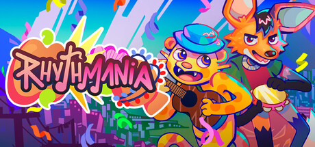
  • Genre Clarity: 9/10 — Vibrant rhythm game instantly clear. The oversized 'RHYTHMANIA' text with musical note iconography, bright neon palette, and energetic cartoon characters in dynamic poses immediately signal a rhythm/music game. At tiny size, the bold lettering and colorful burst effects remain legible and distinctly communicate a fun, casual music title without ambiguity.
  • Title Readability: 9/10 — Bold logo dominates at all sizes. The 'RHYTHMANIA' wordmark uses thick, high-contrast strokes with a hot pink/orange outline against the cool blue-cyan background, ensuring excellent readability from full header down to tiny thumbnail. At small and tiny sizes, the logo maintains its shape and impact without collapsing, anchoring the entire composition with clarity.
  • Contrast & Color: 9/10 — Neon palette pops against dark background. The design uses a vibrant spectrum of hot pink, yellow, orange, cyan, and magenta against deep blues and purples, creating strong value separation that reads crisply on Steam's dark #1b2838 background. In grayscale, the bright character elements and title maintain distinct silhouettes; the composition survives squinting and quick-scroll scanning with high impact.
  • Uniqueness & Polish: 9/10 — Premium art style with personality. The capsule showcases polished, hand-illustrated cartoon aesthetics with expressive character designs, dynamic poses, and a cohesive neon-burst art direction that feels intentional and craft-forward, not template-based. The visual storytelling—playful characters, musical cues, and energetic composition—communicates the game's fun, festive core mechanic without generic filler, standing distinctly apart from typical indie releases.
  • Brand Consistency: 8/10 — Recognizable style, strong visual identity. The capsule establishes a memorable brand through consistent use of neon saturation, cartoon character silhouettes, and a warm-to-cool gradient palette that should carry through the store screenshots and game UI. The orange and pink fox-like character in the center and the signature burst/comic-book effects create iconic motifs, though score is not 9 because the internal identity signals could be slightly more refined in color hierarchy.
  • Composition: 8/10 — Excellent focal hierarchy, minor edge risk. The 'RHYTHMANIA' title anchors the left-center, while the expressive orange fox character forms a clear primary focal point at right-center, with supporting characters and musical elements creating depth and eye flow. At small and tiny sizes, the composition reads cleanly, but the right-side characters sit close to the edge, risking Steam cropping; overall balance and layering are strong, with no dead space or clutter.

What works

  • Genre instantly identifiable. Musical note icons, bold 'RHYTHMANIA' text, and energetic character poses communicate rhythm game at glance, even at thumbnail size.
  • Exceptional visual polish. Hand-illustrated characters, consistent neon palette, and dynamic composition feel premium and intentional, not generic or templated.
  • Strong contrast against Steam background. Neon colors and value separation ensure the capsule pops during quick scroll and maintains clarity in grayscale.
  • Memorable brand motifs. Orange fox character, burst effects, and neon saturation create recognizable identity cues that should persist across store presence.

What hurts the capsule

  • Right-side character placement risk. The secondary characters and orange fox sit close to the right edge and may be cropped or clipped by Steam's responsive layout on narrow viewports.
  • Tagline or secondary text not visible. No readable subtitle or gameplay descriptor is present, so viewers must rely entirely on visual cues to understand 'one-button mini-games' or Brazilian music themes.

Priority fixes

  1. [composition] Shift right-side characters slightly left or reduce their scale to ensure all critical character elements remain visible and safe from Steam cropping on small viewports.
  2. [genre_clarity] Consider adding a subtle one-button icon or Brazilian music visual cue (e.g., drum or samba pattern) to reinforce the specific gameplay hook if store screenshots lack clarity on mechanics.
  3. [title_readability] Verify the 'RHYTHMANIA' outline thickness holds legibility at 120x45px; add a thin white or dark stroke layer underneath the pink if needed for thumbnail clarity.

Store copy priority fixes

  1. [hook_strength] Rewrite the short description to lead with 'Master quick one-button rhythm games through Brazilian music and art' to lead with gameplay verb and cultural specificity instead of adjectives.
  2. [feature_communication] Clarify Supermixes with one sentence explaining if they are timed challenges, difficulty spikes, or campaign-style progressive stages.
  3. [uniqueness] Add a sentence in the opening paragraph explicitly calling out the Brazilian music and artist focus as the core differentiator (e.g., 'Celebrate Brazilian culture through rhythm').

Related guides

Steam app ID: 2322070 · Tags: Rhythm, Music, Minigames, Casual, Hand-drawn