Mining Survivors scores 70/100 — better than 26% of Bullet Hell capsules (n=1,285).

Quick text summary

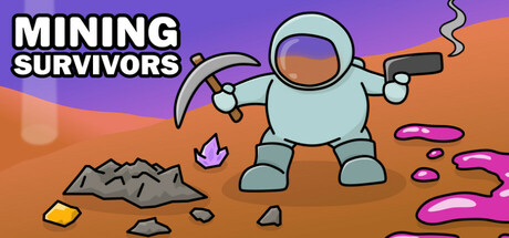
Mining Survivors scored 70/100 on Steam Analyzer — Good for a Bullet Hell capsule. Top priority fix: [uniqueness_polish] Add a distinctive visual hook such as an iconic resource icon, signature effect, or character detail that communicates the incremental/survivors twist at a glance.

Capsule scores by dimension

  • Genre Clarity: 7/10 — Clear casual action with mining theme. The astronaut character with pickaxe and gun immediately signals action-survival gameplay in a hazardous environment. The scattered rocks, mining debris, and enemies (pink creatures) communicate a mining + combat hybrid clearly at full size. At tiny size, the character silhouette and pickaxe remain readable, though the specific 'survivors-like incremental' subgenre is less obvious—it reads as generic action-mining rather than a Survivors clone.
  • Title Readability: 8/10 — Bold, legible title with strong contrast. MINING SURVIVORS uses a thick white outline sans-serif font positioned in the upper left corner against a purple-to-orange gradient background, ensuring excellent contrast and readability at all sizes. The two-line stacked layout maximizes visibility at tiny size without collapsing letterforms. At small and tiny sizes, both words remain crisp and instantly recognizable.
  • Contrast & Color: 8/10 — Vibrant warm palette pops well. The warm orange-brown desert landscape and bright magenta enemy creatures create strong value separation against the cool purple sky, which reads well against Steam's dark background. The light cyan astronaut suit provides mid-tone contrast that helps the character stand out without harsh glare. At tiny size, the color blocking remains clear and the character silhouette is distinct.
  • Uniqueness & Polish: 6/10 — Competent but familiar casual art style. The chunky vector art style and cute astronaut character feel polished and intentional, with clean outlines and consistent rendering throughout. However, the overall presentation reads as a generic casual game aesthetic—the mining theme and enemy design don't communicate a distinctive hook or unique selling point that would differentiate it from other indie casual titles. The craft is solid but the concept feels safe and not particularly memorable.
  • Brand Consistency: 6/10 — Consistent art style, minimal identity cues. The thick-outline vector art, pastel-to-vibrant color palette, and chunky character proportions are coherent throughout, suggesting this style is used consistently in-game. However, there are no strong iconic symbols, signature motifs, or memorable brand identity cues visible that would allow recognition of this game weeks later. The astronaut is a functional protagonist but not a distinctive character brand like iconic IP characters.
  • Composition: 7/10 — Clear focal point with balanced layout. The astronaut is positioned as the primary focal point in the center-right area, drawing the eye immediately while the title anchors the upper left with the game name. Background rocks and scattered enemy creatures provide supporting detail without competing for attention. At small size, the composition remains legible with the character and title both readable; the scattered elements become visual noise at tiny size but don't critically harm the overall read.

What works

  • Strong title contrast and placement. White outlined text in upper left corner against gradient background ensures readability at all sizes including tiny thumbnails.
  • Vibrant warm color palette. Orange, magenta, and purple colors create strong visual pop against Steam's dark background with clear value separation in grayscale.
  • Polished vector art execution. Consistent thick outlines, clean shapes, and intentional style choices throughout give a competent indie craft feel.
  • Clear protagonist silhouette. The astronaut character with pickaxe reads distinctly at all sizes and immediately communicates the mining + action theme.

What hurts the capsule

  • Generic casual game aesthetic. The art style and theme feel safe and familiar without a distinctive visual hook that would make it stand out in genre comparisons.
  • Limited brand identity cues. No iconic character, logo, or signature motif is present that would create lasting brand recognition or recall.
  • Survivors-like subgenre unclear. The capsule communicates 'mining action game' but does not visually signal the incremental/survivor-clone mechanics that differentiate it from similar titles.
  • Supporting elements become visual clutter. At tiny size, the scattered rocks, enemies, and particles create busy mid-tone noise that slightly dilutes focus on the protagonist.

Priority fixes

  1. [uniqueness_polish] Add a distinctive visual hook such as an iconic resource icon, signature effect, or character detail that communicates the incremental/survivors twist at a glance.
  2. [genre_clarity] Introduce a subtle UI element or visual cue (e.g., floating resource counter, wave indicator) that hints at the incremental survival mechanic rather than generic mining action.
  3. [composition] Simplify or stylize background elements to reduce visual clutter at tiny sizes while maintaining depth—consider muting non-critical rocks or using silhouettes.
  4. [brand_consistency] Develop a signature color accent or character marking that could serve as a recognizable brand motif across future marketing and in-game branding.

Store copy priority fixes

  1. [hook_strength] Replace 'Survivors-like' with a self-contained description: 'Roguelite where you mine resources between intense waves of enemies, then spend your haul to upgrade and unlock new territories.'
  2. [uniqueness] Add a sentence explaining what makes mining meaningful: 'Balance mining time against enemy pressure—the longer you mine, the richer your haul, but the deadlier the threats grow.'
  3. [tone_match] Inject energy and personality into the opening: use active verbs and player-centric language (e.g., 'Dig deeper, fight harder, upgrade smarter' or a comparable rallying cry).
  4. [feature_communication] Expand the feature list with one sentence per mechanic explaining impact: e.g., 'Mine rocks to gather resources—the more you mine, the richer your run' and 'Upgrade your character and unlock new territories with your earnings.'

Related guides

Steam app ID: 2322450 · Tags: Bullet Hell, Roguelite, Action Roguelike, Roguelike, Shoot 'Em Up