Quick text summary
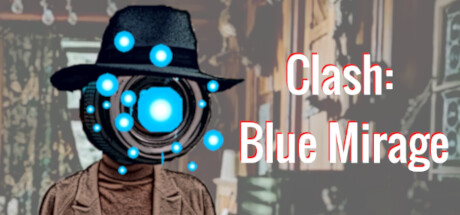
Clash: Blue Mirage scored 63/100 on Steam Analyzer — Solid for a Visual Novel capsule. Top priority fix: [genre_clarity] Add environmental or UI context cues that clearly signal adventure gameplay—such as a map element, compass, or exploration setting in the background or robot design.
Capsule scores by dimension
- Genre Clarity: 5/10 — Unclear genre, mysterious aesthetic. The bright cyan glowing orbs and steampunk/sci-fi robot face with a fedora create an ambiguous visual identity that doesn't strongly signal adventure game type. At tiny size, the glowing elements read as sci-fi or puzzle mechanic indicators, but there is no clear environmental or character context that communicates exploration, narrative-driven adventure, or combat. The surreal, abstract composition prioritizes mystery over genre clarity.
- Title Readability: 7/10 — Readable but slightly cramped placement. The title 'Clash: Blue Mirage' uses clean white sans-serif lettering with good contrast against the background, and remains legible at small and tiny sizes due to high value separation. However, the text placement wraps awkwardly across two lines and sits partially over the bright cyan elements, which can create slight visual competition at medium sizes. At tiny size the title maintains readability but occupies prime right-side real estate that compresses the layout.
- Contrast & Color: 8/10 — Strong cyan pop against dark background. The vivid cyan/bright blue glowing orbs and central lens create excellent silhouette separation and value contrast against the muted warm background and dark #1b2838 Steam background. The bright whites of the title text also punch through clearly with no muddy mid-tones. In grayscale, the cyan elements maintain strong edge definition and the overall composition does not collapse into mid-tone blur even at tiny sizes.
- Uniqueness & Polish: 6/10 — Competent but visually generic execution. The steampunk robot with glowing orbs is a familiar visual trope in indie games and lacks a distinctive art style or memorable hook that would set it apart from comparable adventure titles. The rendering appears clean and professional, but the composition feels like a template application of 'mysterious robot character' without communicating a unique selling point or core mechanic specific to Blue Mirage. The effect work (glowing orbs) is competent but does not suggest a novel gameplay premise.
- Brand Consistency: 5/10 — No memorable identity markers present. The capsule presents an isolated robot character with no recurring motifs, iconic symbols, or signature palette that would allow recognition across other marketing materials. The warm background cityscape and cyan accents are visually coherent internally, but provide no brand identity signals unique to Clash: Blue Mirage. Without reference to the 6 available screenshots, the image does not establish recognizable brand identity cues that would carry forward to future materials.
- Composition: 7/10 — Clear focal point, good depth layering. The robot head with glowing orbs forms a strong primary focal point in the left-center area, with the background cityscape providing clear depth separation as out-of-focus context. The title placement on the right balances the composition and creates a natural left-to-right reading flow. At tiny size, the composition remains coherent with the bright robot clearly separated from background; however, the title text placement creates some right-edge tension and the overall read is slightly busy rather than elegant.
What works
- Excellent cyan-to-background contrast. The bright blue glowing elements create strong silhouette clarity and value separation that punches through at all sizes, even against the dark Steam background.
- Readable title text with clean typography. White sans-serif lettering maintains legibility at small and tiny sizes with no weight loss or collapse due to high contrast with the background.
- Clear focal point and depth layering. The robot head is positioned as an obvious primary subject with a blurred cityscape background that creates proper compositional hierarchy and breathing room.
What hurts the capsule
- Ambiguous genre communication at tiny size. The glowing orbs and steampunk robot do not clearly signal adventure gameplay; the visual instead reads as sci-fi puzzle or mystery without context clues.
- Generic steampunk robot lacks uniqueness. The character design and glowing sphere effect are familiar indie game tropes that do not establish a distinctive visual hook or premium feel compared to benchmark titles.
- No recognizable brand identity markers. The capsule provides no memorable icons, motifs, or signature elements that would allow the game to be identified in future marketing materials or fan recall.
- Title placement creates right-edge tension. The two-line text wrapping and position over bright elements creates compositional awkwardness and risks Steam cropping at certain display ratios.
Priority fixes
- [genre_clarity] Add environmental or UI context cues that clearly signal adventure gameplay—such as a map element, compass, or exploration setting in the background or robot design.
- [uniqueness_polish] Establish a distinctive visual signature or core mechanic hint through the cyan glow pattern or robot design that suggests what makes Blue Mirage unique compared to other adventure games.
- [title_readability] Reposition the title to the left side or use a single-line layout with a subtle background panel to eliminate awkward wrapping and reduce right-edge tension.
- [brand_consistency] Develop a cohesive color palette and character design that can be consistently applied across all 6 store screenshots to build recognizable brand identity.
Store copy priority fixes
- [hook_strength] Rewrite the short description to lead with the core hook: 'A girl's desperate call from a haunted mansion controlled by an AI that can hack offline robots—uncover the mystery before it's too late.' This immediately communicates mystery, stakes, and sci-fi premise.
- [feature_communication] Restructure the detailed description to open with a clear gameplay loop paragraph: 'Play as Clash's assistant: investigate the mansion, interrogate suspects using speech checks, uncover the truth through dialogue choices, and piece together why Blue Mirage has taken the girl.' Then follow with narrative flavor.
- [tone_match] Decide on the game's actual tone (serious detective mystery or quirky sci-fi comedy) and rewrite to maintain consistency throughout—either lean into the tension of the premise or explicitly frame the tone as lighthearted from the start.
- [audience_targeting] Add a sentence clarifying whether this game is accessible to newcomers or requires familiarity with the first Clash game, and signal the intended audience: 'Perfect for mystery and visual novel fans who enjoy dialogue-heavy detective adventures with branching choices.'
Related guides
Steam app ID: 2323650 · Tags: Visual Novel, Adventure, Detective, Robots, Mystery