Scoring genre clarity...
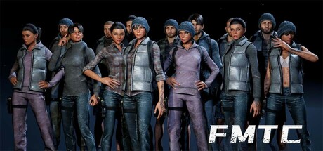
FMTC is a multiplayer online shooter (TPS+FPS), 2Tap gameplay category. Choose the right location to land, choose the right skills for you, search for weapons, ammo, armor, vehicles and other equipment. One shot helmet, one shot head, two shots can kill the enemy, every moment, it is life and death.
$7.00Mostly Positive(74)
Battle RoyaleMOBAShooter
FMTCApr 12, 2025