Scoring genre clarity...

Gone Home capsule

Gone Home

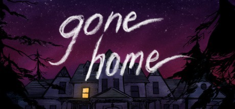
June 7th, 1995. 1:15 AM. You arrive home after a year abroad. You expect your family to greet you, but the house is empty. Something's not right. Where is everyone? And what's happened here? Unravel the mystery for yourself in Gone Home, a story exploration game from The Fullbright Company.

$14.99Mostly Positive(77)
Walking SimulatorShortIndie
FullbrightAug 15, 2013

Gone Home scores 75/100 — better than 78% of Walking Simulator capsules (n=1,312).

Mostly Positive (77 reviews) · $14.99 · Released Aug 15, 2013 · By Fullbright

Quick text summary

Gone Home scored 75/100 on Steam Analyzer — Good for a Walking Simulator capsule. Top priority fix: [uniqueness_polish] Add a subtle visual signature or secondary focal point (e.g., a small figure at a window, a symbolic object, or a unique architectural detail) that distinguishes this from generic haunted house imagery and creates a memorable brand motif.

Capsule scores by dimension

  • Genre Clarity: 7/10 — Mystery and exploration clearly signaled. The abandoned Victorian house with a single lit window, barren trees, and purple dusk sky immediately communicate a narrative mystery or horror-adjacent exploration game. At tiny size, the silhouette of the house remains recognizable as a focal point, though the genre read softens slightly—it could be cozy adventure or unsettling mystery. The visual language favors atmosphere over action, effectively ruling out action or combat genres.
  • Title Readability: 8/10 — Readable title with handwritten charm. The title 'gone home' appears in a clean, light-colored handwritten-style font positioned prominently in the upper half against the purple sky. At small size the text remains legible and maintains its casual, personal tone. At tiny size the letterforms compress but do not collapse, and the contrast against the dark background is sufficient to preserve recognition, though fine serifs soften slightly.
  • Contrast & Color: 8/10 — Strong purple gradient with warm accent. The purple-to-magenta gradient sky provides excellent value separation from the dark house silhouette and black tree branches. The single warm yellow window creates a focal highlight that punches through the cool palette and draws immediate attention. In grayscale the mid-tone house reads clearly against both the bright sky and dark foreground elements; the overall composition maintains clear silhouette separation even at tiny size.
  • Uniqueness & Polish: 7/10 — Atmospheric and intentional but familiar. The haunted house visual is a recognizable trope, but the execution feels deliberate and moody with a cohesive color palette, thoughtful lighting, and a hand-drawn aesthetic that suggests indie craft. The composition avoids generic asset-grab feel—the tree framing, the specific house architecture, and the purple twilight gradient all suggest a curated scene. However, the core concept (mysterious empty house) is well-trodden enough that originality scores as solid rather than distinctive.
  • Brand Consistency: 7/10 — Cohesive aesthetic with internal identity. The visual language is consistent: the hand-drawn or painted house, the atmospheric lighting, the specific color palette of purples and cool blues, and the handwritten title font all reinforce a consistent, introspective indie identity. The capsule would be recognizable as Gone Home on repeated viewing due to the iconic house silhouette and the warm window detail. The branding cues are internal and genre-appropriate rather than relying on external logos or character icons.
  • Composition: 8/10 — Centered focal point with balanced framing. The house is positioned as a strong central focal point, anchored by the illuminated window that naturally draws the eye. The title sits cleanly above in the clear sky area, avoiding clutter or text-on-subject conflicts. The tree branches frame the composition left and right, creating depth and containment. At small and tiny sizes the house silhouette and lit window remain the clear primary read, with trees providing supporting context without competing for attention.

What works

  • Atmospheric mood is immediate. The purple twilight gradient and lone lit window create a strong emotional hook that communicates 'mystery' within seconds of viewing, even at thumbnail size.
  • Title placement and legibility. The handwritten-style 'gone home' text sits in clear sky space with excellent contrast, remaining readable and characteristic down to small sizes without becoming a liability.
  • Silhouette strength across scales. The house shape is bold and recognizable at all sizes, from full header down to 120x45, ensuring the core visual identity doesn't collapse when scaled.
  • Color palette control. The limited but intentional purple-blue-yellow palette avoids muddy mid-tones and creates clear value separation that passes grayscale squint test.

What hurts the capsule

  • House visual is genre-familiar trope. Mysterious empty house at night is a well-worn visual in indie games and horror, limiting distinctiveness compared to peer capsules like DREDGE or The Invincible which show more originality.
  • Limited foreground detail differentiation. The tree branches merge somewhat into the dark house silhouette at tiny size, slightly reducing the layering clarity that could improve silhouette pop.
  • No character or unique motif visible. Unlike top-performing peers (Hades II, Slay the Princess), there is no iconic character, symbol, or mechanic visual that creates an additional brand hook beyond the house setting.

Priority fixes

  1. [uniqueness_polish] Add a subtle visual signature or secondary focal point (e.g., a small figure at a window, a symbolic object, or a unique architectural detail) that distinguishes this from generic haunted house imagery and creates a memorable brand motif.
  2. [contrast_color] Slightly increase the brightness or saturation of the lit window and nearby architecture to create even more pop against the house silhouette when viewed at tiny size, ensuring the warm accent reads instantly in quick scroll.
  3. [composition] Consider adding a thin fog or atmospheric effect in the foreground to further separate the tree branches from the house, enhancing depth layering and silhouette clarity at small scales.

Store copy priority fixes

  1. [feature_communication] Move the 'About the Game' section (starting with 'June 7th, 1995...') to the very top of the detailed description, before patch notes, to lead with narrative hook and gameplay clarity.
  2. [uniqueness] Add one sentence after 'Key Features' that explicitly states what makes Gone Home's story or approach unique (e.g., 'Discover a deeply personal family narrative told entirely through environmental storytelling and found objects').
  3. [tone_match] Rewrite the opening of the patch notes section to transition smoothly from narrative tone (e.g., 'We've been refining Gone Home for new players...' instead of 'Official Languages/Achievements Update Available Now!').

Related guides

Steam app ID: 232430 · Tags: Walking Simulator, Short, Indie, Exploration, Atmospheric