Scoring genre clarity...

Do Not Press The Button (Or You'll Delete The Multiverse) capsule

Do Not Press The Button (Or You'll Delete The Multiverse)

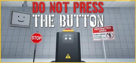
A first-person, narrative-driven game featuring The Developer, who questions, taunts, and tests you at every turn. You shouldn’t press the button, but you’ll want to. You will have control, and you will have none. Power is in your hands... or is it? Inspired by classic narrative driven games.

$13.99Mixed(99)
AdventureExploration3D
Theseus GamesApr 16, 2025

Do Not Press The Button (Or You'll Delete The Multiverse) scores 73/100 — better than 61% of Adventure capsules (n=7,922).

Mixed (99 reviews) · $13.99 · Released Apr 16, 2025 · By Theseus Games

Quick text summary

Do Not Press The Button (Or You'll Delete The Multiverse) scored 73/100 on Steam Analyzer — Good for a Adventure capsule. Top priority fix: [uniqueness_polish] Introduce a visual signature element such as The Developer character or a distinctive art style flourish that differentiates the brand from generic warning aesthetics.

Capsule scores by dimension

  • Genre Clarity: 7/10 — Narrative puzzle with clear premise. The central black button with warning signs, STOP sign, and restricted access labels immediately communicate a puzzle-adventure focused on player choice and consequence. The minimalist industrial setting and warning iconography signal a narrative-driven game about forbidden interaction. At tiny size, the button and warning symbols remain readable enough to convey the core concept, though the full thematic depth requires the title text.
  • Title Readability: 8/10 — Bold, high-contrast typography. The red 'DO NOT PRESS' and white 'THE BUTTON' text sit on a controlled gray background with strong value separation against the #1b2838 Steam background. The all-caps sans-serif font is clean and maintains legibility at small size without decorative flourishes. At tiny size, the text compresses but remains distinguishable due to high contrast and bold weight, though individual letter clarity degrades slightly.
  • Contrast & Color: 8/10 — Strong light-dark separation throughout. The red warning text, white button label, and dark button create clear silhouettes against both the gray environment and the Steam dark background. The yellow warning triangle and red STOP sign provide accent pops that guide attention. In grayscale, the value range remains clean with no muddy mid-tones; the button reads as distinct dark mass, text as bright beacon.
  • Uniqueness & Polish: 7/10 — Distinctive premise with clean execution. The capsule effectively visualizes the game's core mechanic—a tempting forbidden button surrounded by safety warnings—which is a memorable and unique hook not generic to the adventure genre. The 3D rendered environment shows competent craft, though the aesthetic is relatively straightforward without signature stylization or elaborate visual storytelling. The execution is polished and intentional, but the visual hook relies primarily on concept strength rather than distinctive art direction.
  • Brand Consistency: 6/10 — Functional but generic warning aesthetic. The capsule establishes a recognizable identity through warning signs, industrial setting, and the black button motif, which align with the game's theme of forbidden interaction. However, these elements are relatively generic safety/warning clichés without strong signature visual language or character presence that would create lasting brand recall. Internal consistency is solid—all elements serve the warning/restriction theme—but there are no distinctive palette choices, iconic symbols, or narrative visual signatures that build brand recognition across marketing materials.
  • Composition: 8/10 — Clear focal hierarchy with centered emphasis. The black button occupies the center foreground as the primary focal point, with the warning text anchored at top and secondary warning signs (STOP, restricted access label) positioned to frame it. The layered depth—background tile wall, midground button stand, foreground text—creates clear visual hierarchy. At small and tiny sizes, the composition remains legible with the button as obvious primary subject; all supporting elements guide rather than compete for attention.

What works

  • High-contrast title placement. Red and white text on gray background ensures exceptional readability at all sizes without competing with the central button subject.
  • Iconic core mechanic visualization. The forbidden button with surrounding warnings immediately communicates the game's central premise and creates a memorable visual hook.
  • Strong silhouette and value separation. Elements remain distinct in grayscale and against the Steam dark background, ensuring the capsule reads clearly during quick scroll.
  • Coherent thematic consistency. All visual elements—warnings, STOP sign, restricted access label, industrial setting—reinforce the forbidden interaction theme without mixed messaging.

What hurts the capsule

  • Generic safety aesthetic lacks signature style. The warning signs and industrial setting, while thematically appropriate, use common visual language that doesn't distinguish the brand or create lasting visual memory.
  • Limited visual storytelling depth. The capsule communicates the premise but offers no hint of The Developer character, narrative complexity, or unique selling points beyond the button concept.
  • No distinctive palette or art direction. The gray, black, red, and yellow color scheme is functional but predictable for warning/safety themes and lacks the memorable polish of top-tier indie capsules.

Priority fixes

  1. [uniqueness_polish] Introduce a visual signature element such as The Developer character or a distinctive art style flourish that differentiates the brand from generic warning aesthetics.
  2. [brand_consistency] Add a recurring color accent or motif (beyond standard warning colors) that could be recognized across marketing materials and create stronger brand recall.
  3. [title_readability] Consider a subtle outline or shadow on the title text to further reinforce contrast separation at tiny sizes, ensuring zero readability degradation.

Store copy priority fixes

  1. [feature_communication] Add a sentence describing the core gameplay loop: how does the player navigate the facility, what does a typical interaction look like, and how do choices manifest mechanically (e.g., 'explore rooms, discover consequences, unlock new paths based on your choices').
  2. [uniqueness] Replace 'inspired by classic narrative games' with a specific articulation of what differentiates this game—e.g., 'where The Developer actively antagonizes your every choice' or 'the only walking simulator where the narrator sabotages your progress'.
  3. [hook_strength] Move the The Milgram Experiment demo mention to the end of the detailed description or a separate section to avoid competing hooks for the player's attention immediately.
  4. [feature_communication] Clarify the button-pressing mechanic: is there one central button, multiple buttons throughout the facility, or is 'pressing buttons' metaphorical for making choices?

Related guides

Steam app ID: 2336120 · Tags: Adventure, Exploration, 3D, First-Person, Comedy