Scoring genre clarity...
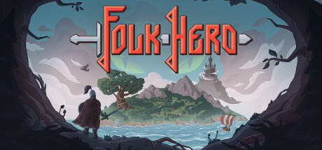
Folk Hero capsule

Folk Hero

Folk Hero is an action-slasher with rogue-lite elements set in the world of Slavic fantasy. Explore the ever-changing island, find treasures, combine weapons and artifacts to defeat mythical enemies. Challenge your skills! One life, one try.

$5.99Very Positive(174)
Action RoguelikeDungeon CrawlerPixel Graphics
Chudo-Yudo GamesOct 19, 2023

Folk Hero scores 77/100 — better than 78% of Action Roguelike capsules (n=1,730).

Very Positive (174 reviews) · $5.99 · Released Oct 19, 2023 · By Chudo-Yudo Games

Quick text summary

Folk Hero scored 77/100 on Steam Analyzer — Good for a Action Roguelike capsule. Top priority fix: [genre_clarity] Consider adding a subtle weapon, artifact, or combat-ready pose detail to the character silhouette to signal the action-slasher and rogue-lite mechanics more explicitly.

Capsule scores by dimension

  • Genre Clarity: 8/10 — Clear Slavic fantasy action adventure. The capsule immediately communicates fantasy action through the silhouetted warrior figure in the foreground, mountain castle setting, and Norse/Slavic visual language (tree, stone architecture, water). The rogue-lite and action-slasher elements are less explicit, but the adventuring pose and island exploration framing clearly signal action-adventure gameplay. At tiny size, the character pose and environmental context remain readable enough to recognize the genre.
  • Title Readability: 8/10 — Bold metal logo reads well small. The 'Folk Hero' title uses a thick, metallic red-orange serif font with strong outline definition positioned at the top center against a clear sky backdrop, providing excellent contrast separation. The letterforms remain distinctly readable at small and tiny sizes due to high saturation and weight, though fine serifs soften slightly at thumbnail size. The strategic placement above the main scene avoids noisy background collision.
  • Contrast & Color: 8/10 — Strong warm tones pop against cool. The warm orange-red title and central character silhouettes contrast sharply against the cool blue-gray landscape and dark cave frame edges, creating clear visual separation on the dark Steam background. The character and tree have bright lime-green accents that further pop against cool midtones. At tiny size the silhouettes and color temperature shift remain readable, though some mid-tone detail in the sky region blends slightly.
  • Uniqueness & Polish: 7/10 — Polished Slavic fantasy visual identity. The art direction feels intentional and distinctive within the action-adventure space, with a cohesive hand-painted illustration style that evokes Slavic mythology rather than generic high fantasy. The cave-frame composition and island reveal create narrative framing that hints at exploration and discovery, avoiding a template feel. However, the core visual—character overlooking landscape—is a familiar composition used across multiple top-performing games in this genre, limiting standout uniqueness.
  • Brand Consistency: 7/10 — Coherent Slavic aesthetic throughout. The capsule establishes internal consistency through unified color palette (warm oranges against cool blues and greens), consistent illustration rendering style, and recognizable Slavic cultural motifs (tree, castle, warrior silhouette). The metal font treatment reinforces a folk-legend brand identity that aligns with the title and game concept. Comparison with available screenshots should confirm whether this painterly style and color language persist across marketing materials.
  • Composition: 8/10 — Clear hierarchy, balanced focal depth. The composition uses strong foreground-to-background layering: dark cave frame edges draw attention inward, the central character silhouette anchors the middle plane, and the bright island landscape creates a clear focal point at depth. The title placement at top-center guides the eye without obstructing the main scene, and the design maintains safe margins from all edges. At small and tiny sizes, the layering structure remains intact and scannable, though the distant castle becomes less distinct.

What works

  • Metallic title contrast. The thick red-orange serif font with strong outline cuts through the background clearly at all sizes and maintains excellent legibility against both light sky and dark cave regions.
  • Depth and environmental storytelling. The cave-framed composition and layered landscape create visual narrative that communicates exploration and discovery without cluttering the focal point.
  • Cohesive Slavic visual identity. The unified art style, color temperature contrast, and cultural motifs (tree, castle, stone) establish a recognizable and distinctive brand aesthetic.
  • Strong silhouette readability. The character and landscape elements maintain clear outlines and separation at small sizes, aided by the warm-cool color contrast and consistent lighting.

What hurts the capsule

  • Familiar landscape composition. The 'lone figure gazing at landscape' setup mirrors multiple top-tier action-adventure capsules (Sea of Stars, Pacific Drive, etc.), reducing visual distinctiveness in a crowded genre.
  • Distant castle loses detail at tiny size. The castle architecture in the far background becomes indistinct at thumbnail scale, contributing less to the immediate visual read than the closer elements.
  • Limited rogue-lite or combat signaling. The capsule does not explicitly hint at combat mechanics, weapon variety, or roguelike progression—core differentiators of the game—relying instead on general adventure framing.

Priority fixes

  1. [genre_clarity] Consider adding a subtle weapon, artifact, or combat-ready pose detail to the character silhouette to signal the action-slasher and rogue-lite mechanics more explicitly.
  2. [uniqueness_polish] Replace or supplement the generic landscape gaze composition with a moment of conflict or mythical creature encounter that signals Folk Hero's specific gameplay hook.
  3. [title_readability] Maintain current strong metal font treatment but verify the outline thickness remains crisp at true thumbnail scale (120x45) to ensure zero legibility regression.

Store copy priority fixes

  1. [feature_communication] Add a dedicated sentence or bullet about local co-op gameplay: how it works, whether builds are shared or independent, and how it changes the difficulty or strategy.
  2. [hook_strength] Rewrite the opening to lead with a specific gameplay hook (e.g., 'Step into the boots of a Slavic hero and face off against mythical enemies in one-shot runs across a shifting island') rather than lore exposition.
  3. [uniqueness] Expand the 'Builds' or 'Souls-like style combat' section with at least one concrete example of how rune combinations or class synergies create emergent playstyles that differ from Hades or Dead Cells.
  4. [tone_match] Inject personality into the feature descriptions: use active voice, specific metaphors tied to Slavic themes, or short narrative flourishes (e.g., 'Force enemies to turn on each other—survival is about cunning, not just reflexes') to make the copy feel authored for this exact game.

Related guides

Steam app ID: 2342150 · Tags: Action Roguelike, Dungeon Crawler, Pixel Graphics, Local Co-Op, Controller