Scoring genre clarity...

Mortanis Prisoners capsule

Mortanis Prisoners

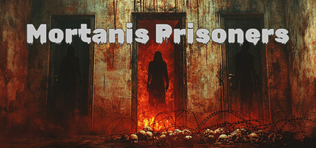
Mortanis Prisoners - A survival horror game set in a Third Reich concentration camp where the camp's leadership, upon discovering a planned rebellion, orders the execution of all accomplices. Main protagonist encounter an even more terrifying fate. Will they be able to escape the nightmare?

$12.99Very Positive(60)
CombatSupernaturalSurvival Horror
Alexey Bulgakov, Vladimir ZlobinJul 23, 2025

Mortanis Prisoners scores 68/100 — better than 17% of Combat capsules (n=3,433).

Very Positive (60 reviews) · $12.99 · Released Jul 23, 2025 · By Alexey Bulgakov

Quick text summary

Mortanis Prisoners scored 68/100 on Steam Analyzer — Solid for a Combat capsule. Top priority fix: [genre_clarity] Introduce a specific visual cue or historical detail (period-appropriate clothing fragment, distinct Nazi-era architectural element, or symbolic object) that communicates the game's unique setting and distinguishes it from generic industrial horror.

Capsule scores by dimension

  • Genre Clarity: 7/10 — Horror atmosphere clear, specifics obscured. The red-orange fire, rusted metal doors, and silhouetted figures strongly communicate survival horror and dark industrial setting. At tiny size the fire and architectural elements read as ominous and threatening, but the specific historical context and Third Reich setting are not visually obvious from imagery alone—it reads as generic dark horror rather than period-specific concentration camp horror. The genre is clear but the unique premise is not.
  • Title Readability: 8/10 — Title reads well across sizes. The white sans-serif 'Mortanis Prisoners' text sits in the upper portion against the darker upper background, providing good contrast against the rusted metal. At small size the title remains legible, and at tiny size the letterforms hold together without collapse. The positioning avoids the busy red fire zone below, which is a smart choice for readability.
  • Contrast & Color: 7/10 — Strong warm-cool separation works. The white title pops cleanly against the dark top third, and the bright orange-red fire creates clear value separation from the darker rust and black silhouettes below. Against Steam's dark background the orange glow reads distinctly. In grayscale the composition maintains good value range from light (fire) to mid (rust) to dark (doors and figures), though the dense rust texture in the middle can feel slightly muddy at tiny size.
  • Uniqueness & Polish: 6/10 — Competent execution, generic horror aesthetic. The rusty industrial doors with central fire and silhouettes are well-composed and professionally rendered, but this exact visual archetype—abandoned metal facility, central flames, shadowed figures—appears frequently in dark horror and indie game marketing. The craftsmanship is solid, but the concept lacks a distinctive hook or signature element that differentiates it from other survival horror capsules. It reads as competent mainstream horror rather than memorable or visually unique.
  • Brand Consistency: 6/10 — Visual style coherent but not iconic. The color palette of rusted oranges, blacks, and muted greens is internally consistent and thematically appropriate for the industrial horror setting. However, there is no recognizable character, symbol, or signature motif visible that would serve as an identity anchor for the franchise across marketing materials. The aesthetic is cohesive but generic enough that it could apply to several different horror titles.
  • Composition: 7/10 — Clear hierarchy, effective focal point. The composition uses strong layering: dark metal doors frame the sides, bright central fire draws the eye, and the title anchors the top with clear separation from busy elements below. At small and tiny sizes the central fire remains the primary focus, and the title does not compete for attention. Margins appear safe and the design does not rely on edge elements that would be cropped away, though the lower rust detail softens as it shrinks.

What works

  • White title contrast and placement. The 'Mortanis Prisoners' text uses high-value white against a controlled dark upper region and remains legible at all sizes without outline artifacts.
  • Clear focal point and layering. The central orange fire creates an obvious primary subject with distinct foreground (fire and rubble), midground (doors), and background (faded upper area), guiding the eye naturally.
  • Strong value separation at small scale. The warm orange-red glow contrasts sharply against the cool dark tones and the Steam background, ensuring the image does not collapse during quick scroll.

What hurts the capsule

  • Generic survival horror visual language. Rusted doors, central fire, and silhouettes are heavily reused tropes in dark horror marketing, making the capsule feel familiar rather than distinctive or memorable.
  • No visible character or iconic element. The silhouettes lack recognizable personality or unique visual identity; there are no signature symbols, distinctive costume details, or memorable characters that could serve as brand anchors.
  • Historical context not visually communicated. While the industrial darkness reads as horror, the specific Third Reich concentration camp setting and its historical gravity are not evident from the imagery—it could depict any dark prison or industrial facility.

Priority fixes

  1. [genre_clarity] Introduce a specific visual cue or historical detail (period-appropriate clothing fragment, distinct Nazi-era architectural element, or symbolic object) that communicates the game's unique setting and distinguishes it from generic industrial horror.
  2. [uniqueness_polish] Add a recognizable character silhouette, icon, or signature visual motif in the center or foreground that could become a memorable brand identity and stand out at tiny size.
  3. [brand_consistency] Develop a distinctive color accent or lighting treatment (e.g., a unique color cast, symbol glow, or character detail) that differentiates this capsule from competing dark horror titles and becomes recognizable across marketing materials.

Store copy priority fixes

  1. [hook_strength] Replace 'even more terrifying fate' with a concrete, visceral detail about the supernatural or horrific element the protagonist faces (e.g., 'twisted experiments conducted by camp doctors' or 'the reanimated corpses of fallen inmates').
  2. [feature_communication] Rewrite the feature list into 2–3 sentences that describe a sample gameplay loop: how shooting, puzzles, and inventory management interact during exploration and survival moments.
  3. [uniqueness] Add one sentence that articulates what makes Mortanis Prisoners distinct within survival horror—e.g., a focus on stealth vs. combat, procedurally generated camp sections, or a non-linear escape path.
  4. [audience_targeting] Specify whether the game appeals to atmosphere-first players, action-first players, or story-first players (e.g., 'for players who value tension and environmental storytelling over combat intensity').

Related guides

Steam app ID: 2354120 · Tags: Combat, Supernatural, Survival Horror, Horror, Atmospheric