Scoring genre clarity...

Lockstone Mountains capsule

Lockstone Mountains

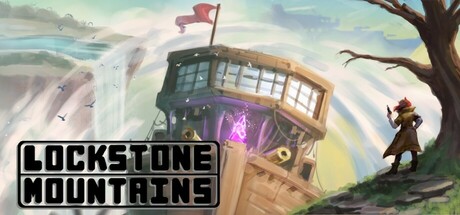
Wake up in the world of Lockstone Mountains as the main Pilot of the Rook expedition. Explore the world, complete quests and gather materials to research new technologies, ships and weapons. Powerful enemies and intriguing mysteries await in the Lockstone Mountains.

$2.992 user reviews
ActionTop-Down ShooterTwin Stick Shooter
Waesome GamesApr 14, 2026

Lockstone Mountains scores 67/100 — better than 13% of Action capsules (n=8,534).

2 user reviews · $2.99 · Released Apr 14, 2026 · By Waesome Games

Quick text summary

Lockstone Mountains scored 67/100 on Steam Analyzer — Solid for a Action capsule. Top priority fix: [uniqueness_polish] Add a distinctive visual element or signature detail to the character or airship that hints at the game's unique mechanic or story (e.g., visible tech detail, unusual outfit motif, or iconic object).

Capsule scores by dimension

  • Genre Clarity: 7/10 — Adventure with airship exploration. The central airship tower with glowing interior, standing character in adventure gear, and mountainous landscape clearly communicate exploration-based gameplay. At tiny size, the silhouette of the character and distinctive airship tower remain readable, though the specific genre blend is less obvious without context. The setting suggests open-world adventure rather than pure action combat.
  • Title Readability: 8/10 — Bold, clear, well-positioned. LOCKSTONE MOUNTAINS uses a heavy sans-serif typeface with black fill and white outline, positioned across the top and bottom with controlled backgrounds. The title reads cleanly at full and small sizes due to strong contrast and outline treatment. At tiny size, the outline width becomes proportionally thinner and readability drops slightly, but the text remains legible.
  • Contrast & Color: 7/10 — Warm pastels with adequate separation. The composition uses cream, soft blue, and pale yellow tones typical of painterly art style, creating depth through atmospheric perspective rather than value contrast. The character and airship silhouettes read against the sky background, but the overall palette is muted and warm-dominated, reducing punch against Steam's dark background. At tiny size, the silhouettes hold but fine details and lighting effects compress into the mid-tone range.
  • Uniqueness & Polish: 6/10 — Competent illustration, generic composition. The art style is clean and professionally executed with painterly atmosphere and believable character/environment rendering, but the composition—character standing left, landmark centered, sky dominating—follows common indie adventure tropes. There is no distinctive visual hook or unique mechanical hint that separates this from dozens of other exploration games. The craftsmanship is solid but the overall presentation reads as competent without memorable distinctiveness.
  • Brand Consistency: 5/10 — Limited visual identity cues. The airship tower is visually interesting but not yet established as an iconic symbol without seeing other promotional materials or gameplay footage. The character design is generic adventurer archetype with no distinctive silhouette, outfit detail, or pose that would create immediate brand recall. The soft, painterly aesthetic could apply to many indie titles, reducing internal cohesion strength.
  • Composition: 7/10 — Clear focal point, safe layout. The airship tower anchors the center-right composition with the character positioned left to create balance and lead the eye across the frame. Title placement top and bottom leaves the scene unobstructed and maintains safe margins for Steam cropping. At small and tiny sizes, the focal point remains clear, though the layering of background sky, midground tower, and foreground character flattens somewhat.

What works

  • Strong title treatment. Black-filled typeface with white outline maintains readability across all sizes and stands out against both the image and dark Steam background.
  • Balanced composition. Character and airship placement creates natural eye movement without cluttering, and title positioning preserves the scene while framing it effectively.
  • Professional illustration quality. Painterly rendering, atmospheric perspective, and coherent lighting demonstrate technical craft and polish throughout the image.

What hurts the capsule

  • Generic character and pose. The standing adventurer lacks distinctive silhouette, costume detail, or memorable visual hook that would support brand recognition.
  • Muted color palette. Warm pastels and soft tones reduce visual impact against Steam's dark background and compress into mid-tones at smaller sizes.
  • Unclear unique selling point. The image communicates exploration and adventure but does not visually hint at distinctive mechanics, story hook, or what sets this game apart from similar titles.

Priority fixes

  1. [uniqueness_polish] Add a distinctive visual element or signature detail to the character or airship that hints at the game's unique mechanic or story (e.g., visible tech detail, unusual outfit motif, or iconic object).
  2. [contrast_color] Introduce a warmer accent color or strategic lighting highlight to increase value separation and visual pop against the Steam background.
  3. [brand_consistency] Develop a recognizable character silhouette or iconic symbol that could be reused across promotional materials to strengthen brand identity.

Store copy priority fixes

  1. [hook_strength] Replace 'Wake up in the world of Lockstone Mountains as the main Pilot' with a verb-forward hook like 'Pilot a customizable flying warship through dangerous floating islands, commanding unique weapon loadouts to survive swarms of airborne enemies' to immediately establish core gameplay and excitement.
  2. [feature_communication] Expand the short description to explicitly state progression mechanics: e.g., 'Gather materials and research new ship hulls, weapons, and technologies to unlock new expedition zones and overcome increasingly powerful threats.'
  3. [uniqueness] Add 1–2 sentences to the opening of the detailed description that explicitly differentiate the flying ship combat from standard twin-stick shooters—e.g., 'Unlike traditional top-down shooters, the physics-based rudder-and-keel system rewards tactical piloting and environmental awareness, making each aerial engagement a puzzle of momentum and positioning.'
  4. [audience_targeting] Clarify the player archetype early: add a sentence such as 'Designed for players who enjoy deep mechanical customization, exploration-driven progression, and skill-based aerial combat' to make the target audience immediately apparent.

Related guides

Steam app ID: 2358900 · Tags: Action, Top-Down Shooter, Twin Stick Shooter, Sailing, Physics