Scoring genre clarity...

Blood Lily Ghoststories capsule

Blood Lily Ghoststories

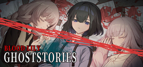
A horror game about a needy female ghost. A trio of close-knit occult club girls gather late at night to enjoy telling ghost stories. Little do they know that Miss Choker, a ghost that targets girls, is just dying to appear...

$2.99Very Positive(92)
Female ProtagonistLGBTQ+Choices Matter
Sounding Stone / 老奉毊, MaouCat Studio / 魔王貓工作室Sep 15, 2025

Blood Lily Ghoststories scores 65/100 — better than 13% of Female Protagonist capsules (n=1,715).

Very Positive (92 reviews) · $2.99 · Released Sep 15, 2025 · By Sounding Stone / 老奉毊

Quick text summary

Blood Lily Ghoststories scored 65/100 on Steam Analyzer — Solid for a Female Protagonist capsule. Top priority fix: [title_readability] Increase BLOODLILY font weight or add a subtle outline to maintain clarity at thumbnail sizes without losing the red color pop.

Capsule scores by dimension

  • Genre Clarity: 7/10 — Horror with anime visual style. The three female characters in close proximity with concerned expressions, combined with the red diagonal slash and dark atmospheric framing, clearly signal horror genre. At TINY size, the character silhouettes and red accent remain visible enough to suggest supernatural tension, though the specific 'ghost story' subgenre is less obvious without reading text. The visual language reads as psychological horror or supernatural thriller rather than action-horror.
  • Title Readability: 6/10 — Readable at full, struggles tiny. BLOODLILY is positioned in red upper left with good contrast, while GHOSTSTORIES sits in white below it. At full size both are legible with clean sans-serif treatment. At TINY size (120x45), the red text compresses significantly and the two-line layout becomes cramped; GHOSTSTORIES remains marginally readable but BLOODLILY loses clarity. The strategic left-side placement helps avoid background noise, but font weight could be bolder for better small-size resilience.
  • Contrast & Color: 7/10 — Strong value separation with red accent. The pale-skinned characters create good separation from the mid-tone blue-gray background clothing and red text slash creates a focal accent line. In grayscale test, the light faces and dark hair maintain silhouette clarity even at small sizes. The red diagonal slash pops distinctly against the dark Steam background (#1b2838), though the overall palette relies heavily on warm skin tones and cool blue fabrics which compress into similar values at TINY size.
  • Uniqueness & Polish: 6/10 — Polished anime aesthetic, generic composition. The character illustration quality is high with clean linework, soft shading, and professional anime rendering. However, the composition—three characters arranged in a portrait layout with a decorative slash—feels like a standard visual novel or horror-adjacent indie game cover template. There is no distinctive mechanical hook, unique art direction, or memorable compositional choice that differentiates it from similar anime-styled indie titles. The polish is evident but the concept feels safe and familiar.
  • Brand Consistency: 6/10 — Coherent but unremarkable identity. The three-girl ensemble, red and white color scheme, and anime illustration style are internally consistent and match the game's visual novel roots. There are no jarring style inconsistencies or tonal breaks within the capsule. However, the identity lacks iconic motifs—no character stands out as a flagship symbol, no distinctive logo treatment, and no visual signature that would make this capsule immediately recognizable on a second viewing. It is competently branded but not memorable.
  • Composition: 7/10 — Clear focal point, good hierarchy. The three character faces form a natural pyramid focal point, with the red diagonal slash guiding the eye and creating dynamic tension. Title placement on the left clears the character space, and safe margins are respected. At SMALL and TINY sizes the character group remains the primary read and the red accent maintains visual interest. The composition avoids clutter and dead space, though the centered character arrangement is somewhat predictable and lacks unexpected depth layering or foreground-background separation.

What works

  • Character illustration quality. Professional anime art with clean linework, soft shading, and expressive character work that communicates tone and personality clearly.
  • Red accent slash effectiveness. The diagonal red line creates dynamic visual interest and strong color pop against both the capsule background and Steam's dark theme.
  • Safe composition and margins. Title and characters are well-positioned to avoid Steam cropping, with clear hierarchy and no wasted prime real estate.

What hurts the capsule

  • Generic horror-visual-novel layout. Three-character portrait with decorative slash is a template-like composition that does not differentiate from dozens of similar indie titles.
  • Title loses legibility at TINY size. BLOODLILY in red text compresses and blurs at 120x45 thumbnail, reducing immediate text recognition in quick scroll.
  • No distinctive visual signature. The capsule contains no iconic character, logo treatment, or unique art direction that would make it recognizable as a specific game brand on repeat exposure.

Priority fixes

  1. [title_readability] Increase BLOODLILY font weight or add a subtle outline to maintain clarity at thumbnail sizes without losing the red color pop.
  2. [uniqueness_polish] Add a distinctive visual hook—such as a signature logo mark, a unique foreground element, or an unexpected compositional choice—to differentiate from standard anime horror covers.
  3. [genre_clarity] Consider incorporating a subtle supernatural or ghost-story visual cue (such as spectral particles, a haunting prop, or unsettling detail) to reinforce the specific 'ghost story' subgenre rather than generic horror.

Store copy priority fixes

  1. [feature_communication] Add a sentence explicitly describing how choices affect the narrative: 'Your decisions shape which stories are told and determine how the mystery unfolds, with multiple endings based on your choices.' [hook_strength] Rewrite the short description to lead with the LGBTQ+ angle or the choice mechanic: 'A queer horror story where your choices determine the truth. Three girls tell ghost stories—but one storyteller isn't human.' This differentiates from the generic 'horror game about a ghost' opener.
  2. [uniqueness] Add a brief line after the feature list explaining what makes this game distinct, such as 'A visual novel where atmospheric storytelling and player choice uncover a supernatural mystery woven into the bonds between the trio.'
  3. [feature_communication] Expand the character section or add a new 'Gameplay' section clarifying the choice mechanic: 'Navigate branching conversations, respond to story prompts, and uncover Miss Choker's identity through dialogue and decisions.'

Related guides

Steam app ID: 2367120 · Tags: Female Protagonist, LGBTQ+, Choices Matter, Visual Novel, Multiple Endings