Scoring genre clarity...
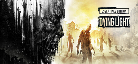
Dying Light capsule

Dying Light

First-person action survival game set in a post-apocalyptic open world overrun by flesh-hungry zombies. Roam a city devastated by a mysterious virus epidemic. Scavenge for supplies, craft weapons, and face hordes of the infected.

$1.80 USDVery Positive(2,398)
ZombiesSurvival HorrorHorror
Techland26 Jan, 2015

Dying Light scores 75/100 — better than 78% of Zombies capsules (n=697).

Very Positive (2,398 reviews) · $1.80 USD · Released 26 Jan, 2015 · By Techland

Quick text summary

Dying Light scored 75/100 on Steam Analyzer — Good for a Zombies capsule. Top priority fix: [genre_clarity] Incorporate a subtle parkour silhouette (vaulting, climbing, or rooftop perspective) into the composition to differentiate the survival-action identity from generic zombie games.

Capsule scores by dimension

  • Genre Clarity: 8/10 — Zombie survival action clear. The left-side zombie head profile with decaying flesh and the center group of infected figures backlit in golden haze immediately signal post-apocalyptic zombie combat. At TINY size, the silhouette of the shambling infected figures and atmospheric fog still communicate survival-action clearly, though specific genre nuance (parkour/melee focus) is less apparent than the zombie threat itself.
  • Title Readability: 7/10 — Solid legibility with label placement. DYING LIGHT text reads cleanly in black bold sans-serif positioned in the upper right, with ESSENTIALS EDITION label above it on a white rectangular background providing solid contrast. At SMALL size the title remains readable; at TINY size the text compresses but the geometric label background preserves recognition due to high contrast and placement away from busy decay textures on the left.
  • Contrast & Color: 8/10 — Strong light-dark separation. The capsule uses high-value contrast between the dark left decay texture and the bright golden-yellow infected silhouettes center-right, creating clear separation against the dark Steam background. The bright atmospheric glow in the middle and the white title label pop effectively; grayscale silhouette test shows strong edge definition and readable layering from dark foreground zombie head to luminous background figures.
  • Uniqueness & Polish: 7/10 — Premium zombie aesthetic executed well. The composition feels crafted with intentional art direction: the artistic decay texture on the left, the cinematic backlighting of infected figures, and the atmospheric haze create a cohesive mood that feels more premium than generic zombie stock. However, the overall scene is still within familiar zombie survival visual language—atmospheric glow and shambling crowds are expected tropes—so it reads as well-executed competence rather than a distinctive hook.
  • Brand Consistency: 7/10 — Recognizable zombie survival brand. The decay aesthetic on the left, golden-haze infected figures, and post-apocalyptic urban atmosphere align with Dying Light's established visual identity from promotional materials and the series' signature parkour-meets-zombie-horror tone. The color palette and atmospheric treatment are consistent with franchise expectations, though the capsule does not showcase the parkour or free-running mechanic that differentiates Dying Light from other zombie games.
  • Composition: 8/10 — Strong hierarchy and focal balance. The left-side zombie head provides a dark, striking anchor; the center-right infected group bathed in golden light forms the primary emotional focal point; the title label occupies the upper right without competing for attention. At SMALL and TINY sizes, the contrast between the dark left third and bright center maintains clear hierarchy, and the title placement respects safe margins and avoids clipping risks despite Steam crop variations.

What works

  • Clear genre visual language. Zombie figures, decay textures, and post-apocalyptic atmosphere immediately communicate survival-action at all sizes.
  • High contrast layout. Dark-to-bright gradient and the white title label pop distinctly against the dark Steam background and maintain readability at TINY compression.
  • Intentional artistic mood. The decay texture and cinematic backlighting feel crafted and premium rather than rushed or template-based.
  • Safe margin title placement. Upper-right label positioning avoids edge clipping and maintains clean hierarchy without overlapping busy imagery.

What hurts the capsule

  • Generic zombie trope execution. While well-done, the backlit infected crowd and atmospheric glow are familiar zombie survival visual clichés that do not differentiate Dying Light's unique parkour mechanic.
  • Parkour identity underutilized. The capsule emphasizes zombie threat and atmosphere but does not visually hint at the series' signature free-running and verticality, which are core differentiators from competitors like Resident Evil.
  • Subtle detail loss at tiny compression. At TINY size the decay texture on the left and individual zombie silhouette clarity begin to blur together, reducing the impact of the detailed left-side artistic element.

Priority fixes

  1. [genre_clarity] Incorporate a subtle parkour silhouette (vaulting, climbing, or rooftop perspective) into the composition to differentiate the survival-action identity from generic zombie games.
  2. [uniqueness_polish] Enhance the distinctive visual hook by layering a recognizable Dying Light signature element—such as the iconic character pose, night mechanic lighting cue, or environmental verticality—into the center focal area.
  3. [contrast_color] Increase saturation or brightness of the golden-infected figures slightly to ensure the silhouettes remain crisp and distinct even at TINY thumbnail size during quick scroll.

Store copy priority fixes

  1. [uniqueness] Add a sentence articulating what makes Dying Light's parkour or combat approach distinct from competing zombie survival titles (e.g., 'Only in Dying Light can you chain parkour and melee combat into seamless environmental takedowns').
  2. [feature_communication] Expand the day/night cycle description to specify what 'hunted' means mechanically (e.g., 'Nightfall spawns tougher infected with new abilities; use stealth or barricade to survive until dawn').
  3. [tone_match] Either expand the narrative framing (Kyle Crane's return, moral choice) into the gameplay sections or move it to a separate Story section to improve coherence between narrative hook and gameplay marketing.
  4. [hook_strength] Consider opening the short description with a stronger emotional or mechanical hook (e.g., 'By day, hunt zombies in a sprawling city. By night, run for your life.' or similar binary tension) rather than a functional but generic premise statement.

Related guides

Steam app ID: 239140 · Tags: Zombies, Survival Horror, Horror, Online Co-Op, Open World