Scoring genre clarity...
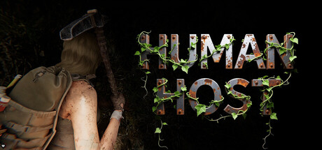
Human Host is an open-world zombie survival crafting game. In this endless procedurally generated world, terrain, buildings, trees, rocks—everything is destructible! Build massive mobile bases, dig deep underground, construct trap-filled fortresses, scavenge supplies, and survive as long as you can!
$9.95Very Positive(178)
Early AccessZombiesSurvival
Virtual Matrix StudioApr 5, 2026