Scoring genre clarity...
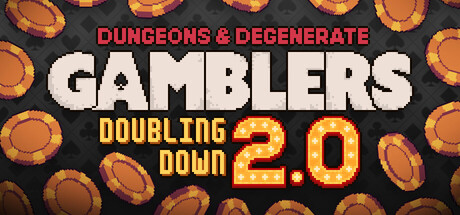
Dungeons & Degenerate Gamblers capsule

Dungeons & Degenerate Gamblers

Battle your way through a seedy tavern filled with gambling addicted townspeople in this Blackjack Roguelike Adventure. From aces and face cards to tarot cards, business cards and more, create your unique deck to beat the house.

$7.49Very Positive(35)
Roguelike DeckbuilderRoguelikeStrategy
Purple Moss CollectorsAug 8, 2024

Dungeons & Degenerate Gamblers scores 70/100 — better than 21% of Roguelike Deckbuilder capsules (n=351).

Very Positive (35 reviews) · $7.49 · Released Aug 8, 2024 · By Purple Moss Collectors

Quick text summary

Dungeons & Degenerate Gamblers scored 70/100 on Steam Analyzer — Good for a Roguelike Deckbuilder capsule. Top priority fix: [title_readability] Increase red subtitle contrast by adding a subtle dark outline or shadow to maintain legibility at tiny sizes below 120px width.

Capsule scores by dimension

  • Genre Clarity: 8/10 — Clear gambling roguelike premise. The capsule immediately communicates a card game/gambling theme through visible poker chips, playing cards, tarot imagery, and a tavern setting. The pixel art style and game board environment signal indie roguelike mechanics. At tiny size, the card and chip elements remain readable enough to convey the gambling card game genre, though specific roguelike mechanics become less obvious.
  • Title Readability: 7/10 — Readable title with strong contrast. The title 'DUNGEONS & DEGENERATE GAMBLERS' uses bold white and red lettering on a dark rounded banner with clear letter spacing. At full size it reads cleanly; at small size the main logo remains legible with strong contrast against the green background, though the red subtitle text becomes slightly compressed. At tiny size, the white main title holds but the red subtitle fades in clarity.
  • Contrast & Color: 7/10 — Good value separation with warm palette. The capsule uses warm orange, tan, and red tones against a dark green tavern background, creating solid value separation. Poker chips in blue and orange pop clearly, and the white title banner stands out sharply. In grayscale the composition maintains clear silhouette separation; however, the playing card elements and some midtone areas blend slightly, reducing contrast efficiency at tiny sizes.
  • Uniqueness & Polish: 7/10 — Distinctive premise with cohesive execution. The fusion of roguelike deck-building with blackjack gambling is visually distinct and well-supported by the tavern microcosm aesthetic with cards, chips, and degenerate gamblers. The pixel art style is cleanly rendered and intentional. The concept avoids generic fantasy RPG tropes, though the execution relies on established pixel art conventions rather than a truly signature visual hook.
  • Brand Consistency: 6/10 — Consistent aesthetic lacking iconic identity. The capsule maintains internal cohesion with unified pixel art rendering, warm color palette, and tavern gambling theme throughout all visible elements. However, there are no strongly memorable brand symbols or signature motifs—no iconic character, mascot, or distinctive visual shorthand that would instantly recognize this game later. The identity is functional but generic within the indie roguelike space.
  • Composition: 7/10 — Balanced layout with clear focal hierarchy. The title occupies prime real estate at the top with a strong, centered focal point. Supporting elements—chips, cards, and tavern details—frame the composition without competing for attention. The background is active but not cluttered. At small and tiny sizes, the layout remains intelligible with the title and primary gaming elements visible, though some card details on the left and right edges risk minor Steam cropping impact.

What works

  • Strong genre communication. Poker chips, playing cards, tarot imagery, and tavern setting immediately signal gambling roguelike without ambiguity.
  • Readable primary title. White 'GAMBLERS' text on dark banner maintains clarity from full size down to small size with strong contrast.
  • Warm color palette cohesion. Orange, tan, and red tones feel warm and tavern-appropriate while separating well from the dark green background.
  • Intentional pixel art execution. Clean, purposeful rendering style suggests indie craft without appearing amateurish or asset-flip.

What hurts the capsule

  • Red subtitle loses legibility at tiny size. The 'DUNGEONS & DEGENERATE' red text becomes compressed and less readable when scaled down below small capsule size.
  • Generic roguelike brand identity. No iconic character, mascot, or signature visual element creates lasting brand recall beyond the thematic assets.
  • Mid-tone blending in grayscale. Card details and some background elements lose silhouette clarity when color contrast is removed, reducing contrast score.
  • Edge-hugging decorative elements. Left and right card/chip elements sit close enough to borders that Steam's dynamic cropping may clip secondary details.

Priority fixes

  1. [title_readability] Increase red subtitle contrast by adding a subtle dark outline or shadow to maintain legibility at tiny sizes below 120px width.
  2. [composition] Pull the leftmost playing card and rightmost chip elements slightly inward from the edges to ensure they survive Steam's safe-margin cropping at all viewport sizes.
  3. [brand_consistency] Consider adding a subtle, recurring visual motif—such as a house symbol, specific card back design, or character silhouette—to create iconic brand recall across store screenshots.
  4. [contrast_color] Test grayscale rendering and boost separation between midtone card details and background by increasing light/dark value gaps in overlapping elements.

Store copy priority fixes

  1. [feature_communication] Add one sentence explaining how a turn of Blackjack works in this game and what 'corrupted blackjack' rules means (e.g., 'Hit or Stand to reach 21, but cards have special effects—some give you healing, others spawn traps').
  2. [uniqueness] Rewrite the opening of the detailed description to lead with what is mechanically unique about Blackjack-based rogueliking rather than tavern flavor (e.g., 'Build synergies across card effects instead of just chasing damage to beat the house edge').
  3. [feature_communication] Replace 'rule-breaking synergies' with one specific example of how cards interact (e.g., 'Pair fire suits with tarot cards to multiply damage, or use business cards to generate currency mid-run').
  4. [hook_strength] Strengthen the short description's opening with an action verb that highlights the unique Blackjack twist (e.g., 'Defy the house with a hand-crafted deck of aces, tarot, and chaos in this Blackjack Roguelike').

Related guides

Steam app ID: 2400510 · Tags: Roguelike Deckbuilder, Roguelike, Strategy, Card Game, Deckbuilding