Scoring genre clarity...
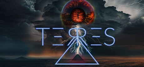
Terres capsule

Terres

Terres is a challenging teamwork and communication based 4-player co-op puzzle adventure game. While inside the trials you can adjust everything from lighting, duration and visibility to enemy behaviour and difficulty. Creating entirely new ways to overcome the challenge. Includes Singleplayer.

$7.99Positive(29)
Co-opPuzzleSurvival Horror
ingamemechanicsJun 29, 2024

Terres scores 65/100 — better than 6% of Co-op capsules (n=1,661).

Positive (29 reviews) · $7.99 · Released Jun 29, 2024 · By ingamemechanics

Quick text summary

Terres scored 65/100 on Steam Analyzer — Solid for a Co-op capsule. Top priority fix: [genre_clarity] Incorporate a visual puzzle element or co-op hint—such as interlocking shapes, multiple characters, or a clear trial/challenge interface—to communicate the core gameplay loop at tiny size.

Capsule scores by dimension

  • Genre Clarity: 6/10 — Mystical sci-fi, genre unclear at tiny. The capsule shows a glowing red eye embedded in a geometric triangle with neon blue lines, set against a dramatic stormy sky. This suggests sci-fi or fantasy mystery rather than action-adventure puzzle co-op gameplay. At tiny size the geometric symbol and eye dominate, but nothing clearly communicates the core puzzle-solving teamwork mechanic the game is known for.
  • Title Readability: 7/10 — Readable title, clean neon treatment. The title 'TERRES' uses a modern all-caps neon blue outline font centered above the central eye symbol, with good letter spacing and clear separation from background. At full size it reads cleanly; at small size it remains legible due to the bright blue-on-dark contrast. At tiny size the letterforms compress slightly but the outline weight maintains enough clarity to recognize the text.
  • Contrast & Color: 7/10 — Strong red-blue neon against dark sky. The bright crimson eye and neon blue geometric elements create sharp value separation against the dark storm cloud background (#1b2838 compatible darkness). The red-blue complementary pair pops well in quick scroll and holds silhouette definition even at small sizes. In grayscale the value separation remains strong, though the eye and triangle compete slightly for attention rather than layering clearly.
  • Uniqueness & Polish: 6/10 — Polished sci-fi aesthetic, lacks puzzle identity. The rendering quality is high—clean neon effects, professional sky lighting, sharp geometric shapes—and the all-caps neon treatment feels premium and intentional. However, the eye-in-triangle motif is a common esoteric symbol that does not visually communicate the co-op puzzle-adventure identity or gameplay hooks that set Terres apart from mystery sci-fi games. It reads as atmospheric and mysterious but generic within that space.
  • Brand Consistency: 6/10 — Cohesive neon-mystical aesthetic internally. The capsule maintains consistent art direction—neon blue geometric treatment, dramatic sky lighting, warm-cool color separation, and a polished digital style. Without reference to the 17 store screenshots, internal coherence appears strong. However, the symbol-based approach does not establish a distinctive Terres-specific visual identity or recurring motif that would be memorable across multiple marketing assets.
  • Composition: 7/10 — Balanced focal point, clear hierarchy. The red eye nested in a blue triangle at center creates a strong primary focal point with the title anchored above, establishing clear top-to-bottom hierarchy. The stormy sky fills the background without clutter, and safe margins are respected around the title and symbol. At small and tiny sizes the layering remains readable with no critical content touching edges, though the eye and title could separate further vertically to reduce overlap ambiguity.

What works

  • Striking neon color pairing. The red-blue complementary contrast pops distinctly against the dark Steam background and reads at all viewing sizes including tiny thumbnail view.
  • Clean professional rendering. High-quality lighting, sharp geometric shapes, and precise neon effects create a premium polished feel that stands out above template-based competitors.
  • Legible title treatment. All-caps neon blue font with good letter spacing and outline weight maintains readability from full size down to tiny, with clear value separation from background.

What hurts the capsule

  • Generic mystery symbol over gameplay identity. The eye-in-triangle motif is common esoteric imagery that does not communicate the unique co-op puzzle-adventure or teamwork mechanic; it reads as sci-fi mystery instead of the actual game loop.
  • No distinctive brand recognition signal. The capsule lacks an iconic character, recurring motif, or signature element that would be memorable or recognizable if seen again on other Terres marketing materials.
  • Vertical composition ambiguity. The title sits close enough to the top of the eye symbol that at small sizes the hierarchy between title and focal point becomes slightly muddled rather than clearly layered.

Priority fixes

  1. [genre_clarity] Incorporate a visual puzzle element or co-op hint—such as interlocking shapes, multiple characters, or a clear trial/challenge interface—to communicate the core gameplay loop at tiny size.
  2. [brand_consistency] Establish a recurring Terres visual motif (logo, symbol variant, or UI element) that creates brand recognition across multiple marketing assets and distinguishes the game from generic sci-fi mystery titles.
  3. [composition] Increase vertical separation between the title and the eye-triangle focal point to eliminate overlap ambiguity and create clearer hierarchy at small viewing sizes.

Store copy priority fixes

  1. [hook_strength] Rewrite the short description to lead with a specific, compelling angle—e.g., 'Solve deadly extraterrestrial puzzles together, or face them alone. Customize every variable to carve your own path through trials designed to break teamwork.'
  2. [tone_match] Remove or completely rewrite the final 'ITS A GAME ABOUT' section; replace with a clean, professional summary of the core loop that matches the serious tone of the puzzles and horror tags.
  3. [feature_communication] Add a brief narrative or atmospheric context sentence early in the detailed description to anchor the customizable trials in a believable setting and motivate why the player cares about overcoming challenges.
  4. [uniqueness] Add one sentence comparing or contrasting this game's customization system against rival co-op puzzle games, or explain how difficulty tuning creates new strategies that wouldn't exist in fixed-difficulty games.

Related guides

Steam app ID: 2408210 · Tags: Co-op, Puzzle, Survival Horror, Supernatural, Early Access