Scoring genre clarity...

Munch capsule

Munch

Kill. Eat. Evolve. METAL! \m/

$16.66Mixed(96)
Villain ProtagonistHack and SlashRoguelite
Mac n Cheese GamesNov 4, 2024

Munch scores 82/100 — better than 86% of Villain Protagonist capsules (n=37).

Mixed (96 reviews) · $16.66 · Released Nov 4, 2024 · By Mac n Cheese Games

Quick text summary

Munch scored 82/100 on Steam Analyzer — Good for a Villain Protagonist capsule. Top priority fix: [brand_consistency] Develop a signature character or symbol that could serve as a recognizable franchise mascot across future marketing materials and sequels.

Capsule scores by dimension

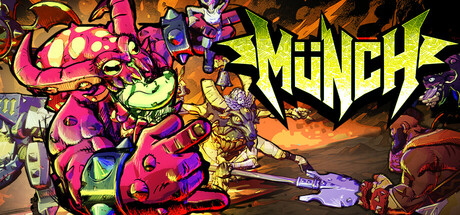
  • Genre Clarity: 8/10 — Action-heavy arcade metal vibe clear. The bright neon pink, lime green, and orange color palette with stylized cartoon violence, chunky robot/creature designs, and aggressive typography immediately signal a wild action game with comedic tone. The chaotic composition and metal logo reinforce action-arcade gameplay. At TINY size, the bold color blocking and angular shapes still read as high-energy action despite detail loss.
  • Title Readability: 9/10 — Bold yellow metal logo stands out. The 'MUNCH' title uses a thick, angular metal-style font in bright yellow positioned in the upper right against darker orange/brown background, providing excellent contrast and legibility. The letterforms remain sharp and readable even at TINY size due to weight and color separation. No small taglines compete for attention.
  • Contrast & Color: 9/10 — Vibrant neon pops against dark Steam background. Hot pink, lime green, and yellow elements create strong value contrast against the warm dark orange midground and black edges, ensuring clarity at all sizes. The neon saturation and light-dark separation maintain silhouette integrity even when squinting or at TINY thumbnail size. Colors do not muddy or blend into #1b2838.
  • Uniqueness & Polish: 8/10 — Distinctive art style memorable and premium. The hand-drawn cartoon aesthetic with exaggerated proportions, metallic accents on creatures, and vibrant graffiti-like energy conveys a distinctive identity well beyond generic action templates. The 'Kill. Eat. Evolve.' concept is visually supported by the grotesque mutating designs and metal styling. Craft feels intentional with coherent effects and color grading.
  • Brand Consistency: 7/10 — Consistent neon aesthetic no clear symbol. The bold color palette, angular typography, and cartoon creature design create a recognizable internal style across the composition. However, there is no single iconic character, symbol, or logo motif that would serve as a lasting brand marker for franchise recognition. The metal aesthetic and neon treatment are thematically cohesive but not uniquely proprietary.
  • Composition: 8/10 — Strong focal hierarchy with clear depth. The composition layers foreground creatures (pink/magenta), midground chaos, and background orange glow, creating natural depth. The 'MUNCH' logo anchors the top right without blocking key art. At SMALL and TINY sizes, the chaotic center draws eye while title remains separated and legible. Safe margins respected with no critical edge-hugging.

What works

  • Excellent color contrast and saturation. Neon pink, lime, and yellow create vibrant separation from dark Steam background ensuring instant visibility in quick scroll.
  • Title legibility at all sizes. Thick yellow metal-style 'MUNCH' logo remains sharp and readable from full header down to TINY thumbnail due to weight and placement.
  • Genre and tone immediately clear. Chaotic cartoon violence, metal branding, and wild color palette signal action-arcade gameplay with comedic metal attitude without ambiguity.
  • Depth and layering create visual interest. Foreground creatures, midground chaos, and background glow prevent flat feel and maintain engagement across sizes.

What hurts the capsule

  • No iconic character or symbol. While stylistically cohesive, there is no singular memorable mascot or brand icon that would enable instant recognition in future marketing.
  • Dense composition risks detail loss. At TINY size, intricate creature details and background elements merge into visual noise, though core read remains intact.
  • Generic creature shapes lack specificity. While the cartoon style is distinctive, individual creature designs do not immediately communicate unique gameplay mechanics or evolutionary concept visually.

Priority fixes

  1. [brand_consistency] Develop a signature character or symbol that could serve as a recognizable franchise mascot across future marketing materials and sequels.
  2. [uniqueness_polish] Refine one creature design as a clear protagonist or transformation centerpiece to better visualize the 'Kill. Eat. Evolve.' core mechanic.
  3. [composition] Test composition at TINY size to ensure primary creature silhouette remains distinct and does not merge with background when full detail is lost.

Related guides

Steam app ID: 2427050 · Tags: Villain Protagonist, Hack and Slash, Roguelite, Action, Gore