Quick text summary
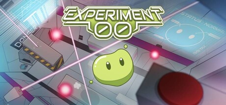
Experiment 00 scored 70/100 on Steam Analyzer — Good for a Difficult capsule. Top priority fix: [uniqueness_polish] Add a signature visual element or pose that hints at the platformer's falling mechanic—e.g., character in mid-jump or with dynamic motion blur to signal action.
Capsule scores by dimension
- Genre Clarity: 7/10 — Puzzle platformer identity readable. The yellow smiley-face protagonist and grid-based digital environment clearly signal a puzzle or logic game set in a tech space. At TINY size, the character silhouette and grid backdrop remain identifiable, though the platformer aspect is less obvious—the casual pose suggests puzzle-solving rather than action jumping. The neon aesthetic and button interface hint at experimental mechanics but don't scream platformer urgency.
- Title Readability: 8/10 — Bold yellow outline legible throughout. EXPERIMENT 00 uses a bright yellow-green outline font with dark interior fill on a clear upper background zone, ensuring strong contrast against the dark Steam background and maintained legibility even at TINY size. The letterforms are thick and geometric, resisting collapse at small scales. The title placement avoids direct overlap with busy mid-field elements, preserving clarity during quick scrolls.
- Contrast & Color: 8/10 — Strong luminance separation clean. The bright yellow title and neon pink/magenta lights create sharp value separation from the cooler blue-grey tech environment and dark Steam background. The yellow smiley face pops distinctly against the darker metallic chamber floor and panel details. At TINY size, the silhouette and color blocks read clearly; the grayscale mental test confirms strong mid-dark separation in the core focal area, though some mid-tone buttons and vents blend slightly.
- Uniqueness & Polish: 6/10 — Clean but familiar tech-puzzle look. The capsule is well-crafted with coherent neon sci-fi styling and intentional lighting effects, but the combination of happy-face character plus tech chamber is a familiar indie puzzle trope seen in games like Portal and similar titles. The smiling face mascot and grid environment feel competent rather than distinctly memorable; there is no immediately unique selling point that separates this from other cute-character puzzle games in the catalogue.
- Brand Consistency: 6/10 — Consistent art direction, generic identity. The neon-lit laboratory aesthetic, yellow protagonist, and geometric UI elements appear internally cohesive—this visual language likely carries through to screenshots. However, the smiley-face mascot and tech-lab setting are broad visual clichés in indie games, offering limited iconic recognition or memorable brand distinctiveness. The capsule would not stand out as uniquely recognizable in a random gallery without the title.
- Composition: 7/10 — Clear focal point with layered depth. The yellow smiley face sits in the center-lower third, anchoring attention clearly at all sizes, while the title dominates the upper zone and neon lights guide the eye around the scene. The layering of background panels, mid-ground chamber elements, and foreground character creates depth and visual interest. At SMALL and TINY sizes the hierarchy remains clear; however, the scattered neon lights and multiple button details create minor visual noise that slightly dilutes focus compared to premium benchmarks like DREDGE or Jusant.
What works
- Legible yellow title with outline. Bold geometric letterforms with dark interior and bright outline maintain clarity at TINY size and stand out sharply against the dark Steam background.
- Strong neon color contrast. Bright yellow and magenta accents create excellent luminance separation from cool blues and greys, ensuring the core elements read clearly even in quick scroll and grayscale.
- Clear focal point hierarchy. The centered yellow smiley-face character anchors attention while the title frame guides the eye, creating a natural read path at all display sizes.
What hurts the capsule
- Generic cute-character puzzle identity. The happy-face mascot in a tech lab replicates a familiar indie template without a distinctive visual hook or memorable brand signature.
- Platformer genre underplayed. The calm centered character pose and puzzle-focused aesthetic downplay the jumping and falling mechanics core to the game, potentially confusing players about gameplay type at TINY size.
- Mid-tone detail clutter. Multiple neon lights, buttons, and vents create visual noise that slightly fragments attention and reduces the premium polish of top-tier comparison titles.
Priority fixes
- [uniqueness_polish] Add a signature visual element or pose that hints at the platformer's falling mechanic—e.g., character in mid-jump or with dynamic motion blur to signal action.
- [genre_clarity] Include a subtle visual cue (falling motion, perilous height, or broken platform) that communicates the platformer/failure-retry loop core to gameplay.
- [composition] Reduce mid-field lighting and button detail; simplify background elements to strengthen focus on the character and title without sacrificing atmosphere.
Store copy priority fixes
- [feature_communication] Add 2–3 concrete mechanical details to the detailed description: e.g., 'Each fall costs you time / progress / a life,' 'Platforms grow narrower as you climb,' or 'Checkpoints reward persistence' to ground the emotional narrative in actual gameplay systems.
- [uniqueness] Include a sentence that articulates what makes this vertical platformer distinct: e.g., 'Unlike traditional platformers, the game tracks your choice to quit and acknowledges it in the ending' or 'Features dynamic difficulty that responds to repeated failures.'
- [audience_targeting] Explicitly name the intended player in a parenthetical or sentence: e.g., 'Perfect for players who loved [comp title] or enjoy short, punishing indie platformers' to reduce uncertainty about expected playtime and difficulty curve.
- [hook_strength] Strengthen the short description with a secondary emotional or mechanical hook: e.g., 'A vertical platformer about making careful jumps, falling a lot, and deciding whether to give up—or whether the research facility will let you.' to deepen curiosity about the setting.
Related guides
Steam app ID: 2436060 · Tags: Difficult, Adventure, Psychological Horror, Indie, Precision Platformer