Scoring genre clarity...

Splatterbot capsule

Splatterbot

The cleaning robots have gone rogue! Up to 4-players compete in local-multiplayer to make the most mess! Utilize your environment and power-ups to overwhelm your opponents with untidiness. It's about to get messy..

$9.99Positive(10)
PvPArcadeCute
Hey! KookaburraSep 3, 2025

Splatterbot scores 78/100 — better than 79% of PvP capsules (n=1,862).

Positive (10 reviews) · $9.99 · Released Sep 3, 2025 · By Hey! Kookaburra

Quick text summary

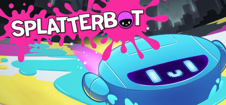
Splatterbot scored 78/100 on Steam Analyzer — Good for a PvP capsule. Top priority fix: [uniqueness_polish] Add a visual element that explicitly hints at the 'messy cleaning chaos' core mechanic, such as exaggerated dirt splatter patterns, multiple robots competing, or environmental objects being destroyed to strengthen the hook at small sizes.

Capsule scores by dimension

  • Genre Clarity: 8/10 — Colorful multiplayer party action game. The bright neon pink and cyan palette, playful robot character with expressive features, and dynamic splash effects immediately signal a casual, colorful multiplayer game rather than a serious action title. At tiny size, the vibrant color contrast and robot silhouette remain readable enough to suggest 'fun arcade-style action,' though the specific 'messy cleaning robot' premise is not obvious without context. The visual tone is distinctly lighthearted and party-game oriented, which aligns well with the genre.
  • Title Readability: 8/10 — Bold title with clear visual hierarchy. The 'SPLATTERBOT' title is rendered in large, high-contrast white letters with a thick black outline, positioned in the upper left and center, making it legible at all sizes including tiny. The white-on-dark background and solid letterforms hold up well under the squint test and at 120x45 thumbnail resolution. The circular bot eye integrated into the 'O' adds a memorable branding touch without compromising readability.
  • Contrast & Color: 9/10 — Vibrant neon palette with strong value separation. The magenta/hot pink splatter effects, cyan robot body, and yellow accents create excellent contrast against the dark background and each other across the full, small, and tiny viewing sizes. Even in grayscale, the bright neon cyan and pink values separate clearly from the dark gray cityscape and the dark background, with the white title providing a strong anchor. The color choices feel intentional and avoid muddy mid-tones, ensuring the capsule pops in a quick scroll.
  • Uniqueness & Polish: 7/10 — Polished casual aesthetic with genre-appropriate style. The capsule demonstrates clean execution with smooth gradients, well-defined character geometry, and a cohesive art direction that feels intentional and premium for a casual multiplayer title. The neon color grading and playful robot design communicate a specific tone and unique selling point—colorful, fun multiplayer chaos—rather than a generic action game. However, the overall composition and visual storytelling are fairly straightforward; the design does not contain a breakthrough hook or unexpected visual surprise that would elevate it to 8-9 range.
  • Brand Consistency: 7/10 — Consistent colorful robot identity. The cyan and magenta color palette, robot character design with expressive eye, and playful neon aesthetic are internally cohesive and appear to match the game's visual identity based on available game context. The character silhouette and color signature are memorable and could be recognized in other promotional materials. The consistency is solid but not iconic enough to feel like a standout brand mark across the industry.
  • Composition: 8/10 — Balanced focal point with clear depth layering. The robot character is centered as the primary focal point with the splatter effect and cityscape providing mid and background layers, creating good visual depth and hierarchy that holds at small and tiny sizes. The title placement in the upper region is safe from cropping, and the composition does not suffer from dead-center voids or awkward empty gaps. The design maintains a clear read across all viewing sizes with no elements competing for attention or hugging unsafe margins.

What works

  • Excellent contrast and color pop. Neon magenta, cyan, and yellow palette creates vibrant visual separation against the dark Steam background and maintains clarity at thumbnail size without muddy mid-tones.
  • High-legibility title design. White text with thick black outline and integrated circular bot eye is readable at all sizes and adds a branded visual hook without sacrificing clarity.
  • Clear visual hierarchy and depth. Foreground robot, midground splatter effects, and background cityscape create layered composition that guides the eye and maintains focal clarity at tiny sizes.
  • Polished, intentional art direction. Smooth gradients, clean character geometry, and cohesive neon color grading signal premium casual-game execution aligned with the playful multiplayer tone.

What hurts the capsule

  • Generic scene setup without unique hook. While polished, the visual composition is a straightforward character-plus-environment layout that does not communicate a distinctive core mechanic or surprising visual idea specific to the 'rogue cleaning robot' premise.
  • Limited brand iconography. The robot and color palette are cohesive but not striking or iconic enough to feel immediately recognizable or distinctive compared to other colorful multiplayer casual games in the market.
  • Minimal visual storytelling. The capsule communicates 'colorful fun action game' but does not visually convey the specific selling point of competitive messy chaos or cleaning-gone-wrong premise without reading the description.

Priority fixes

  1. [uniqueness_polish] Add a visual element that explicitly hints at the 'messy cleaning chaos' core mechanic, such as exaggerated dirt splatter patterns, multiple robots competing, or environmental objects being destroyed to strengthen the hook at small sizes.
  2. [brand_consistency] Introduce a signature visual motif or icon (e.g., a stylized dirt cloud, grime splatter logo, or recurring UI element) that appears consistently across promotional materials to build stronger brand recognition.
  3. [composition] Consider adding a secondary competing robot character or interactive environmental element in the mid-ground to visually reinforce the competitive multiplayer chaos without cluttering the focal point.

Store copy priority fixes

  1. [feature_communication] Replace the duplicate opening in the detailed description with a new first paragraph that teases a specific signature mechanic or standout game mode (e.g., a special arena type or unique power-up system that competitors lack).
  2. [uniqueness] Add 1-2 sentences explicitly comparing Splatterbot to similar games or stating what makes it the best choice for players seeking local multiplayer chaos (e.g., 'Unlike traditional shooter-based party games, Splatterbot rewards bold, creative area control over reflexes').
  3. [feature_communication] Expand the 'Dynamic Environments' section with 1-2 concrete examples of how environmental hazards create emergent gameplay moments (e.g., 'Lure opponents into spinning fans to splatter your color further than theirs').

Related guides

Steam app ID: 2436660 · Tags: PvP, Arcade, Cute, Split Screen, Top-Down