Scoring genre clarity...
Enginefall capsule

Enginefall

Enginefall is a player-driven crafting shooter set on colossal, post-apocalyptic megatrains. Start in the tail alone or with friends as you scavenge, craft, and build your way to First Class. Seize better gear car by car, and escape with high-value loot to upgrade your personal home on the rails.

PvPSurvivalSandbox
Red Rover Interactive2026

Enginefall scores 72/100 — better than 49% of Survival capsules (n=1,899).

Released 2026 · By Red Rover Interactive

Quick text summary

Enginefall scored 72/100 on Steam Analyzer — Good for a Survival capsule. Top priority fix: [uniqueness_polish] Integrate a visual element that hints at the crafting or megatrain progression mechanic—such as visible salvaged parts, a gear progression overlay, or a distinctive train silhouette motif—to differentiate from generic action games.

Capsule scores by dimension

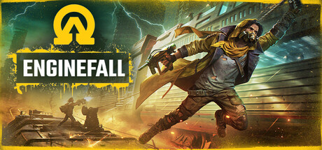
  • Genre Clarity: 7/10 — Action shooter with industrial setting. The dynamic pose of the protagonist wielding a large weapon, combined with the post-apocalyptic industrial environment and megatrain architecture, clearly signals an action-adventure shooter. The yellow and teal color scheme with explosions and lightning reinforce high-energy combat gameplay. At tiny size, the weapon silhouette and action pose remain readable, though the specific crafting-driven mechanic is not visually obvious without context.
  • Title Readability: 8/10 — Bold white text, strong contrast. The title 'ENGINEFALL' is rendered in large, clean white lettering with a black shadow outline, positioned prominently against the yellow branded bar on the left side. The text remains legible at small and tiny sizes due to high contrast and generous letter spacing. The positioning on a controlled solid background rather than busy textures ensures reliable readability across all viewing sizes.
  • Contrast & Color: 8/10 — Strong warm-cool palette separation. The composition uses a vibrant yellow-gold accent (logo, accent bar) against cool teal-blue atmospheric elements and dark green-teal background tones, creating clear value separation against the Steam dark background #1b2838. The protagonist in warm brown tones stands out distinctly from cool background lighting, and the bright explosive elements create clear focal depth. At tiny size, the silhouettes remain distinct and do not muddy.
  • Uniqueness & Polish: 7/10 — Polished industrial aesthetic, familiar formula. The capsule demonstrates solid craft with layered lighting effects, detailed mechanical environment, and a dynamic character pose that conveys the action-focused gameplay. The industrial steampunk-meets-sci-fi aesthetic is cohesive and well-rendered with intentional lighting design and particle effects. However, the core visual language—action hero on dystopian backdrop—is common in the genre, limiting the distinctive hook that separates it from top-tier capsules like HELLDIVERS 2 or Armored Core VI.
  • Brand Consistency: 6/10 — Consistent style, limited iconic motif. The capsule maintains a coherent art direction with the megatrain industrial aesthetic, warm and cool color grading, and action-focused composition that should align across store screenshots. The yellow circular logo with an upward arrow is a functional brand mark but lacks the memorable iconic punch of top performers. The rendering quality and lighting approach appear intentional, though without access to other materials, the internal cohesion signal is moderate rather than distinctive.
  • Composition: 7/10 — Clear focal point, well-balanced layout. The protagonist positioned slightly right of center as the primary focal point, with the logo and title anchored to the left creating a strong visual hierarchy. Background destruction and lightning frame the subject without overwhelming it, and the yellow accent bar provides structural organization without cluttering. At small and tiny sizes, the character silhouette and logo remain the clear priority, though edge-cropping could potentially cut off some lower-right explosion detail on certain aspect ratio platforms.

What works

  • Title legibility across all sizes. White text with black outline on the yellow accent bar ensures the title remains crisp and readable from full size down to tiny thumbnail view.
  • Strong color separation against Steam background. The warm yellow and cool teal palette creates natural contrast that makes the capsule pop against the #1b2838 dark background without muddy mid-tones.
  • Clear action-adventure messaging. The dynamic pose, weapon, explosion effects, and industrial setting immediately communicate an action-focused gameplay experience with high production value.
  • Layered depth composition. Background lightning, midground mechanical structures, and foreground character create natural depth layering that guides the eye effectively at all viewing sizes.

What hurts the capsule

  • Generic action-game formula. The core visual concept—armed protagonist against dystopian explosion—is a well-worn template that does not immediately differentiate Enginefall from other action titles in the genre.
  • Weak brand identity anchor. The yellow circular logo with arrow is functional but not visually distinctive enough to become a recognizable brand mark on repeated exposure compared to top-tier indie competitors.
  • Crafting and progression mechanics not visually communicated. While the action shooting is clear, the unique player-driven crafting and megatrain progression hook are not evident from the capsule visuals alone, potentially underselling the game's distinctive loop.

Priority fixes

  1. [uniqueness_polish] Integrate a visual element that hints at the crafting or megatrain progression mechanic—such as visible salvaged parts, a gear progression overlay, or a distinctive train silhouette motif—to differentiate from generic action games.
  2. [brand_consistency] Refine the circular logo mark into a more iconic symbol that can stand alone and become recognizable across multiple marketing materials and future capsule iterations.
  3. [genre_clarity] Add subtle craft-specific visual language like floating components or a loot indicator to the composition to fully communicate the player-driven crafting shooter hook at tiny size.

Store copy priority fixes

  1. [audience_targeting] Add a sentence clarifying solo viability and whether players need a dedicated crew to progress, or explicitly state 'play solo or squad-based' to set expectations early.
  2. [feature_communication] Expand the short description or add a sentence in the detailed copy explaining raid duration, respawn mechanics, or a concrete example of a typical session flow.
  3. [uniqueness] Insert a differentiator statement such as 'unlike traditional extraction shooters, Enginefall lets you own and upgrade your own train' to highlight what makes this distinct in the genre.

Related guides

Steam app ID: 2437390 · Tags: Survival, Sandbox, Crafting, Extraction Shooter, Realistic