Scoring genre clarity...

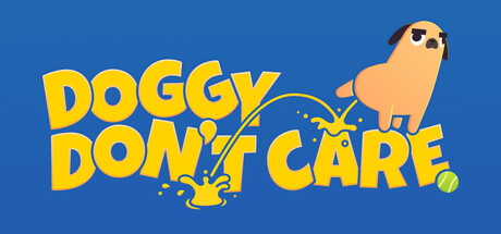
Doggy Don't Care capsule

Doggy Don't Care

Unleash adorable chaos, solve puzzles, and leave your mark (literally!) as a mischievous dog on the loose.

FunnyPuzzleVillain Protagonist
Rohan NowellComing soon

Doggy Don't Care scores 80/100 — better than 90% of Steam capsules we've analysed (n=22,823).

Released Coming soon · By Rohan Nowell

Quick text summary

Doggy Don't Care scored 80/100 on Steam Analyzer — Good for a Villain Protagonist capsule. Top priority fix: [uniqueness_polish] Add a visual hint of the puzzle-solving mechanic (e.g., object silhouettes or UI element) to differentiate from generic mischief-dog theme and signal gameplay depth.

Capsule scores by dimension

  • Genre Clarity: 8/10 — Clear comedic action with dog protagonist. The cartoon dog character with sunglasses and mischievous pose immediately signals a lighthearted action game with comedic tone. The chaotic visual elements (splatter effects, playful typography) reinforce adventure and sandbox-style gameplay. At tiny size, the dog silhouette and yellow text remain recognizable as indie action comedy, though specific genre nuance becomes less clear.
  • Title Readability: 9/10 — Excellent bold typography legibility. The title 'DOGGY DON'T CARE' uses large, thick yellow letters with strong black outline on a solid blue background, maintaining excellent contrast at all sizes. The text placement is centered and unobstructed, with strategic spacing that preserves readability even at tiny thumbnail size. No competing elements interfere with the text hierarchy.
  • Contrast & Color: 9/10 — Strong value separation and saturation. The vibrant yellow title and orange-tan dog pop decisively against the deep blue background (#1b2838 equivalent), creating excellent contrast in both color and value. The white highlight on the dog and splash effects add dimensional separation. At tiny size, the yellow and blue relationship remains distinct and readable without muddy midtones.
  • Uniqueness & Polish: 7/10 — Charming indie aesthetic with clear personality. The playful dog character with sunglasses and the irreverent title convey a distinctive indie charm and comedic personality that differentiates it from generic action games. The hand-drawn style and splatter effects suggest intentional art direction. However, the overall composition relies on familiar indie tropes (cute character, chaos theme) without a breakthrough visual hook that would push it to premium polish tier.
  • Brand Consistency: 7/10 — Coherent art style with recognizable character. The dog character design is distinctive and likely recognizable across marketing materials, with consistent cartoon rendering and color palette (tan, sunglasses, playful expression). The blue and yellow color scheme is cohesive and would support brand recall. The internal visual language is consistent, though without seeing other materials it is difficult to assess full brand ecosystem strength.
  • Composition: 8/10 — Clear hierarchy with balanced focal points. The title anchors the left side while the dog character commands the right, creating a natural left-to-right reading flow with good balance. The splatter and effect elements guide the eye without overwhelming the composition. Safe margins around critical elements ensure the design holds at small sizes, and the horizontal layout suits Steam's capsule aspect ratio well.

What works

  • Outstanding title legibility. Bold yellow text with black outline remains completely readable from full size through tiny thumbnail, with no letterform collapse or muddy rendering.
  • Vibrant color-value contrast. The yellow-and-orange elements separate cleanly from the deep blue background with strong saturation and luminance, ensuring rapid visual parsing in quick scroll.
  • Clear comedic brand personality. The sunglasses-wearing dog and irreverent title immediately communicate an indie action-comedy tone that differentiates from serious genre entries.
  • Well-balanced composition. Text and character are spatially distributed to create natural hierarchy and focal flow without clutter or dead zones.

What hurts the capsule

  • Limited visual depth. The flat blue background with minimal layering lacks the dimensional foreground-midground-background separation seen in top-tier indie capsules.
  • Generic indie trope reliance. The cute-character-chaos-mayhem formula is familiar within indie games, without a breakthrough mechanic or visual hook that suggests core gameplay uniqueness.
  • Splatter effects feel supplementary. The splash and particle elements read as decorative surface treatment rather than suggesting specific gameplay mechanics or the puzzle-solving core mentioned in description.

Priority fixes

  1. [uniqueness_polish] Add a visual hint of the puzzle-solving mechanic (e.g., object silhouettes or UI element) to differentiate from generic mischief-dog theme and signal gameplay depth.
  2. [composition] Introduce a secondary background layer (interior room, level environment) behind the character to create visual depth and suggest specific gameplay context.
  3. [genre_clarity] Consider a subtle UI element or prop (puzzle piece, puzzle grid, objective marker) to clarify the simulation and puzzle aspects beyond pure action-comedy.

Store copy priority fixes

  1. [feature_communication] Expand the puzzle description with 1-2 specific examples (e.g., 'Use found items to create ramps, activate switches, or unlock pathways') to clarify the puzzle design.
  2. [uniqueness] Add a sentence after the detailed description opening that differentiates this from other collectathon platformers (e.g., 'Physics-based destruction and dog-specific abilities like digging set this apart' or 'Every environment reacts to your mischief in unique ways').
  3. [audience_targeting] Clarify the target skill level with a single phrase (e.g., 'ideal for casual explorers and puzzle fans' or 'designed for players ages 6 and up') to help the right audience self-identify.
  4. [feature_communication] Briefly explain feathered friends in the Key Features section or main body (e.g., add 'Impress bird NPCs who unlock new areas and rewards' to reduce mystery and increase clarity).

Related guides

Steam app ID: 2438180 · Tags: Villain Protagonist, Exploration, Puzzle Platformer, Collectathon, 3D Platformer