Scoring genre clarity...
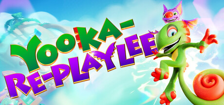
Yooka-Replaylee capsule

Yooka-Replaylee

Embark on an epic 3D platforming collectathon adventure with Yooka and Laylee! Yooka-Replaylee is packed with new moves, more story, exciting challenges, hidden secrets, and more than double the collectibles to uncover. Can you help them rescue the world’s biggest treasure?

$20.99Very Positive(24)
Exploration3D PlatformerCollectathon
Playtonic GamesOct 9, 2025

Yooka-Replaylee scores 85/100 — better than 98% of Exploration capsules (n=5,083).

Very Positive (24 reviews) · $20.99 · Released Oct 9, 2025 · By Playtonic Games

Quick text summary

Yooka-Replaylee scored 85/100 on Steam Analyzer — Excellent for a Exploration capsule. Top priority fix: [composition] Consider repositioning the title to the lower left or integrating it more seamlessly with the background to reduce focal point competition and improve overall balance.

Capsule scores by dimension

  • Genre Clarity: 9/10 — Vibrant 3D platformer collectathon instantly clear. The bright, whimsical art style, colorful chameleon protagonist with exaggerated proportions, floating collectible orb, and cheerful sky setting immediately signal a family-friendly 3D platformer adventure. At tiny size, the distinctive character silhouette and playful pose remain unmistakable, and the genre reads as accessible action-adventure without ambiguity.
  • Title Readability: 8/10 — Bold two-tone title clearly legible throughout. YOOKA in green and REPLAYLEE in magenta use thick, rounded letterforms with strong value separation against the light cyan sky background. The title remains readable at small size with good letter spacing and outline clarity, though the decorative style loses some sharpness at tiny thumbnail size but does not collapse into illegibility.
  • Contrast & Color: 9/10 — Saturated palette pops against dark Steam background. The vibrant cyan-to-blue sky gradient, bright green character, hot magenta text, and warm yellow-orange collectible create strong saturation and value separation that stands out immediately on the dark #1b2838 Steam background. Even at tiny size, the warm-cool color contrast and clear silhouettes maintain visual impact and quick readability.
  • Uniqueness & Polish: 8/10 — Distinctive character and vibrant world-building shine. The capsule showcases a memorable protagonist with personality and a cohesive, colorful environment that communicates the cheerful tone and collectathon appeal without relying on generic fantasy templates. The dynamic character pose, floating collectibles, and cloud-filled sky create visual storytelling that hints at the adventure and fun, though the composition is relatively straightforward compared to top-tier indie standouts.
  • Brand Consistency: 9/10 — Yooka-Laylee identity strongly reinforced. The iconic chameleon duo (Yooka as green protagonist, Laylee's silhouette visible in design), signature vibrant color palette, and playful art direction align perfectly with the established Yooka-Laylee brand. The visual language is immediately recognizable and consistent with the franchise's tone and visual identity across marketing materials.
  • Composition: 8/10 — Clear hierarchy with dynamic character focal point. Yooka anchors the right-center with a dynamic pose while the title dominates the upper-left quadrant, creating a strong primary focal point that guides the eye naturally across sizes. The layered background (clouds, sky gradient) and floating collectible support without cluttering; however, the composition is slightly weighted to one side, which slightly reduces perfect balance, though it remains effective and safe within Steam crop margins.

What works

  • Iconic character instantly recognizable. The distinctive green chameleon with exaggerated features and dynamic pose is a memorable brand anchor that stands out even at thumbnail size.
  • Vibrant color contrast against Steam dark background. The saturated cyan, magenta, and green palette creates immediate visual pop and quick discoverability in Steam browse mode.
  • Genre-signaling art style and composition. The whimsical, bright aesthetic and playful character pose clearly communicate a family-friendly 3D platformer collectathon without ambiguity.
  • Bold, readable typography with strong outline. Two-tone title uses thick letterforms and clear value separation that remains legible across full, small, and tiny viewing sizes.

What hurts the capsule

  • Composition slightly asymmetrical. The weight bias toward the right side (character placement) creates a less balanced overall composition compared to perfectly centered or rule-of-thirds layouts.
  • Title placement competes with character focal point. Upper-left text and right-center character both demand attention, which slightly fragments focus instead of creating a single clear hierarchy.

Priority fixes

  1. [composition] Consider repositioning the title to the lower left or integrating it more seamlessly with the background to reduce focal point competition and improve overall balance.
  2. [title_readability] Add a subtle text shadow or inner outline to magenta REPLAYLEE to further boost readability at tiny thumbnail size without changing the vibrant color palette.

Store copy priority fixes

  1. [hook_strength] Replace 'epic' with a specific emotional hook or mechanic that appeals to newcomers, e.g., 'Master 50+ new platforming moves and combos as you hunt 300 collectibles across reimagined worlds.'
  2. [audience_targeting] Add a sentence explicitly stating 'Perfect for completionists and fans of classic Rare 3D platformers—solo play, no combat required' to clarify intended player type and difficulty tone.
  3. [uniqueness] Strengthen the opening to lead with what is new in this version first, not the original game's premise, e.g., 'The ultimate 3D platformer returns with double the content, new areas, a completely reworked moveset, and an orchestral remix of the iconic soundtrack.'

Related guides

Steam app ID: 2448020 · Tags: Exploration, 3D Platformer, Collectathon, Puzzle, Platformer