Scoring genre clarity...
Space Engineers capsule

Space Engineers

Space Engineers is a sandbox engineering game where you design and build ships, stations, and planetary bases in a fully destructible environment. Explore planets and space, mine resources, survive hazards, and engage in combat alone or with friends in Creative or Survival modes.

$9.99Very Positive(219)
SandboxBuildingSpace
Keen Software HouseFeb 28, 2019

Space Engineers scores 77/100 — better than 68% of Sandbox capsules (n=1,624).

Very Positive (219 reviews) · $9.99 · Released Feb 28, 2019 · By Keen Software House

Quick text summary

Space Engineers scored 77/100 on Steam Analyzer — Good for a Sandbox capsule. Top priority fix: [uniqueness_polish] Replace or reposition the UPDATE badge to allow focus on a distinctive gameplay moment—such as a completed multi-block structure, a unique ship design, or a signature mechanic in action that sets Space Engineers apart from generic sandbox competitors.

Capsule scores by dimension

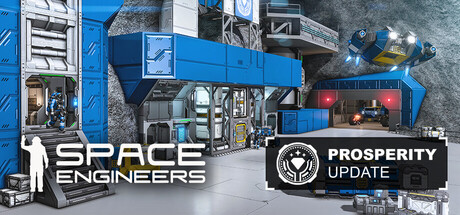
  • Genre Clarity: 8/10 — Industrial sci-fi building game clear. The capsule immediately signals sandbox engineering through industrial machinery, cranes, construction vehicles, and a white character figure in a space suit working on platforms. At TINY size, the yellow safety markings, green industrial structures, and crane silhouette still convey the manufacturing/building theme effectively. Genre intent is unambiguous—this is clearly a construction and engineering sandbox.
  • Title Readability: 9/10 — Bold white sans-serif dominates clearly. The SPACE ENGINEERS title uses high-contrast white sans-serif text positioned in the lower-left foreground against dark industrial background, ensuring legibility at all sizes. The ECONOMY II UPDATE badge on the right uses white and circular framing to maintain readability. At TINY size, both text blocks remain distinguishable and the hierarchy is preserved without collapse.
  • Contrast & Color: 8/10 — Strong value separation industrial palette. The composition leverages a high-contrast palette: bright sky blue background, green and gray industrial structures, yellow safety markings, and white text create clear silhouettes against the dark Steam background. The character figure in white suit stands out distinctly in the midground. At TINY size, the value separation holds and elements do not muddy together in grayscale.
  • Uniqueness & Polish: 7/10 — Solid functional design, generic theme. The capsule demonstrates clean execution with intentional layout, proper typography, and coherent industrial aesthetic that matches the game's core premise. However, the scene is a fairly conventional construction site tableau without a standout hook or narrative moment that would elevate it above competent—it shows the game's tools but not a unique selling point or memorable visual signature. The ECONOMY II UPDATE badge adds context but feels more informational than premium.
  • Brand Consistency: 6/10 — Functional but generic space theme. The capsule uses recognizable Space Engineers iconography—industrial construction, space suit, machinery—consistent with in-game visuals and brand expectations for a building sandbox. However, there are no distinctive motifs, signature color palettes, or iconic character silhouettes that create lasting brand recall; the industrial aesthetic is functional but could apply to several games in the genre. Consistency is competent but not memorable.
  • Composition: 8/10 — Clear hierarchy with balanced focal point. The layout uses strong depth layering: busy industrial structures and crane in background, mid-ground platform and vehicle details, foreground character figure and yellow safety markings guiding focus. Title placement in lower-left anchors without blocking the action, and the UPDATE badge balances the right edge. At SMALL and TINY sizes, the crane and character remain clear focal points without cluttered distraction.

What works

  • Readable title at all sizes. White sans-serif SPACE ENGINEERS text has high contrast and clean positioning that remains legible from FULL to TINY without decorative collapse.
  • Strong industrial visual identity. Green machinery, yellow safety markings, cranes, and platforms create a cohesive sandbox engineering aesthetic immediately recognizable as construction-focused gameplay.
  • Effective depth and focal point. Layered composition with crane background, platform midground, and suited character foreground creates visual hierarchy that reads clearly at small sizes.
  • High value contrast preservation. The palette uses bright sky, whites, and distinct grays that maintain silhouette clarity and separation against the dark Steam background even in grayscale.

What hurts the capsule

  • Generic scene without unique hook. The industrial construction tableau is functional but does not showcase a distinctive mechanic, narrative moment, or visual signature that stands out against similar sandbox/simulation games.
  • Limited brand recall elements. No iconic character, logo motif, or signature visual that would make the capsule instantly recognizable as Space Engineers on repeat exposure.
  • Informational UPDATE badge feels secondary. The ECONOMY II UPDATE stamp adds clutter and draws attention away from the core game visuals rather than enhancing the primary selling proposition.

Priority fixes

  1. [uniqueness_polish] Replace or reposition the UPDATE badge to allow focus on a distinctive gameplay moment—such as a completed multi-block structure, a unique ship design, or a signature mechanic in action that sets Space Engineers apart from generic sandbox competitors.
  2. [brand_consistency] Introduce a more iconic visual element or signature color accent that creates immediate brand recognition specific to Space Engineers, such as a recurring character pose, a distinctive logo treatment, or a memorable structural silhouette.
  3. [composition] Consider adding a subtle atmospheric or lighting effect (e.g., planet glow, thruster glow, or dynamic shadow) that adds visual interest and narrative context without cluttering the focal point.

Store copy priority fixes

  1. [feature_communication] Move the 'About the Game' section to immediately follow the short description and remove the redundant opening sentences; use recovered space to add a concrete example of a player journey (e.g., 'Start with mining equipment, automate production with conveyors and assemblers, defend with turrets—all simulated in real-time.').
  2. [uniqueness] Add a differentiator sentence after the physics description: e.g., 'Unlike voxel games built on magic systems, every machine you build obeys real physics and can fail catastrophically if designed poorly—your engineering mistakes cost you resources and progress.'
  3. [hook_strength] Rewrite the Deluxe Edition header to 'STANDARD EDITION' or move it below the fold; lead with 'About the Game' to avoid cosmetic distraction on first impression.
  4. [feature_communication] Expand 'exploration encounters' and 'exploration systems' with a single concrete sentence explaining the discovery loop: e.g., 'Encounter derelict wrecks and abandoned stations to salvage, reverse-engineer, or restore as your own bases.'

Related guides

Steam app ID: 244850 · Tags: Sandbox, Building, Space, Survival, Physics