Scoring genre clarity...

重生之时 - Rebirth Moment capsule

重生之时 - Rebirth Moment

【Bug Slayer PT021 · Final · Log】 As the heavy truck sways forward across the sandy terrain, the ruins of the city ahead are now visible. Is this the location assigned to me? Time is running short. Before my antibodies and life are depleted, I must do as much as possible for humanity...

$6.994 user reviews
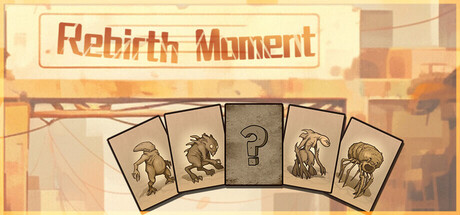
Card BattlerRogueliteIncremental
Polatouche StudioOct 31, 2025

重生之时 - Rebirth Moment scores 60/100 — better than 0% of Card Battler capsules (n=660).

4 user reviews · $6.99 · Released Oct 31, 2025 · By Polatouche Studio

Quick text summary

重生之时 - Rebirth Moment scored 60/100 on Steam Analyzer — Solid for a Card Battler capsule. Top priority fix: [contrast_color] Introduce a darker accent or stronger value contrast in the foreground—consider a darker card border, shadow beneath the cards, or a deep shadow gradient at the bottom to anchor the composition and improve separation from the Steam background at tiny size.

Capsule scores by dimension

  • Genre Clarity: 5/10 — Mixed signals, unclear primary genre. The capsule shows tarot-like cards with animal silhouettes and a question mark, suggesting divination or narrative mystery, but the warm desert landscape background and the game description mentioning a truck and ruins imply post-apocalyptic survival or adventure. At tiny size, the card motif dominates but the genre connection remains ambiguous—it could be a story game, puzzle game, or strategy sim depending on interpretation.
  • Title Readability: 7/10 — Title readable at full, struggles at tiny. The 'Rebirth Moment' title uses a warm reddish-brown serif font with a cream outline box at the top, providing reasonable contrast against the warm background. However, at tiny size the ornate letterforms lose definition and the tagline/branding becomes illegible; the title itself remains recognizable but not sharp.
  • Contrast & Color: 6/10 — Warm palette lacks dark separation. The capsule uses a unified warm color scheme of cream, tan, orange, and brown tones that work together but create limited value separation against the Steam dark background. The cards and landscape blend into the warm gradient background; at tiny size the entire composition reads as a muddy warm mass. In grayscale, midtone dominance reduces silhouette clarity.
  • Uniqueness & Polish: 6/10 — Competent design, generic visual hook. The tarot card arrangement is a clear visual motif and the warm color palette is intentional, but the execution feels like a straightforward application of that idea rather than a distinctive artistic voice. The cards themselves are hand-drawn style with some character, but the overall composition and treatment do not signal a premium or particularly memorable experience compared to benchmark titles like Slay the Princess or Chants of Sennaar.
  • Brand Consistency: 6/10 — Tarot motif is recognizable, lacks depth. The card motif with animal iconography could become a brand identifier if used consistently, and the warm earth-tone palette is coherent throughout. However, without exposure to other brand materials, the identity feels thin—the cards alone don't communicate a specific game voice or memorable visual signature that would stand out on a shelf next to titles like DREDGE or Chants of Sennaar.
  • Composition: 6/10 — Clear focal point, unbalanced space. The five cards arranged in an arc create a strong horizontal focal point in the center-lower portion of the capsule, with the title anchored at the top. The landscape background supports without overwhelming. However, at small and tiny sizes, the top-heavy title placement and the sprawling card arrangement create compositional tension; the cards feel slightly cramped while the upper third feels empty, and the edge-hugging of the title box risks cropping.

What works

  • Clear visual motif with card arrangement. The tarot-style cards fanned in an arc provide an immediate, recognizable focal point that draws the eye and hints at puzzle or narrative gameplay.
  • Intentional warm color palette. The cohesive cream, tan, and orange gradient creates an intentional mood that reinforces the desert/ruins setting described in the game narrative.
  • Title box with outline provides some separation. The cream background with reddish title text and border helps the title stand apart from the landscape, maintaining readability at full size.

What hurts the capsule

  • Limited contrast against dark Steam background. The warm palette does not create strong value separation from the #1b2838 background, making the capsule feel less striking in a scrolling list of thumbnails.
  • Genre identity remains ambiguous. The card motif could signal tarot-based narrative game, puzzle, or strategy, but combined with the desert survival description, the primary gameplay loop is not visually clear.
  • Top-heavy composition with unbalanced negative space. The title occupies prime upper real estate while the cards cluster in the center-lower portion, leaving awkward empty areas that reduce compositional cohesion at small sizes.
  • Lacks premium visual polish compared to benchmarks. The design is competent but does not match the distinctive art direction or visual storytelling found in titles like Chants of Sennaar, DREDGE, or Slay the Princess.

Priority fixes

  1. [contrast_color] Introduce a darker accent or stronger value contrast in the foreground—consider a darker card border, shadow beneath the cards, or a deep shadow gradient at the bottom to anchor the composition and improve separation from the Steam background at tiny size.
  2. [genre_clarity] Add a subtle UI element or visual cue that signals the core mechanic—if strategy, add a grid or stat indicator; if story-driven, emphasize the character silhouette or quest marker to clarify intent at small size.
  3. [composition] Reposition the title to the lower third with centered alignment and the cards in the upper-center area to balance the visual weight and reduce the top-heavy feel that becomes pronounced at tiny size.
  4. [uniqueness_polish] Strengthen the tarot motif with more detailed card iconography or a unique border treatment that signals this game's specific identity rather than a generic divination aesthetic.

Store copy priority fixes

  1. [genre_clarity] Add a single sentence to the short description that explicitly names the card-battler or deck-building mechanic, e.g., 'Build decks of tools and tactics to eliminate alien threats in turn-based combat.'
  2. [feature_communication] Rewrite the Features section to include 2–3 concrete gameplay loops: 'Construct custom decks from collected tools and abilities' / 'Engage in turn-based combat against bugs and zombies' / 'Progress through roguelite runs, upgrading your loadout between missions.'
  3. [audience_targeting] Add a sentence early in the detailed description that signals the gameplay style to strategy and card-game players, e.g., 'Strategically build and evolve your deck to overcome increasingly difficult alien encounters.'
  4. [hook_strength] Strengthen the opening line by leading with the core interaction rather than setting alone, e.g., 'As the heavy truck sways forward, strategize your final deck—before my antibodies deplete, I must rid these ruins of alien threats.'

Related guides

Steam app ID: 2453440 · Tags: Card Battler, Roguelite, Incremental, Strategy, Card Game