Scoring genre clarity...

The Deadly Path capsule

The Deadly Path

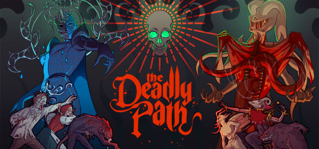
Aid the Deities of Dread in their quest for vengeance and pave the way for their ascension. Gather grim materials, construct defences and expand the underworld to appease the rage of the gods in The Deadly Path, a unique building management and roguelike strategy game.

$12.99Mixed(80)
Choices MatterStrategySurvival
Owlskip EnterprisesMar 25, 2025

The Deadly Path scores 78/100 — better than 89% of Choices Matter capsules (n=2,098).

Mixed (80 reviews) · $12.99 · Released Mar 25, 2025 · By Owlskip Enterprises

Quick text summary

The Deadly Path scored 78/100 on Steam Analyzer — Good for a Choices Matter capsule. Top priority fix: [genre_clarity] Add subtle UI elements or structural hints (building silhouettes, defense indicators, or resource icons) to the background or foreground to reinforce the building-management gameplay loop without cluttering the composition.

Capsule scores by dimension

  • Genre Clarity: 7/10 — Dark strategy with roguelike undertones. The occult iconography, skull imagery, and demonic creature designs clearly signal a dark fantasy strategy game with supernatural themes. At TINY size, the skull centerpiece and red demonic silhouettes still read as ominous and strategic rather than action-oriented, though the building/management aspect isn't visually explicit. Genre clarity benefits from the consistent visual language but could benefit from more explicit UI or structural hints.
  • Title Readability: 8/10 — Bold red lettering stands out clearly. The title 'The Deadly Path' uses a strong red serif font with confident spacing centered below the skull motif on a dark background. At SMALL and TINY sizes, the red maintains excellent contrast and letterforms remain legible despite decorative styling. The placement on a controlled dark region rather than over busy texture ensures the title doesn't collapse.
  • Contrast & Color: 8/10 — Strong red-blue separation on dark base. The bright red title, red radiant halo, and orange accents create vivid value separation against the dark teal-gray background. The blue-lit left creature and red-lit right creature establish a clear color split that reads at all sizes, including TINY where the opposing hues still create distinct silhouettes. Grayscale squint test shows solid value separation across all key elements.
  • Uniqueness & Polish: 8/10 — Distinctive occult art direction with refinement. The hand-drawn aesthetic, specific creature designs, and layered visual storytelling (Deities of Dread flanking a central skull oracle) communicate a cohesive supernatural building-management fantasy. The radiating skull halo and symmetrical demon flanking create a memorable and intentional composition that feels premium rather than generic dark fantasy. The art style is consistent with store screenshots and establishes a recognizable visual brand.
  • Brand Consistency: 8/10 — Cohesive occult aesthetic with iconic motifs. The skull oracle, symmetrical demonic creatures, red-and-blue color scheme, and occult decorative elements create a memorable internal identity that should be recognizable across marketing materials. The consistent rendering style and art direction suggest strong brand vision aligned with the underworld-building theme. These visual motifs (skull, demons, radiant mandala) are distinctive enough to support brand recall.
  • Composition: 8/10 — Symmetrical balance with strong focal point. The composition uses radial symmetry around a central skull oracle with equal-weight demonic figures flanking left and right, creating visual harmony and a clear hierarchical center. The title anchors below the primary focal point without competing for attention, and key elements maintain safe margins from edges at all viewing sizes. Depth layering (creatures in foreground, skull halo in mid-ground, background darkness) creates clear spatial read even at TINY size.

What works

  • Memorable visual identity. The skull oracle with radiating halo, flanked by distinct demonic entities, creates an iconic compositional hook that reads as premium and intentional rather than template-based.
  • Excellent color contrast. Red and blue opposing forces against a dark base provide vivid silhouette separation that maintains readability at TINY size and works in grayscale.
  • Clean title presentation. Bold red serif lettering with confident spacing sits on a controlled dark region, ensuring legibility across all viewing sizes without compromising letterforms.
  • Balanced composition structure. Symmetrical arrangement with clear focal hierarchy and safe margins prevents edge clipping while maintaining visual interest and depth layering.

What hurts the capsule

  • Genre mechanics not visually explicit. While the dark fantasy aesthetic is clear, the building-management and strategic defense elements aren't communicated through visible UI or structural cues, leaving strategy aspect ambiguous at small sizes.
  • Complex creature details reduce at TINY. The intricate linework and decorative elements on the demonic creatures lose definition at thumbnail size, potentially reducing visual impact in rapid scrolling scenarios.

Priority fixes

  1. [genre_clarity] Add subtle UI elements or structural hints (building silhouettes, defense indicators, or resource icons) to the background or foreground to reinforce the building-management gameplay loop without cluttering the composition.
  2. [contrast_color] Increase the saturation or brightness of the teal background slightly to create even more value separation from the creatures' midtones and ensure silhouettes remain crisp at TINY size.

Store copy priority fixes

  1. [hook_strength] Rewrite the short description to lead with the most compelling single hook—e.g., 'Appease capricious dark gods by building and managing a dungeon underworld' or 'Command a demon workforce to construct and defend against godly wrath in this roguelike strategy game' to sharpen the entry point.
  2. [uniqueness] Add 1-2 sentences explaining what makes The Deadly Path mechanically or thematically distinct from other management/roguelike games—e.g., how deity mechanics create unique victory conditions, or how roguelike runs interact with permanent progression.
  3. [feature_communication] Clarify the card game tag by explaining whether cards are part of charms, deity powers, or a separate mechanic—or remove the tag if it is not central to gameplay.
  4. [feature_communication] Expand the roguelike description to specify permadeath, run structure, or how progression persists across runs, as this is a core selling point for the audience.

Related guides

Steam app ID: 2455350 · Tags: Choices Matter, Strategy, Survival, Dark Fantasy, Management