Scoring genre clarity...

Teenage Mutant Ninja Turtles: Mutants Unleashed capsule

Teenage Mutant Ninja Turtles: Mutants Unleashed

Join the Turtle brothers straight from the sewers and slide into this new adventure of shell-shocking proportions!

$39.99Mixed(111)
Beat 'em upMartial Arts3D Fighter
AHEARTFULOFGAMESOct 18, 2024

Teenage Mutant Ninja Turtles: Mutants Unleashed scores 88/100 — better than 100% of Beat 'em up capsules (n=412).

Mixed (111 reviews) · $39.99 · Released Oct 18, 2024 · By AHEARTFULOFGAMES

Quick text summary

Teenage Mutant Ninja Turtles: Mutants Unleashed scored 88/100 on Steam Analyzer — Excellent for a Beat 'em up capsule. Top priority fix: [title_readability] Increase subtitle font weight or simplify to ensure 'TEENAGE MUTANT NINJA' remains legible at TINY size, or consider relying solely on the TMNT logo.

Capsule scores by dimension

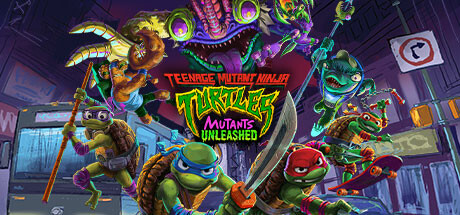
  • Genre Clarity: 9/10 — Iconic TMNT action adventure. The four distinct turtle characters in combat poses with weapons, vibrant neon color coding (blue, red, orange, purple), and futuristic NYC sewer setting instantly communicate action-adventure gameplay. At TINY size, the character silhouettes and bright color differentiation remain unmistakable, making genre recognition immediate and unambiguous.
  • Title Readability: 8/10 — Bold yellow-green logo, clear hierarchy. The yellow-green 'TMNT' text with red 'TEENAGE MUTANT NINJA' subtitle uses strong value contrast and clean letterforms that hold legibility at SMALL size. At TINY size, the logo remains readable due to bold weight, though the full subtitle becomes challenging; the iconic TMNT abbreviation alone carries sufficient recognition.
  • Contrast & Color: 9/10 — Neon against dark purple backdrop. Bright neon greens, purples, oranges, and yellows pop dramatically against the dark purple-blue background, creating excellent silhouette separation and visual pop on the Steam dark theme. The grayscale squint test shows strong value separation between character highlights and background, with no muddy mid-tone blending that would hurt TINY size legibility.
  • Uniqueness & Polish: 9/10 — Premium polish, distinctive neon aesthetic. The capsule demonstrates high-end 3D rendering with clean lighting, particle effects in the background (glowing orbs, neon signs), and intentional color grading that feels premium and cohesive. The visual style is distinctly TMNT while avoiding generic action game clichés—the neon cyberpunk-sewer fusion is a unique selling point that communicates personality and craft.
  • Brand Consistency: 9/10 — Instantly recognizable TMNT identity. The four turtles with their signature color-coded masks, iconic weapons, and distinct personality poses create an unmistakable TMNT brand signature. The neon aesthetic, purple-green color palette, and urban setting reinforce the franchise's visual identity while feeling fresh and contemporary.
  • Composition: 9/10 — Balanced ensemble with clear focal hierarchy. The four turtles are positioned with overlapping depth, creating foreground-midground layering that guides the eye without scattering attention. The title placement centers the composition without crowding, and character poses fan outward naturally, maximizing safe margins and maintaining visual balance across FULL, SMALL, and TINY sizes.

What works

  • Iconic character recognition. Four distinctly color-coded turtles with signature weapons and poses instantly communicate TMNT IP and action-adventure gameplay at any size.
  • Strong neon color palette. Vibrant neon greens, purples, oranges, and yellows create excellent contrast against the Steam dark background and feel premium and energetic.
  • Clear compositional hierarchy. Ensemble arrangement with overlapping depth, strategic title placement, and well-balanced spacing ensures legibility from FULL to TINY sizes without clutter.
  • High-quality 3D rendering. Clean lighting, detailed character models, and atmospheric particle effects (glowing backgrounds, neon signage) convey premium production value.

What hurts the capsule

  • Subtitle text loses clarity at TINY. The 'TEENAGE MUTANT NINJA' red text above the main logo becomes difficult to parse at thumbnail size due to smaller font weight and positioning.
  • Busy background may compete at SMALL. Multiple neon signs, glowing orbs, and architectural detail in the background create visual noise that slightly dilutes focus from the turtle characters at reduced sizes.

Priority fixes

  1. [title_readability] Increase subtitle font weight or simplify to ensure 'TEENAGE MUTANT NINJA' remains legible at TINY size, or consider relying solely on the TMNT logo.
  2. [composition] Reduce background particle density or apply subtle blur to background elements to strengthen the four turtles as the undisputed focal point at SMALL and TINY sizes.

Related guides

Steam app ID: 2460130 · Tags: Beat 'em up, Martial Arts, 3D Fighter, 3D, Action