Scoring genre clarity...
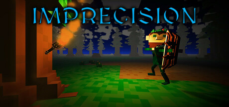
Imprecision is a first/third person, action-adventure, rogue-lite set in The Middle Ages. In Imprecision, you play as a lone archer, Örvar, who is training to take down The Black Knights of Bjørn and their kingdom. You are determined to defeat King Bjørn the Bloodthirsty and take back what is yours.
$4.992 user reviews
ExplorationFPSThird-Person Shooter
Morgan Houston, MM's Gaming Community LLCMar 20, 2025