Scoring genre clarity...

The Farming Frontier capsule

The Farming Frontier

The Farming Frontier is a farming adventure game with a sandbox economy and a linear story. Grow crops, raise cattle, go fishing, master crafting, and battle enemies as you build your frontier.

$9.992 user reviews
Farming SimShop KeeperStrategy RPG
Cuneyt AliustaogluAug 19, 2025

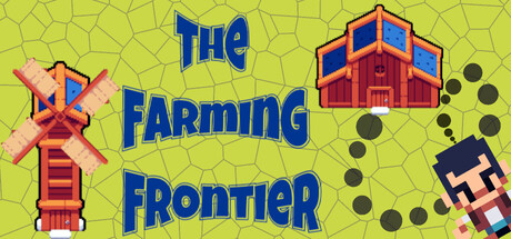
The Farming Frontier scores 70/100 — better than 17% of Farming Sim capsules (n=449).

2 user reviews · $9.99 · Released Aug 19, 2025 · By Cuneyt Aliustaoglu

Quick text summary

The Farming Frontier scored 70/100 on Steam Analyzer — Good for a Farming Sim capsule. Top priority fix: [genre_clarity] Either emphasize the farming core by removing combat symbols or integrate combat visuals more cohesively into the farm setting (e.g., character actively farming or defending farm) to resolve genre confusion.

Capsule scores by dimension

  • Genre Clarity: 7/10 — Farm setting clear, combat unclear. The windmill, barn, crops, and pastoral yellow background immediately signal a farming game. At SMALL and TINY sizes, the farm iconography remains visible and recognizable. However, the small character sprite in the bottom right and scattered dark circles (likely combat or enemies) create mixed messaging about whether this is pure farming or action-adventure, muddying genre expectations slightly.
  • Title Readability: 8/10 — Bold blue title reads well overall. The title 'THE FARMING FRONTIER' uses a thick blue sans-serif font with strong contrast against the lime yellow background, ensuring legibility at FULL and SMALL sizes. At TINY size the letters remain distinguishable, though word spacing compresses slightly. The positioning in the upper-left and center areas keeps text on a relatively clean background rather than obscured by detailed assets.
  • Contrast & Color: 8/10 — Bright yellow background pops cleanly. The lime-yellow base provides excellent value separation against the dark Steam background (#1b2838), and the blue title text has strong complementary contrast. The red barn and windmill with blue/orange accents read clearly in silhouette even at TINY size. A grayscale squint test confirms distinct light-dark separation between all major assets and the background.
  • Uniqueness & Polish: 6/10 — Competent farm aesthetic, generic execution. The capsule uses clean pixel-art or semi-stylized farming assets that are well-rendered and thematic, but the overall presentation is functionally competent rather than distinctive. The combination of a windmill, barn, and crops tells a farming story without a memorable visual hook or unique selling point that would set it apart from other farm sims. The scattered dark circles and distant character sprite suggest deeper mechanics but lack cohesive visual storytelling that communicates a unique core concept.
  • Brand Consistency: 6/10 — Consistent color scheme, no memorable identity. The palette is cohesive: warm yellows, reds, blues, and muted greens work together without clashing. The style appears consistent across the visible assets (windmill, barn, background pattern). However, there are no iconic character motifs, signature symbols, or distinctive brand markers that would make the game immediately recognizable in future marketing or by returning players.
  • Composition: 7/10 — Clear focal points, minor edge-hugging risk. The windmill on the left and barn in the upper-center create a balanced two-point hierarchy that guides the eye naturally. At SMALL size the composition holds with clear foreground assets against the textured yellow background. The small character sprite bottom-right and scattered dark circles are secondary and do not compete for attention, though the bottom-right element risks partial cropping on narrow Steam displays.

What works

  • Strong title-to-background contrast. Blue text on bright yellow ensures the title remains legible at TINY size with no loss of readability.
  • Clear farming theme communication. Windmill, barn, and pastoral colors immediately signal a farming game without ambiguity at any viewing size.
  • Balanced asset distribution. The composition avoids clutter by placing major assets (windmill, barn) at natural focal points with supporting elements (dark circles, character) playing secondary roles.

What hurts the capsule

  • Mixed genre messaging. Dark circles and a small character sprite suggest combat or action elements that dilute the core farming identity and create genre confusion.
  • Lack of distinctive visual identity. The capsule uses competent but generic farm iconography with no memorable character, symbol, or style signature that would make the game stand out or be recognizable later.
  • Bottom-right element crop risk. The small character sprite positioned near the bottom-right corner risks being cut off or diminished on narrow Steam listing displays.

Priority fixes

  1. [genre_clarity] Either emphasize the farming core by removing combat symbols or integrate combat visuals more cohesively into the farm setting (e.g., character actively farming or defending farm) to resolve genre confusion.
  2. [uniqueness_polish] Add a memorable focal character or iconic visual motif (e.g., a distinctive farmer avatar or signature farm element) that creates a recognizable brand identity and competitive visual hook.
  3. [composition] Reposition the small character sprite toward the center or safe area to prevent cropping on narrow displays and improve visual balance.

Store copy priority fixes

  1. [uniqueness] Replace 'everything is connected' with a specific example: 'Chop trees to build barracks, train soldiers to defend your farm, then harvest their crops to feed them—each system depends on the last' to demonstrate systemic depth concretely.
  2. [hook_strength] Strengthen the short description opening by leading with emotional payoff instead of genre labels: 'Build a thriving frontier where your crops feed your soldiers and your soldiers protect your harvests' to create narrative resonance.
  3. [feature_communication] Add a brief progression timeline or endgame goal statement (e.g., 'Defend against increasingly difficult raids' or 'Unlock advanced crafting tiers') to clarify how the game evolves beyond the baseline loop.
  4. [audience_targeting] Add one explicit sentence clarifying difficulty or tone expectation, such as 'Designed for players who enjoy relaxing sandbox building with optional strategic combat challenges' to reduce ambiguity about intended player type.

Related guides

Steam app ID: 2468970 · Tags: Farming Sim, Shop Keeper, Strategy RPG, Tactical RPG, Farming