Mortanis Prisoners Prologue scores 70/100 — better than 29% of Combat capsules (n=3,433).

Quick text summary

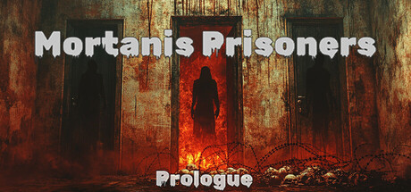
Mortanis Prisoners Prologue scored 70/100 on Steam Analyzer — Good for a Combat capsule. Top priority fix: [uniqueness_polish] Introduce a distinctive character design element, symbol, or pose (e.g., a unique silhouette, iconic weapon, or Mortanis-specific rune/mark) that differentiates the brand from generic dark-action templates.

Capsule scores by dimension

  • Genre Clarity: 7/10 — Dark action-adventure clearly signaled. The silhouetted figure in the center, fiery red glow, rusted industrial setting, and ominous atmosphere strongly suggest a dark action or survival-horror game. At TINY size, the red center focal point and black figure read as a threat or horror motif. The visual language aligns with action-adventure expectations but lacks specific mechanical clarity (e.g., no visible weapons, HUD elements, or character detail that would confirm precise subgenre).
  • Title Readability: 8/10 — Bold white text, solid readability. The white sans-serif title 'Mortanis Prisoners' appears at top-left with strong contrast against the dark background; the white outline helps separation. At SMALL size it remains readable; at TINY size the letter forms hold their shape and remain legible due to weight and spacing. The subtitle 'Prologue' below is smaller but still readable at small size, though it risks becoming noise at extreme thumbnail scales.
  • Contrast & Color: 8/10 — Strong red-black value separation. The composition leverages high contrast: white title against dark, fiery red/orange core figure against black silhouettes and rust textures, and warm tones pop against the cool dark background. In grayscale, the value separation remains clear with the bright center (red converts to light gray) distinct from the dark surrounds. The saturation of the red and glow effects read well at SMALL and TINY sizes without muddiness.
  • Uniqueness & Polish: 6/10 — Competent but familiar dark aesthetic. The rusted industrial environment, silhouetted figure, and fiery core are well-executed but align closely with common dark-action and horror game visual tropes (similar to genre benchmarks like Lies of P and Hellblade II). The lighting and particle effects show craft, but the overall composition feels more serviceable than distinctive—there is no clear unique selling point or memorable motif that distinguishes Mortanis Prisoners from other indie dark-action titles. No iconic character pose, symbol, or narrative hook stands out.
  • Brand Consistency: 6/10 — Coherent internal style, limited identity. The rendering style (photo-realistic rust, volumetric glow, silhouette contrast) is internally consistent and matches the dark-action aesthetic. However, without reference to the 13 store screenshots or prior brand exposure, the capsule communicates a generic dark-action feel rather than a memorable, recognizable Mortanis Prisoners identity. The color palette (rust-red, black, white) is cohesive but not distinctly branded.
  • Composition: 7/10 — Clear focal point, good depth layering. The silhouetted figure centered with bright red glow creates a strong primary focal point that holds at SMALL and TINY sizes. Foreground (rusted doors), midground (figure and glow), and background (dark interior) create depth hierarchy. The title placement at top-left respects margins and does not compete with the center figure. At TINY size, the composition remains readable with the red center and title clear; however, the supporting background details begin to blur together, reducing secondary storytelling.

What works

  • High-contrast title placement. White sans-serif title at top-left with strong value separation ensures readability across all sizes, including TINY thumbnails.
  • Clear focal point with depth. The centered silhouette with glowing red core draws the eye immediately and maintains hierarchy at small sizes due to layered foreground, midground, and background elements.
  • Strong mood and atmosphere. The industrial rust aesthetic, fiery glow, and dark silhouette effectively communicate a dark-action or horror tone consistent with the game's premise.

What hurts the capsule

  • Generic visual formula. The composition relies on familiar dark-action tropes (silhouette, fire, rust) that appear in many competing titles, reducing distinctive brand identity and memorability.
  • Limited gameplay clarity. There are no visible weapons, UI hints, or character details that signal specific mechanics or first-person perspective, leaving genre subtype ambiguous.
  • Prologue subtitle at risk. While readable at SMALL, the 'Prologue' text may become illegible or visually noisy at extreme TINY scales, potentially confusing whether this is the full game.

Priority fixes

  1. [uniqueness_polish] Introduce a distinctive character design element, symbol, or pose (e.g., a unique silhouette, iconic weapon, or Mortanis-specific rune/mark) that differentiates the brand from generic dark-action templates.
  2. [genre_clarity] Add a subtle gameplay hint or environmental detail (e.g., visible sci-fi/fantasy tech, weapon, or first-person perspective frame) to clarify the specific action-adventure subgenre and core mechanic.
  3. [brand_consistency] Develop and apply a signature visual motif (color accent, lighting style, or symbol) across store assets to build recognizable brand identity and player recall.

Store copy priority fixes

  1. [hook_strength] Replace the short description entirely with a single punchy line that leads with the core conflict and emotional hook: 'Escape a concentration camp nightmare where survival is just the first terror' or similar, front-loading 'escape' as the primary verb.
  2. [feature_communication] Add 2–3 sentences in the detailed description explaining core gameplay verbs: 'You must [solve puzzles / fight supernatural enemies / hide and survive] while [uncovering the camp's dark secret / evading guards], using [specific mechanics like inventory, crafting, stealth].'
  3. [audience_targeting] Clarify the horror subtype and pacing in a single sentence: e.g., 'A psychological and atmospheric horror experience focused on narrative survival' or 'A combat-heavy action-horror prologue' to signal whether the game prioritizes story, combat, or atmosphere.
  4. [uniqueness] Add one sentence articulating why this game's premise matters: e.g., 'Grounded in historical horror, [this game] explores [specific theme or mechanic unique to this title] that no other horror game addresses.'

Related guides

Steam app ID: 2469550 · Tags: Combat, Supernatural, Survival Horror, Horror, Atmospheric