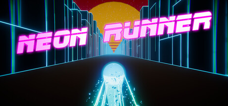
Neon Runner scores 88/100 — better than 100% of Action capsules (n=8,535).

Quick text summary

Neon Runner scored 88/100 on Steam Analyzer — Excellent for a Action capsule. Top priority fix: [composition] Increase the width or visibility of the glowing highway lane markers to create a slightly wider sense of forward motion tunnel at small sizes

Capsule scores by dimension

  • Genre Clarity: 9/10 — Arcade racer immediately obvious. The first-person perspective down a neon highway with glowing lane markers and converging vanishing point unmistakably communicates a racing or runner arcade game at all sizes. The retrowave aesthetic with cyan and magenta neon lines against dark background is the signature visual language of arcade racing games. At tiny size, the forward motion tunnel and neon geometry remain instantly readable.
  • Title Readability: 9/10 — Bold neon title perfectly legible. NEON RUNNER is rendered in thick, bright magenta neon italic letterforms with cyan outline glow that provide excellent contrast against the dark background. The title positioning across the upper-left and center maintains readability even at tiny 120x45 size due to large letterforms and high saturation. The glow effect adds depth without compromising clarity across all viewing scales.
  • Contrast & Color: 10/10 — Exceptional neon pop and separation. Bright magenta (#FF00FF range) and cyan (#00FFFF range) neon elements create maximum value separation against the black background (#1b2838), with the glowing effect adding luminosity that reads clearly even when squinting or at tiny size. The yellow sun and blue highway details provide secondary color hierarchy without competing. In grayscale simulation, the neon lines maintain strong silhouette separation and the overall composition never muddles or blends into background.
  • Uniqueness & Polish: 8/10 — Distinctive retrowave aesthetic well-executed. The capsule delivers a cohesive retrowave/synthwave style with intentional design choices: neon glow effects, geometric architecture, 80s-inspired color palette, and iconic forward-motion perspective that feels premium and nostalgic. The sun gradient, layered skyline, and particle-like glow effects demonstrate craft beyond generic asset usage. While retrowave is a recognizable subgenre style, this execution stands out with clean craft and no amateurish visual artifacts or cheap asset feel.
  • Brand Consistency: 8/10 — Strong retrowave identity with coherence. The capsule establishes a clear and internally consistent brand voice through the retrowave neon aesthetic, color palette (magenta, cyan, yellow, dark blue), and geometric architectural language that would be recognizable across game materials. The rendering style is uniform, the gradient effects are controlled, and the overall art direction feels cohesive without jarring tonal shifts. This visual identity aligns with arcade runner expectations and creates a memorable, iconic look.
  • Composition: 9/10 — Excellent hierarchy and focal depth. The composition uses perfect perspective depth with the highway tunnel converging to a focal point, creating three clear zones: neon cityscape background (top), glowing highway midground (center), and forward motion emphasis (foreground). The title placement across the upper third does not obscure the critical highway element, and the sun provides a natural eye-draw without dead space. All critical elements remain safely within margins across small and tiny sizes with no Steam crop risk.

What works

  • Neon contrast unmistakable at all sizes. Magenta and cyan glow against black background creates maximum legibility and visual pop that sustains clarity from full header down to 120x45 thumbnail.
  • Genre and game type instantly clear. First-person highway perspective with lane markers and converging vanishing point communicates arcade racing immediately, even at tiny size with no ambiguity.
  • Cohesive retrowave brand identity. Consistent geometric neon aesthetic, controlled color palette, and glow effects create a premium, distinctive look that feels intentional and memorable.
  • Strong depth and focal hierarchy. Layered composition with background skyline, glowing highway, and forward motion creates clear visual flow that guides the eye without clutter or competing elements.

What hurts the capsule

  • RUNNER text slightly less prominent. While NEON is the primary focus, the RUNNER portion sits lower and slightly less saturated, creating minor secondary emphasis that could be more unified.
  • Central highway slightly narrow. The forward-motion tunnel is effective but leaves some unused prime real estate on the left and right edges that could reinforce the racing corridor theme.

Priority fixes

  1. [composition] Increase the width or visibility of the glowing highway lane markers to create a slightly wider sense of forward motion tunnel at small sizes

Store copy priority fixes

  1. [uniqueness] Add a specific differentiator in the short description (e.g., 'the only runner with X' or 'combines Y mechanic with Z aesthetic') to explain why players should choose this game over other arcade runners.
  2. [hook_strength] Rewrite the opening line to lead with a concrete gameplay hook or emotional payoff (e.g., 'Survive impossible neon obstacles at breakneck speed' or 'Chase the perfect run in this procedurally endless arcade racer').
  3. [audience_targeting] Add a sentence explicitly stating the ideal player ('Perfect for arcade veterans seeking quick-play thrills' or 'Ideal for players who love retro-inspired, high-score-driven action').

Related guides

Steam app ID: 2471910 · Tags: Action, Arcade, Indie, Singleplayer, Racing