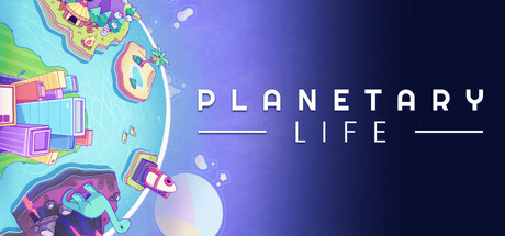
Planetary Life scores 82/100 — better than 94% of Early Access capsules (n=3,067).

Quick text summary

Planetary Life scored 82/100 on Steam Analyzer — Good for a Early Access capsule. Top priority fix: [genre_clarity] Consider adding a subtle creature or cell silhouette to the planet surface to hint at the life evolution core mechanic and increase immediate gameplay recognition.

Capsule scores by dimension

  • Genre Clarity: 8/10 — Clear sandbox simulation visual language. The colorful isometric planet with visible UI elements, structures, and organic shapes immediately communicates a creative sandbox or simulation game. At TINY size, the vibrant planet silhouette and stacked building-like structures read as strategy/simulation, though the specific 'life evolution' mechanic is not visually obvious. The visual language aligns well with indie sandbox expectations.
  • Title Readability: 9/10 — Excellent legibility across all sizes. PLANETARY LIFE is rendered in clean, modern sans-serif typography with strong white-on-dark contrast and strategic horizontal dividing lines that enhance readability. At TINY size, the title remains clearly readable due to generous letter spacing and high contrast against the dark upper background. The layout is centered and uncluttered, making it stand out during quick scroll.
  • Contrast & Color: 9/10 — Strong value separation and visual pop. The capsule achieves excellent contrast with vibrant magenta, cyan, and lime greens against the purple-to-dark gradient background, creating distinct silhouettes even at tiny size. The white title text pops cleanly against the dark upper section, and the bright planet orb in the lower right provides a strong focal anchor. In grayscale, the value range from dark navy to bright neon reads clearly without muddiness.
  • Uniqueness & Polish: 8/10 — Polished indie aesthetic with strong identity. The isometric planet design with playful colorful structures conveys a premium, intentionally crafted visual style that feels distinctive for a simulation game. The art direction is cohesive, showing clear UI mockups and organized building layouts rather than generic assets, which communicates the core mechanic of planetary construction and manipulation. The overall polish and color confidence elevate it above template-based capsules.
  • Brand Consistency: 7/10 — Coherent visual style with recognizable motifs. The isometric perspective, pastel-bright color palette, and playful UI elements establish a consistent internal identity that would be recognizable across marketing materials. The planet-as-primary-subject motif is iconic for this title's concept of life simulation. However, without reference to the 14 store screenshots, it is difficult to verify whether all brand touchstones are consistently applied across the full ecosystem.
  • Composition: 8/10 — Well-balanced hierarchy with clear focal point. The planet sits prominently in the lower-left to center area, drawing the eye immediately, while the title anchors the upper half with balanced negative space. At SMALL and TINY sizes, the planet silhouette reads as the primary subject and the title remains legible without competing for attention. The composition respects safe margins and the planet orb placement avoids edge-hugging, allowing the design to survive Steam's cropping resilience.

What works

  • Title legibility across sizes. Clean sans-serif typography with strong white contrast and horizontal dividers ensures PLANETARY LIFE reads clearly from full header down to tiny thumbnail without collapsing.
  • Vibrant color separation. Neon cyan, magenta, and lime against the dark purple-navy gradient create bold silhouettes and visual pop that stand out during quick scroll.
  • Genre-appropriate visual language. Isometric planet with visible structures and UI elements immediately communicates sandbox strategy/simulation gameplay to the target indie audience.
  • Intentional, premium craft. Polished isometric design, organized building layouts, and confident color palette convey a carefully designed game rather than a generic or template-based asset.

What hurts the capsule

  • Life evolution mechanic not visually apparent. While the planet sandbox is clear, the core selling point of evolving creatures from cells to civilizations is not communicated through the capsule visuals alone.
  • Limited depth layering. The composition relies primarily on a single focal planet without strong background-midground-foreground separation, reducing visual storytelling depth.

Priority fixes

  1. [genre_clarity] Consider adding a subtle creature or cell silhouette to the planet surface to hint at the life evolution core mechanic and increase immediate gameplay recognition.
  2. [composition] Introduce a layered background element (e.g., subtle planet atmosphere, space particles, or terrain) to strengthen depth and create more visual interest without cluttering the title area.

Store copy priority fixes

  1. [uniqueness] Add a sentence that explicitly differentiates Planetary Life—e.g., 'The only game where you design life at the cellular level, then watch societies emerge from your choices' or 'Combines creature evolution with full planetary terraforming in real-time'.
  2. [hook_strength] Strengthen the short description opening by leading with the most unique hook: consider 'Design life from single cells to civilizations, then reshape entire planets to ensure their survival' instead of leading with climate manipulation.
  3. [audience_targeting] Add 1–2 sentences clarifying playstyle scope, e.g., 'Whether you want to optimize ecosystems, create chaotic experiments, or watch emergence unfold hands-off, Planetary Life lets you play your way.'
  4. [feature_communication] Expand the CELL STAGE section with a concrete sentence about how cell design works—e.g., 'Combine cell types (motile, photosynthetic, neural) to design organisms that fit your environment.'

Related guides

Steam app ID: 2471970 · Tags: Early Access, God Game, Sandbox, Simulation, Science