Scoring genre clarity...
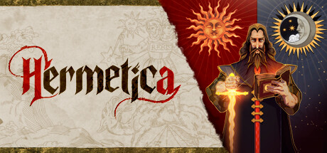
Hermetica capsule

Hermetica

Travel back to darker times, and enjoy a roguelike deckbuilder adventure, set in XVI Century. Discover the secrets of alchemy and fight mythical beasts. Hermetica combines card tactical combat and potion crafting, with a unique medieval art style.

DeckbuildingRoguelike DeckbuilderMedieval
Red MountainTo be announced

Hermetica scores 78/100 — better than 88% of Deckbuilding capsules (n=951).

Released To be announced · By Red Mountain

Quick text summary

Hermetica scored 78/100 on Steam Analyzer — Good for a Deckbuilding capsule. Top priority fix: [contrast_color] Increase brightness or saturation of the sun and moon icons to ensure they read as distinct symbols rather than blurring together at small scales

Capsule scores by dimension

  • Genre Clarity: 8/10 — Occult deckbuilder adventure clear. The alchemist character with glowing cross, sun/moon iconography, and ornate medieval styling immediately signals a supernatural card game with 16th century mysticism. At TINY size, the bearded figure and glowing light effects still read as magical/occult gameplay rather than action or combat. The visual language of alchemy symbols and religious iconography creates strong genre expectation alignment.
  • Title Readability: 7/10 — Bold serif readable at small. The title 'Hermetica' uses a strong red serif font with clear letterforms and good contrast against the beige/cream left panel background. At SMALL size the text remains legible, though at TINY size individual letter details blur slightly but the word shape remains recognizable. The placement on a controlled light background rather than over busy texture preserves clarity across scales.
  • Contrast & Color: 8/10 — Strong value separation reads well. The composition uses clear zones: warm beige left panel, deep red center, and dark blue-gray right panel, creating strong silhouette separation from Steam's dark background. The golden and orange glow effects on the alchemist's cross and sun symbols pop distinctly even at small size. In grayscale, the light cream and gold elements maintain clear separation from darker midground and background, supporting legibility during quick scroll.
  • Uniqueness & Polish: 8/10 — Premium medieval alchemy aesthetic. The hand-drawn ornamental background patterns, detailed alchemist character illustration, and coherent sun/moon symbolism convey intentional art direction and craft above generic template work. The color palette of muted golds, deep reds, and rich blues feels cohesive and deliberately curated rather than stock imagery. The visual storytelling of an alchemist holding mystical symbols creates a specific hook that communicates the core mechanic (potion crafting + card play) without generic fantasy cliché.
  • Brand Consistency: 8/10 — Distinctive alchemist identity strong. The bearded alchemist with cross and glowing effects serves as a recognizable icon that would be memorable across marketing materials and future promotional art. The ornamental patterning and medieval manuscript aesthetic create a signature visual language distinct from other deckbuilders. The consistent use of red, gold, and dark earth tones across the composition establishes a cohesive brand color palette that supports later recognition.
  • Composition: 8/10 — Balanced hierarchy focal point clear. The design creates three zones with clear hierarchy: prominent title on left anchor, central alchemist character with glowing cross as primary focal point, and secondary sun/moon symbols reinforcing mysticism on the right. At SMALL size the bearded figure and red cross remain the eye's anchor without competing elements. The composition respects safe margins and avoids edge hugging, with the title and character both well-positioned within the frame even accounting for Steam's potential cropping.

What works

  • Memorable alchemist character icon. The detailed bearded figure with glowing cross creates a distinctive brand asset that would be instantly recognizable across store pages and promotional materials.
  • Sophisticated color hierarchy. The deliberate segmentation of warm beige, deep red, and dark blue zones creates visual rhythm and prevents muddy mid-tone blending even at tiny scale.
  • Medieval manuscript atmosphere. The ornamental background patterning and serif typography authentically convey 16th century alchemy setting without feeling generic or overwrought.
  • Strong genre signaling. The sun/moon duality, cross symbolism, and alchemist pose immediately communicate supernatural deckbuilder gameplay with occult theming.

What hurts the capsule

  • Right panel character detail loss. At TINY size, the detailed facial features and clothing textures of the alchemist blur together, reducing the premium feel that makes the full-size version distinctive.
  • Background pattern clarity. The ornamental patterns on the left beige panel become indistinct noise at very small sizes, losing the intentional medieval manuscript aesthetic that separates this from generic designs.
  • Secondary symbol legibility. The sun and moon icons on the right, while thematically strong, lack sufficient scale and contrast to remain individually identifiable at TINY size.

Priority fixes

  1. [contrast_color] Increase brightness or saturation of the sun and moon icons to ensure they read as distinct symbols rather than blurring together at small scales
  2. [composition] Simplify or remove fine ornamental background patterns on the left panel and replace with cleaner supporting texture that maintains visual richness at TINY size
  3. [title_readability] Add a subtle dark outline or shadow to the 'Hermetica' title to increase value separation from the beige background and improve TINY size legibility further

Store copy priority fixes

  1. [hook_strength] Move 'XVI Century Toledo' earlier in the short description to anchor the atmospheric hook with specificity: 'In XVI Century Toledo, uncover alchemy's secrets...' instead of 'Travel back to darker times.'
  2. [feature_communication] Add one sentence to the detailed description explaining how card effects interact in combat: 'Cards deal damage and apply elemental effects based on their assigned pattern and the enemies you face' or similar to close the combat resolution gap.
  3. [uniqueness] Strengthen the final unique selling point by adding: 'No two expeditions are identical: roguelike card pools, enemy layouts, and potion recipes shift each run' to emphasize replayability as a core differentiator.
  4. [audience_targeting] Add a phrase signaling whether this rewards strategic mastery vs. casual play: 'Master the interplay of positioning and potions' or 'Perfect your alchemical strategy' depending on difficulty, to clarify the skill ceiling.

Related guides

Steam app ID: 2477420 · Tags: Deckbuilding, Roguelike Deckbuilder, Medieval, Roguelite, Crafting