Scoring genre clarity...
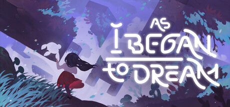
As I Began to Dream is a hand-illustrated puzzle platformer telling the story of a young girl's journey of navigating grief and loss. With the power to swap and rotate the world around her, Lily embarks on a journey through a dreamlike limbo world to find acceptance and peace.
$15.99Positive(20)
Puzzle PlatformerHand-drawnAtmospheric
StrayfluxNov 19, 2025