Flower in Us scores 65/100 — better than 19% of Interactive Fiction capsules (n=1,043).

Quick text summary

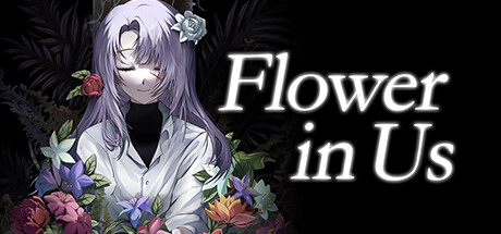
Flower in Us scored 65/100 on Steam Analyzer — Solid for a Interactive Fiction capsule. Top priority fix: [genre_clarity] Add a specific adventure or mystery mechanic visual cue—such as a investigation UI element, hidden object, or symbolic object that communicates the core gameplay loop beyond emotional narrative.

Capsule scores by dimension

  • Genre Clarity: 5/10 — Anime aesthetic, genre intent unclear. The image presents a stylized anime character with flowers in a contemplative pose, which suggests narrative-driven indie game rather than clear adventure or mystery genre markers. At tiny size, the visual reads as generic anime character art without specific gameplay or genre iconography—flowers and melancholy tone hint at emotional story but not mystery investigation mechanics or adventure action. The aesthetic does not communicate what makes this adventure unique or what systems drive gameplay.
  • Title Readability: 8/10 — Clean italic serif, strong legibility. The title 'Flower in Us' is rendered in white italic serif font with excellent contrast against the dark background and character silhouette. The text placement on the right side avoids busy texture and maintains clarity at all sizes including tiny thumbnails. At small and tiny sizes the letterforms remain distinct and the title does not collapse, though the italic styling adds slight decorative complexity that could reduce emergency legibility at extreme blur.
  • Contrast & Color: 7/10 — Strong value separation with vivid florals. The purple-gray character and white title stand out sharply against the dark background, and the colored flowers (reds, purples, blues, yellows) create localized saturation that pops on Steam's dark background. At tiny size the silhouette remains readable and flowers guide the eye without overwhelming the composition. In grayscale the character and flowers lose some distinctiveness from the dark foliage, which slightly reduces silhouette clarity at the smallest viewing sizes.
  • Uniqueness & Polish: 6/10 — Competent anime art, limited standout hook. The character illustration and floral arrangement show solid craft and emotional tone, with layered flowers suggesting thematic depth about growth or inner struggle. However, the overall presentation feels like a standard anime visual novel or story game cover—the combination of melancholic character and garden flowers is familiar territory in indie games without clear mechanical or narrative differentiation. The polish is professional but the visual storytelling does not communicate a distinctive selling point beyond 'emotional story with flowers.'
  • Brand Consistency: 6/10 — Coherent aesthetic, limited icon memory. The color palette (purples, whites, deep blacks) and anime illustration style are internally consistent and suggest a specific mood and target audience. The character design with gentle features and flower motif could become recognizable with repeated exposure, but there is no iconic symbol, signature object, or memorable visual hook that immediately signals 'Flower in Us' without the text. The art direction is cohesive but generic within the narrative indie game space.
  • Composition: 7/10 — Balanced focal point, safe title placement. The character occupies center-left with flowers distributed around to create depth and layering from dark foliage background through colorful mid-ground blooms to the figure. The title anchors the right side with strategic negative space, creating clear hierarchy and focal point without clutter. At small and tiny sizes the composition remains legible with the character silhouette as primary subject and title as secondary anchor, though the distributed flowers at the edges risk minor crop loss on some Steam store placements.

What works

  • Excellent title contrast and placement. White italic serif text on dark background with positioned right-side placement ensures the title reads clearly at all sizes including tiny thumbnails without fighting the character art.
  • Emotional narrative atmosphere. The melancholic character pose combined with vibrant flowers creates a cohesive mood that signals this is a story-driven experience with themes of growth or inner conflict.
  • Clean value separation. The light character figure and bright title stand distinctly against the dark background, maintaining strong silhouette legibility even at small viewing sizes.

What hurts the capsule

  • Genre identity unclear at thumbnail. The capsule does not communicate whether this is a mystery adventure, visual novel, simulation, or narrative puzzle—the anime aesthetics dominate over gameplay type signals.
  • Generic anime visual novel look. The combination of contemplative character, flowers, and melancholic tone matches dozens of other indie story games without distinctive mechanical or thematic hooks that stand out in Steam's crowded adventure/indie space.
  • Limited brand recognition icon. No memorable symbol, character logo, or signature visual element exists that would let players recognize 'Flower in Us' from the capsule alone without the text.

Priority fixes

  1. [genre_clarity] Add a specific adventure or mystery mechanic visual cue—such as a investigation UI element, hidden object, or symbolic object that communicates the core gameplay loop beyond emotional narrative.
  2. [uniqueness_polish] Introduce a distinctive visual hook or character detail that differentiates this from standard anime story games—consider a unique color palette shift, art style signature, or thematic symbol that becomes recognizable.
  3. [brand_consistency] Develop an iconic motif or character silhouette detail that could serve as a visual brand marker across marketing materials and store pages for instant recognition.

Store copy priority fixes

  1. [uniqueness] Add a sentence that articulates what makes this mystery distinct—e.g., a specific thematic focus, an unusual narrative structure, or a particular gameplay mechanic that differentiates it from other mystery adventures.
  2. [hook_strength] Move or promote the 'darkness of the basement...memory wiped clean' atmospheric hook into the short description to immediately engage players with vivid tension rather than generic framing.
  3. [feature_communication] Expand the detailed description to specify puzzle types (inventory-based, dialogue-driven, environmental), approximate playtime, number of endings, and save/load functionality to give players a clearer mental model of gameplay.
  4. [audience_targeting] Include a sentence clarifying the intended audience—e.g., 'perfect for fans of visual novels and narrative mysteries' or 'ideal for players seeking story over mechanical challenge'—to strengthen audience resonance.

Related guides

Steam app ID: 2482920 · Tags: Interactive Fiction, Puzzle, Investigation, Visual Novel, Choices Matter