Scoring genre clarity...

Blocks and Bones capsule

Blocks and Bones

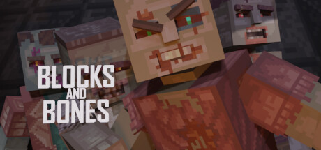
Blocks and Bones is a zombie wave shooter with endless hordes of the undead in custom maps built by players. Build mode is the sandbox side of the game where you build levels from blocks and publish them online in-game so other players can survive the apocalypse inside your chilling creations.

$4.994 user reviews
VoxelFirst-PersonShooter
HawkSandwichJan 7, 2026

Blocks and Bones scores 70/100 — better than 29% of Voxel capsules (n=174).

4 user reviews · $4.99 · Released Jan 7, 2026 · By HawkSandwich

Quick text summary

Blocks and Bones scored 70/100 on Steam Analyzer — Good for a Voxel capsule. Top priority fix: [uniqueness_polish] Add a distinctive visual element—iconic zombie character variant, signature UI flourish, or unique apocalypse world detail—that creates memorable brand identity separate from standard Minecraft clones.

Capsule scores by dimension

  • Genre Clarity: 7/10 — Minecraft-style zombie survival clear. The capsule immediately communicates a blocky, voxel-based zombie shooter through the pixelated undead models, cubic architecture, and warm reddish-brown palette typical of zombie apocalypse games. At tiny size, the stacked zombie heads and block-like structures still read as 'building game with threats,' though the specific wave-shooter mechanic is not entirely obvious without context. The genre messaging is strong but could benefit from more explicit action iconography.
  • Title Readability: 8/10 — Bold white title, excellent contrast. The title 'BLOCKS AND BONES' is rendered in a clean, bold sans-serif with strong white-on-dark contrast that remains legible at small and tiny sizes. The all-caps treatment and letter spacing help maintain clarity even when squinted or viewed at 120×45. The two-line stacking is well-balanced and does not collapse at any viewing size.
  • Contrast & Color: 8/10 — High-value separation, warm cohesion. The white title pops cleanly against the dark background, and the warm oranges, terracottas, and browns of the zombie blocks create strong value separation from the darker gray-black shadows and stone textures. At tiny size, the silhouettes of the stacked undead and structures remain distinct without muddy midtones. In grayscale, the composition holds clear tonal hierarchy.
  • Uniqueness & Polish: 6/10 — Competent but familiar design approach. The capsule executes a straightforward mashup of Minecraft aesthetic with zombie horror, using recognizable blocky art style and undead theme without a distinctive visual hook that separates it from similar voxel-based survival games. The composition is clean and professional, but lacks a memorable art direction choice, signature character, or unique mechanical visual cue that would signal a standout title. It reads as a well-crafted indie project rather than a premium or innovative offering.
  • Brand Consistency: 6/10 — Consistent blocky style, limited identity. The internal art direction is cohesive—all elements use the same pixelated voxel rendering, warm color palette, and cubic logic consistent with the game's building mechanics. However, there is no iconic character, distinctive logo treatment, or memorable visual motif that would create recognizable brand identity across future marketing. The aesthetic is faithful to the Minecraft-inspired sandbox style but not uniquely branded.
  • Composition: 7/10 — Clear layering, title placement solid. The composition uses effective depth layering with stacked zombie blocks in the foreground, architectural elements in the midground, and darker stone structures in the background, creating visual interest and hierarchy. The title is positioned in the upper-left quadrant with good breathing room and clear focal point separation. At tiny size, the eye naturally reads the title first, then the stacked undead forms, though the lower-right architectural elements compete slightly for attention.

What works

  • Title legibility at all sizes. White bold sans-serif maintains perfect readability from full header down to 120×45 thumbnail with no collapse or blur.
  • Cohesive voxel art style. All visual elements use consistent blocky pixelated rendering that reinforces the building-game core mechanic.
  • Strong warm color palette. Terracotta, orange, and brown tones create visual warmth and clear separation from the dark Steam background without clashing.
  • Effective depth layering. Foreground zombie stacks, midground structures, and background elements create dimensional clarity that aids composition at small sizes.

What hurts the capsule

  • No distinctive brand identity. The design relies entirely on Minecraft-adjacent aesthetic without a unique visual signature, memorable icon, or signature color scheme that distinguishes it from competitors.
  • Generic zombie horror execution. While technically competent, the undead blocks and apocalypse setting lack an innovative or memorable visual hook that communicates a unique selling point.
  • Wave-shooter mechanic not clearly signaled. The capsule emphasizes the building sandbox aspect but does not visually communicate the action-focused wave-shooter gameplay loop through UI hints or combat iconography.
  • Lower-right architectural clutter. Secondary structures in the bottom-right create mild visual noise that slightly competes with the primary zombie stack focal point at small sizes.

Priority fixes

  1. [uniqueness_polish] Add a distinctive visual element—iconic zombie character variant, signature UI flourish, or unique apocalypse world detail—that creates memorable brand identity separate from standard Minecraft clones.
  2. [genre_clarity] Include subtle wave-shooter cues such as a weapon silhouette, targeting reticle, or player figure to clarify that this is an action game, not a pure sandbox builder.
  3. [composition] Reduce or reposition lower-right architectural elements to strengthen the centered zombie stack as the clear singular focal point and reduce attention competition.

Store copy priority fixes

  1. [uniqueness] Add a sentence explaining what design element or mechanic is unique to Blocks and Bones (e.g., 'procedural difficulty scaling based on map features' or 'turret placement strategy that rivals traditional tower defense').
  2. [feature_communication] Expand on progression and difficulty: clarify how areas unlock, how wave difficulty scales, and what strategic depth turret placement and weapon choice provide.
  3. [tone_match] Fix punctuation ('there's:') and audit tone consistency; replace generic phrases like 'gruesome experience' with language specific to voxel-block aesthetics and sandbox philosophy.
  4. [hook_strength] Strengthen the closing hook ('Can you survive the terror you create?') by replacing it with a question or statement that hints at the unique interplay between building and surviving (e.g., 'Build the nightmare. Now survive it.').

Related guides

Steam app ID: 2490900 · Tags: Voxel, First-Person, Shooter, Level Editor, Sandbox