Quick text summary
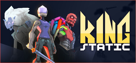
King Static scored 70/100 on Steam Analyzer — Good for a Action Roguelike capsule. Top priority fix: [uniqueness_polish] Introduce a signature visual motif or iconic character element (e.g., crown symbol, unique costume detail, or distinctive silhouette) that appears consistently across marketing to establish immediate brand recognition.
Capsule scores by dimension
- Genre Clarity: 7/10 — Action rogue-like identity clear. The capsule clearly signals stylish action combat through the dynamic character poses, glowing weapon effects, and neon-accented robot/armored figures on the left. At tiny size, the silhouettes of multiple combat-ready characters and vivid color accents (purple, red, orange) immediately suggest fast-paced action gameplay. The rogue-like tournament premise is less obvious from visuals alone, reading more as generic sci-fi action rather than specifically conveying permadeath progression.
- Title Readability: 8/10 — Bold title reads well at scale. The 'KING STATIC' logo uses a strong geometric sans-serif typeface in bright yellow-gold, positioned in the right two-thirds with clear contrast against the dark navy background. The title remains readable at small and tiny sizes due to letterform weight and saturation. The white outline/drop shadow supporting the main text ensures edge definition, though at tiny size some subtle detail softens slightly.
- Contrast & Color: 8/10 — Strong value separation, vibrant accents. The design leverages high contrast between the dark navy background and bright yellow title text, plus neon purple, red, and orange character highlights that pop distinctly. Character silhouettes benefit from warm glow effects that separate them from the cool dark backdrop, maintaining clarity at small scales. In grayscale, the value range is sufficient for clear separation, though the mid-tone purple character could merge slightly with the background.
- Uniqueness & Polish: 6/10 — Competent but genre-familiar approach. The capsule presents well-lit character models with stylish neon accents and dynamic poses that align with action game conventions, but lacks a distinctive visual hook that separates it from other stylish action titles like Armored Core VI or similar indie action rogue-likes. The composition and color treatment are polished and professional, yet feel more like a solid execution of expected genre language rather than a memorable signature style. The geometric title font is clean but not particularly unique to King Static's identity.
- Brand Consistency: 6/10 — Generic action aesthetic, limited identity. The neon-on-dark color palette (purple, red, orange, yellow) is cohesive internally but widely shared across modern action games, offering no immediately recognizable King Static signature. Without reference to the 8 store screenshots, the capsule does not establish a distinctive visual motif, character silhouette, or iconic symbol unique to this title. The dark background and bright accent approach is consistent but generic for the stylish action rogue-like space.
- Composition: 7/10 — Clear hierarchy, characters left, title right. The layout effectively positions the three combat characters on the left as the focal point, drawing the eye into dynamic action, while the right-justified title creates clear separation and reading flow. The layering of foreground characters, mid-tone effects, and dark background provides visual depth. At tiny size, the character group reads as a unified cluster on the left, and the yellow title dominates the right, maintaining legibility without competing focal points. Margins appear safe, though at small sizes the rightmost edge of the title could risk slight crop sensitivity.
What works
- High-contrast title typography. The yellow 'KING STATIC' logo maintains strong readability at both small and tiny sizes due to bold letterforms and saturation against the dark background.
- Dynamic character silhouettes. Multiple stylized character poses with neon glow effects immediately signal fast-paced action combat and create visual interest across the capsule.
- Balanced left-right composition. Characters occupy the left visual weight, title anchors the right, creating clear hierarchy and logical information flow without competing focal points.
What hurts the capsule
- Generic aesthetic without signature identity. The neon-on-dark color treatment and character styling closely follow genre conventions, offering little visual distinction from comparable stylish action titles like Armored Core VI.
- Limited unique visual hook. The capsule communicates 'stylish action' effectively but does not clearly convey King Static's specific tournament/rogue-like premise or a memorable core mechanic through visuals.
- Mid-tone purple character clarity at tiny size. The central purple character risks slight value collapse into the dark background when viewed at thumbnail scale, particularly in grayscale contexts.
Priority fixes
- [uniqueness_polish] Introduce a signature visual motif or iconic character element (e.g., crown symbol, unique costume detail, or distinctive silhouette) that appears consistently across marketing to establish immediate brand recognition.
- [genre_clarity] Add a subtle visual cue that reinforces the tournament/wishes premise, such as a crown, prize elements, or repeating circle/cycle motif, to differentiate from generic stylish action games.
- [contrast_color] Increase the contrast of the central purple character by adding a stronger outline or adjusting its value to improve silhouette separation at tiny sizes.
Store copy priority fixes
- [feature_communication] Explain 'style' with one concrete example: 'Chain hits without taking damage, land critical strikes, or execute flashy combos to unlock style bonuses that increase loot rarity and unlock powerful moves.' This clarifies the core unique mechanic.
- [hook_strength] Rewrite the short description to lead with the spectacle: 'A stylish third-person action rogue-like where devastating combos and audacious risk-taking earn you stronger weapons and new moves—defeat the King to claim your wish.' This emphasizes the combat fantasy.
- [feature_communication] Expand the detailed description to 150–200 words and add a structured list of 3–4 core features with brief explanations: weapons/moves, style rewards, progression unlocks, and run variety.
- [uniqueness] Add one sentence articulating why this style system is different: 'Unlike roguelikes that reward survival alone, King Static rewards aggressive, skillful play—turning every run into an opportunity to experiment and show off.'
Related guides
Steam app ID: 2492070 · Tags: Action Roguelike, Spectacle fighter, Hack and Slash, Roguelite, Beat 'em up