Scoring genre clarity...

Bloodgrounds capsule

Bloodgrounds

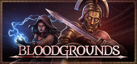
Bloodgrounds merges tactical turn-based combat with strategic management, RPG and roguelite elements. Forged in the pits of the arena, you fought your way out and now as a wealthy patron you recruit, train, and command your team of hardened Gladiators to glory - or death.

$19.99Mostly Positive(16)
Turn-Based TacticsRomeTurn-Based Combat
Exordium GamesMar 12, 2026

Bloodgrounds scores 77/100 — better than 80% of Turn-Based Tactics capsules (n=1,210).

Mostly Positive (16 reviews) · $19.99 · Released Mar 12, 2026 · By Exordium Games

Quick text summary

Bloodgrounds scored 77/100 on Steam Analyzer — Good for a Turn-Based Tactics capsule. Top priority fix: [uniqueness_polish] Incorporate a signature visual motif—such as a wealth symbol, gladiator pit architecture, or team roster UI element—to create a memorable brand hook beyond standard fantasy RPG aesthetics

Capsule scores by dimension

  • Genre Clarity: 8/10 — Arena combat and tactical strategy clear. The dual character poses—a mystical mage casting blue lightning on the left and a gladiator warrior in armor and helmet on the right—immediately signal tactical RPG combat and arena-based gameplay. At tiny size, the lightning effect and armor silhouettes remain distinct enough to communicate action-oriented strategy. The gladiator thematics align strongly with the tactical management premise, though the roguelite aspect is less visually explicit.
  • Title Readability: 8/10 — Title legible with strong outline presence. The title 'BLOODGROUNDS' uses bold, capitalized serif-style lettering with a gold fill and dark outline, positioned centrally in the lower half of the composition on a semi-transparent dark background. At small and tiny sizes, the outline holds and the letters remain individually parseable due to strong value contrast. The strategic placement away from character details ensures it doesn't compete with focal elements at any viewing size.
  • Contrast & Color: 8/10 — Strong separation with warm and cool tones. The capsule uses warm gold tones for the title and character skin against cool blue lightning and deep purple-blue backgrounds, creating clear value and hue separation. The left character's blue magical aura pops distinctly against the darker background, and the gold title stands out sharply from the dark region. In grayscale mental test, the silhouettes remain distinct, though the background gradient does flatten slightly at tiny size but maintains acceptable separation.
  • Uniqueness & Polish: 7/10 — Polished presentation with arena fantasy hook. The dual-character composition with one mystical caster and one warrior suggests diverse tactical options and team-based gameplay, differentiating it from single-hero RPG capsules. The rendering quality is clean and the gold framing with ornate border details signals production value, though the overall scene feels somewhat familiar within tactical RPG conventions. The specific gladiator + mage pairing is more distinctive than generic fantasy, but not as memorable as top-tier indie breakouts.
  • Brand Consistency: 7/10 — Consistent gold and arena aesthetic. The gold color palette, ornate border framing, and dual-character presentation establish a cohesive visual identity around wealth, combat, and strategic management. The gladiator armor and mage robes align with the game's recruitment and team composition systems visible in store screenshots. The palette and border styling would be recognizable if seen again, though the identity is more about genre convention than a signature visual hook unique to Bloodgrounds specifically.
  • Composition: 8/10 — Balanced dual-focus with clear hierarchy. The two characters are positioned on either side of the composition, creating symmetry and allowing each to command attention without competing for the focal point. The blue lightning effect draws the eye leftward to the mage, establishing a clear depth hierarchy (foreground characters, mid-ground effects, background gradient). The title placement at bottom center balances the composition well, and all critical elements remain safely away from crop edges even at small sizes.

What works

  • Genre iconography immediately clear. Gladiator armor, magical abilities, and dual-character composition signal tactical RPG combat strategy at every size without ambiguity.
  • Readable title with confident framing. Bold gold lettering with dark outline and semi-transparent background ensures 'BLOODGROUNDS' remains legible from full size down to tiny thumbnails.
  • Strong color contrast against Steam background. Warm gold and cool blue tones separate clearly from the dark #1b2838 background, with blue lightning providing visual pop and animation suggestion.
  • Polished rendering and border details. Ornate framing and smooth character rendering communicate production quality and intentional art direction rather than template assembly.

What hurts the capsule

  • Generic tactical RPG visual language. The gladiator-and-mage composition, while clear, relies on familiar fantasy RPG tropes without a signature visual hook that distinguishes Bloodgrounds from competing tactical games.
  • Roguelite elements not visually communicated. The capsule emphasizes arena combat and team building but does not hint at the roguelite progression or run-based mechanics that are core to the game loop.
  • Background gradient lacks visual interest. The purple-to-dark gradient, while serviceable for contrast, is neutral and passive, offering no thematic detail that reinforces arena or management gameplay.

Priority fixes

  1. [uniqueness_polish] Incorporate a signature visual motif—such as a wealth symbol, gladiator pit architecture, or team roster UI element—to create a memorable brand hook beyond standard fantasy RPG aesthetics
  2. [genre_clarity] Add a subtle roguelite visual cue such as run counter, progression ring, or draft-selection hint to communicate the full game loop alongside the combat and management aspects
  3. [composition] Consider layering a mid-ground arena environment or crowd silhouette to establish setting and reinforce the 'pits' narrative context mentioned in the game description

Store copy priority fixes

  1. [feature_communication] Restructure the detailed description into clear sections (Combat, Management, Progression, Permadeath) with 1-2 sentence summaries under each, breaking up the wall of text and improving scannability without losing information.
  2. [uniqueness] Add a specific sentence that articulates the core blend: e.g., 'Bloodgrounds uniquely merges the tactical depth of XCOM-style grid combat with gladiator roster management and a city-building overworld—all with permanent consequences.'
  3. [audience_targeting] Add 1-2 sentences clarifying expected audience and playstyle: e.g., 'Built for players who embrace permadeath and enjoy long-term strategic planning with high-stakes tactical battles. Expect dozens of runs, each building toward your ultimate confrontation with the Emperor.'
  4. [feature_communication] Expand the deity and crime lord mechanics with a single concrete example to show how they are used in practice, e.g., 'Use a Deity ability to heal your gladiators mid-battle, or pay the crime lord to weaken an enemy team before the match begins.'

Related guides

Steam app ID: 2507820 · Tags: Turn-Based Tactics, Rome, Turn-Based Combat, Perma Death, RPG