Scoring genre clarity...
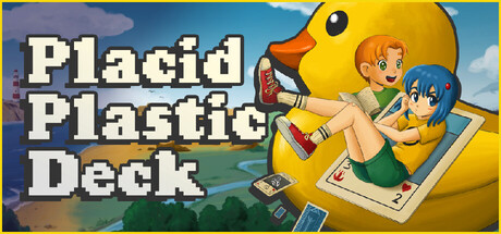
A story-driven adventure featuring card battles, multiple-choice dialogue, and funny characters! A friendship to mend, and a cast of opponents to beat, each with a uniquely built deck. But you're in luck… yours is all ducks!
$12.99Very Positive(177)
Card GameCard BattlerAdventure
turbolento games, Fantastico StudioFeb 17, 2026