Scoring genre clarity...

Vestiges: Fallen Tribes capsule

Vestiges: Fallen Tribes

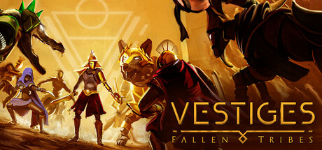
Dive into a gripping strategy adventure set in a dystopian world. Lead your tribe to victory, deploy animated units, and conquer tactical challenges in this immersive (PC & PCVR) turn by turn board game.

$24.99Positive(36)
Turn-Based StrategyAuto BattlerCard Game
WanadevStudioApr 24, 2025

Vestiges: Fallen Tribes scores 73/100 — better than 56% of Turn-Based Strategy capsules (n=1,225).

Positive (36 reviews) · $24.99 · Released Apr 24, 2025 · By WanadevStudio

Quick text summary

Vestiges: Fallen Tribes scored 73/100 on Steam Analyzer — Good for a Turn-Based Strategy capsule. Top priority fix: [composition] Adjust left-side character positions inward by 8-10% to ensure no silhouettes sit within cropping safety margin and improve composition balance.

Capsule scores by dimension

  • Genre Clarity: 7/10 — Strategy gameplay clear, tribal setting evident. The image communicates tactical strategy through grouped character units in combat poses against a glowing mystical background, clearly signaling turn-based strategy. The tribal aesthetic with stylized warrior characters and golden magical elements supports the fantasy strategy positioning. At tiny size, the silhouettes and poses still read as tactical units, though the exact subgenre detail softens.
  • Title Readability: 8/10 — Strong title legibility, gold serif stands out. VESTIGES is rendered in a bold, high-contrast golden serif font positioned prominently in the right half against darker background elements, maintaining excellent readability at full and small sizes. The subtitle FALLEN TRIBES is smaller but legible and supported by a decorative diamond separator. At tiny size the main title remains recognizable, though the subtitle becomes obscured.
  • Contrast & Color: 8/10 — Warm gold and dark silhouettes separate well. The warm golden gradient background with glowing magical effects creates strong value separation from the dark character silhouettes and black unit outlines, providing excellent pop against Steam's dark interface. The rich orange-to-gold palette maintains saturation without muddiness and the backlit character positioning ensures silhouette clarity. Grayscale conversion shows robust value separation maintaining the focal hierarchy.
  • Uniqueness & Polish: 7/10 — Polished fantasy strategy with solid execution. The capsule demonstrates competent craft with deliberate particle effects, consistent character rendering, and a cohesive mystical aesthetic that avoids generic templates. The golden glow and layered character composition convey premium production values appropriate to the strategy genre. While visually solid and distinctive within indie strategy, it lacks a breakthrough memorable hook that would elevate it to excellent tier—it executes the formula well rather than reinventing it.
  • Brand Consistency: 7/10 — Consistent tribal aesthetic, recognizable identity. The capsule establishes clear brand identity through the recurring golden serif typography, consistent character design style, and distinctive tribal warrior aesthetic that would be recognizable across other marketing materials. The mystical golden glow and warm color palette feel cohesive and intentional. Internal consistency is strong, though the visual identity, while distinctive, is not iconically memorable on first impression alone.
  • Composition: 7/10 — Clear hierarchy, well-layered depth structure. The composition uses effective depth layering with a glowing background, mid-ground magical effects, and foreground character silhouettes that guide attention naturally to the central warrior figures. The title placement in the right third avoids competing with the visual center and maintains clear margins. At small and tiny sizes the focal point remains readable, though some edge characters on the left approach cropping risk on certain Steam layouts.

What works

  • High contrast golden typography. The VESTIGES title in bold golden serif maintains excellent legibility and pop at all sizes against the controlled background.
  • Effective depth and layering. Background glow, mid-ground effects, and foreground characters create clear visual hierarchy that guides the eye naturally across the composition.
  • Thematic consistency with genre. Warrior silhouettes, mystical lighting, and tactical positioning clearly communicate strategy-adventure gameplay without ambiguity.
  • Strong silhouette separation. Dark character outlines against the golden background ensure visual clarity and silhouette recognition even at thumbnail size.

What hurts the capsule

  • Left-edge character cropping risk. Several unit silhouettes on the far left approach the edge and may be partially clipped depending on Steam's adaptive cropping at different aspect ratios.
  • Subtitle legibility collapse at tiny size. The FALLEN TRIBES subtitle and diamond separator become illegible at thumbnail scale, reducing title completeness perception.
  • Generic mystical aesthetic choice. While executed well, the glowing magical warriors-in-mist formula is common within indie strategy genre and doesn't establish a uniquely memorable visual signature.
  • Limited tactical UI communication. The capsule emphasizes character aesthetics over strategic gameplay hints—board game elements, grid mechanics, or tactical positioning indicators are absent.

Priority fixes

  1. [composition] Adjust left-side character positions inward by 8-10% to ensure no silhouettes sit within cropping safety margin and improve composition balance.
  2. [title_readability] Increase FALLEN TRIBES subtitle font size or weight to remain legible at small capsule size (231x87) and improve branding completeness.
  3. [genre_clarity] Add subtle grid pattern, hex tiles, or tactical UI overlay element to reinforce turn-based strategy gameplay beyond character visuals.
  4. [uniqueness_polish] Introduce one iconic visual motif—tribal symbol, unique magical signature effect, or distinctive unit pose—that could become recognizable brand mark across materials.

Store copy priority fixes

  1. [hook_strength] Rewrite the short description to lead with the autobattler card mechanic and tribal warfare concept: 'Command one of three tribes in real-time tactical card battles—summon animated units, manage energy, and outmaneuver opponents in this strategy card autobattler (PC & VR).'
  2. [uniqueness] Add a single sentence in the opening of the detailed description that explicitly differentiates the game from other autobattlers: 'Unlike other autobattlers, Vestiges lets you [specific mechanic] to create [specific strategic outcome].'
  3. [feature_communication] Add a brief subsection on progression and rewards to clarify long-term engagement: mention unlockable cards, cosmetics, ranked ladder, or seasonal content that keeps players returning.
  4. [audience_targeting] Specify whether the game is designed for casual deck experimenters or hardcore competitive players, or state that it supports both playstyles equally.

Related guides

  • Steam page optimisationCapsule, copy, screenshots, tags — the full Steam page conversion stack.
  • Steam tags guideTag selection, ordering, and how it shapes Steam's recommendation rails.

Steam app ID: 2511780 · Tags: Turn-Based Strategy, Auto Battler, Card Game, VR, Tabletop