Scoring genre clarity...
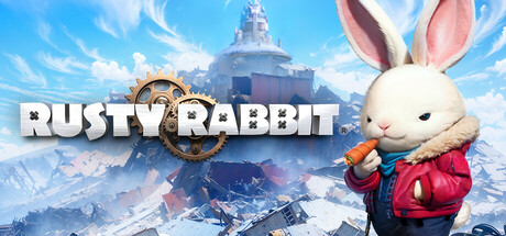
Humankind abandoned Earth as it entered another ice age. Over time, those who came to hold dominion over the world were... rabbits!? Stamp, a cute rabbit with an old soul, pilots his trusty mech "Junkster" through the giant ruins of a frozen world in this Side-Scrolling Action Adventure.
$19.99Mixed(59)
ActionAction-Adventure2D Platformer
NITRO PLUSApr 16, 2025