Scoring genre clarity...
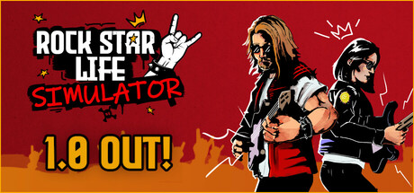
Rock Star Life Simulator capsule

Rock Star Life Simulator

Rock Star Life Simulator is an extensive fame simulation game. Start this adventure by playing the guitar on the street, form your own band. Protect the fame, money, and charisma you earned with the right decisions and become a world star!

$3.12Very Positive(495)
FPSImmersive SimRhythm
HOGO GamesJan 24, 2025

Rock Star Life Simulator scores 73/100 — better than 61% of Adventure capsules (n=8,231).

Very Positive (495 reviews) · $3.12 · Released Jan 24, 2025 · By HOGO Games

Quick text summary

Rock Star Life Simulator scored 73/100 on Steam Analyzer — Good for a Adventure capsule. Top priority fix: [title_readability] Add white outline or stronger background shape behind 'SIMULATOR' text to improve legibility at TINY size and prevent red-on-warm-color blending

Capsule scores by dimension

  • Genre Clarity: 8/10 — Rock star music game immediately clear. The capsule uses iconic rock star visual language: long-haired musician with guitar, stage setting, rock pose with peace sign, dramatic red and yellow stage lighting, and amp silhouette. At TINY size, the guitar and character pose remain legible enough to signal 'music/rock' genre. The visual hierarchy strongly communicates simulation/management gameplay through the multi-character band composition on the right side.
  • Title Readability: 7/10 — Title readable with minor contrast issues. Main title 'ROCK STAR LIFE' uses bold white sans-serif with strong contrast against the red/yellow background and is readable at SMALL and TINY sizes. The 'SIMULATOR' subtitle in red italic text sits below with adequate separation but loses some clarity at TINY size due to color proximity to the background gradient. The white outline on primary text prevents collapse at smaller sizes.
  • Contrast & Color: 8/10 — Strong value separation and vibrant palette. The red and yellow burst background creates high energy against the Steam dark background (#1b2838), with white characters and text providing excellent silhouette separation. Black details on characters and stage elements add depth. At TINY size, the light/dark contrast holds well, though the red italic subtitle blends slightly with warm background tones but remains distinguishable in grayscale due to value difference.
  • Uniqueness & Polish: 7/10 — Energetic but relies on familiar tropes. The capsule demonstrates solid art direction with clean vector-style illustration, intentional color blocking, and stage-inspired composition. Character design feels polished and specific to rock culture. However, the overall execution follows familiar music/rock game visual conventions without a distinctive mechanical hook or unique visual storytelling element that sets it apart from other music simulators.
  • Brand Consistency: 6/10 — Coherent art direction lacks memorable symbol. The capsule maintains consistent illustration style, warm color palette, and rock culture theming throughout. Character rendering is uniform and the stage/crowd motifs align well. However, there is no iconic character, logo mark, or distinctive brand symbol that would make this recognizable in isolation—it reads as a competent rock theme rather than a unique brand identity that could be spotted in a store list.
  • Composition: 8/10 — Clear focal hierarchy with balanced layout. The lead guitarist on the left anchors as primary focal point with strong pose and largest silhouette, while supporting band members on the right guide the eye without competing. Title placement at left-center uses the controlled background area effectively. Depth layering (characters, crowd, stage elements) creates visual interest. At TINY size, the composition remains cohesive and the primary subject reads clearly despite complexity.

What works

  • Strong genre recognition through visual language. Guitar, rock pose, stage lighting, and character styling immediately signal rock/music game without ambiguity.
  • High-contrast title with white bold typography. Main text 'ROCK STAR LIFE' remains legible at SMALL and TINY sizes due to bold weight and outline strategy.
  • Vibrant energetic color palette. Red and yellow burst creates visual impact against Steam dark background and signals music/concert energy.
  • Clear focal point and composition hierarchy. Lead guitarist anchors the design while band members and background elements support without clutter or scattered attention.

What hurts the capsule

  • Red subtitle loses clarity at tiny size. 'SIMULATOR' text in red italic blends toward the warm background gradient, reducing legibility at TINY viewing size.
  • No distinctive brand symbol or icon. The capsule relies entirely on generic rock tropes rather than a memorable logo or unique visual hook that signals this specific title.
  • Visually generic within music game space. While competent, the design follows expected rock game visual conventions without a standout mechanical or artistic differentiator.

Priority fixes

  1. [title_readability] Add white outline or stronger background shape behind 'SIMULATOR' text to improve legibility at TINY size and prevent red-on-warm-color blending
  2. [uniqueness_polish] Introduce a distinctive visual motif, signature element, or unique art style twist that differentiates this from standard rock simulation games and increases memorability
  3. [brand_consistency] Design and integrate a recognizable logo mark or icon that could serve as a brand identifier across marketing materials and in-game UI

Store copy priority fixes

  1. [feature_communication] Reorganize the detailed description into clear sections: 'Core Gameplay Loop' (guitar mastery, stats, venues), 'Life Systems' (love, career, finance), 'Progression' (equipment, world tour, leaderboards). This will immediately improve clarity and scannability.
  2. [genre_clarity] Explicitly state whether guitar playing is rhythm-based or turn-based/stat-driven, and confirm how quick-time events factor into gameplay, to resolve the mixed signals from the tags.
  3. [uniqueness] Add a sentence explaining what distinguishes this game from other life sims—e.g. 'the only rockstar sim that combines real-time rhythm challenges with permadeath career choices' or similar unique hook.
  4. [hook_strength] Rewrite the short description opening to lead with the emotional appeal or unique hook rather than the mechanic: 'Live the rockstar dream or crash and burn—your choices shape everything' instead of starting with street guitar.

Related guides

Steam app ID: 2530950 · Tags: Adventure, Choose Your Own Adventure, Choices Matter, Immersive Sim, Quick-Time Events