Scoring genre clarity...
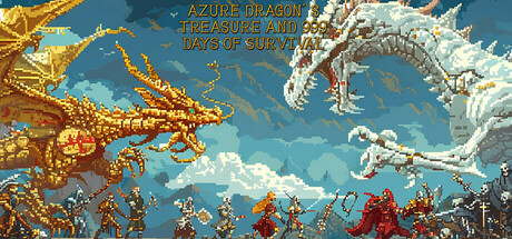
This is a simulation roguelite game. Players adventure on random maps with land, sea, and underground areas. Recruit troops from different factions. Upgrade heroes and troops in - game, yet resource collection is key.. A simple three - choose - one operation integrates various strategies.
$4.99Positive(15)
RoguelikeChoose Your Own AdventureMultiple Endings
Moyu StudioDec 1, 2025