Scoring genre clarity...

Mousey capsule

Mousey

Mousey is a retro style 3D-platformer that takes inspiration from various early 2000's classics. Travel through air ducts, explore rooms, watch out for hazards and most importantly - collect cheese.

$2.99Positive(19)
ActionAdventurePlatformer
PearlByteAug 25, 2023

Mousey scores 75/100 — better than 69% of Action capsules (n=8,838).

Positive (19 reviews) · $2.99 · Released Aug 25, 2023 · By PearlByte

Quick text summary

Mousey scored 75/100 on Steam Analyzer — Good for a Action capsule. Top priority fix: [uniqueness_polish] Add environmental context (air duct, brick wall, or retro computer aesthetic) to the background to reinforce the early 2000s platformer theme and differentiate from generic gradient treatment

Capsule scores by dimension

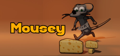
  • Genre Clarity: 7/10 — Clear platformer, playful tone reads well. The cartoon mouse character mid-jump over cheese blocks immediately signals a lighthearted platformer with collectible mechanics. The dynamic pose, exaggerated proportions, and cheerful art style convey action-adventure gameplay effectively at full size. At tiny size, the character silhouette and cheese remains readable, though the specificity of the platformer subgenre softens slightly due to art abstraction.
  • Title Readability: 8/10 — Bold yellow title, excellent contrast and placement. The word 'Mousey' appears in thick, bright yellow outlined lettering positioned left-center on the warm orange background with strong value separation. The letterforms remain legible at small size and maintain clarity at tiny size due to high saturation and bold stroke weight. Title placement avoids the character entirely, keeping the focal point uncluttered.
  • Contrast & Color: 8/10 — Warm palette pops against dark Steam background. The warm orange-brown gradient background and yellow title create strong value contrast against Steam's dark #1b2838 interface, ensuring visual punch during quick scroll. The character's gray-brown tones and black outlines read clearly in silhouette, with the bright yellow text anchoring attention. At tiny size, the warm color temperature and yellow accent survive squinting well.
  • Uniqueness & Polish: 7/10 — Charming character, retro style, competent execution. The Mousey character design is appealing and memorable with expressive eyes and cartoonish proportions that fit the described early 2000s platformer inspiration. The illustration quality is clean and intentional, avoiding generic asset library appearance. However, the warm gradient background feels somewhat standard for indie platformers, and the overall composition lacks a distinctive visual hook that would elevate it to premium-tier polish like top-performing indie capsules (DAVE THE DIVER, Hades II, COCOON).
  • Brand Consistency: 7/10 — Consistent cartoon art style, character-driven identity. The capsule establishes a clear, recognizable brand through the distinctive Mousey character design with unique proportions and personality. The art direction (cartoon illustration, retro color palette, playful tone) is internally cohesive and would be recognizable across marketing materials. The character serves as a strong identity anchor, though without access to the 14 store screenshots, consistency across the full brand ecosystem cannot be fully assessed beyond this capsule's internal signals.
  • Composition: 8/10 — Strong focal point, balanced hierarchy, safe margins. The jumping Mousey character positioned right-center creates a clear primary focal point with the cheese blocks grounding the composition. The yellow title on the left provides secondary guidance without competing for attention, and the entire scene has breathing room with safe margins from edges. At small and tiny sizes, the character and cheese silhouettes remain distinct and readable, with no critical elements lost to edge cropping.

What works

  • Bright yellow title with strong contrast. The thick outlined 'Mousey' text pops clearly against the warm background and maintains readability even at tiny thumbnail size.
  • Expressive character design with personality. The mouse's exaggerated proportions, wide eyes, and dynamic jumping pose communicate charm and playfulness effectively at all viewing scales.
  • Clear focal hierarchy and balance. Mousey dominates the right side while the title anchors the left, creating stable composition with no cluttered or dead zones.
  • Warm color palette stands out on Steam. The orange-brown gradient and yellow accents create strong value separation against the dark Steam interface background.

What hurts the capsule

  • Generic gradient background lacks distinctiveness. The warm orange gradient is competent but feels like a standard template choice for indie platformers, missing a memorable visual hook or unique thematic element.
  • Limited visual storytelling or core mechanic hint. While the cheese blocks hint at collectible mechanics, the capsule doesn't visually communicate the promised air duct exploration or early 2000s platformer inspiration beyond the character style.
  • Modest polish compared to top-tier indie benchmarks. The execution is solid but lacks the refined visual effects, dynamic lighting, or innovative art direction seen in standout indie capsules like DAVE THE DIVER or Hades II.

Priority fixes

  1. [uniqueness_polish] Add environmental context (air duct, brick wall, or retro computer aesthetic) to the background to reinforce the early 2000s platformer theme and differentiate from generic gradient treatment
  2. [genre_clarity] Enhance visual storytelling by including subtle hazard indicators or gameplay UI elements (platforms, spikes, or level architecture) to strengthen platformer genre signals
  3. [contrast_color] Introduce a complementary accent color (cool blue or purple rim lighting) to add depth and visual interest to the character without compromising contrast with the Steam interface

Store copy priority fixes

  1. [hook_strength] Rewrite the opening of the detailed description to lead with the mouse protagonist and the house setting, e.g., 'Guide a precise little mouse through the forgotten corners of a sprawling house' instead of repeating early 2000s nostalgia.
  2. [feature_communication] Expand with 2-3 concrete feature bullets or a short paragraph covering level count, estimated playtime, cosmetics system depth, and how the precision moveset differs from standard platformers.
  3. [uniqueness] Add a specific differentiator, such as which early 2000s game most inspired it or what unique mechanic or setting element sets it apart from similar retro 3D platformers.
  4. [audience_targeting] Include a brief sentence signaling difficulty level or playstyle (e.g., 'perfect for platformer veterans seeking tight controls and challenging secrets' or 'accessible exploration for casual collectors').

Related guides

Steam app ID: 2536120 · Tags: Action, Adventure, Platformer, 3D Platformer, Collectathon