Scoring genre clarity...
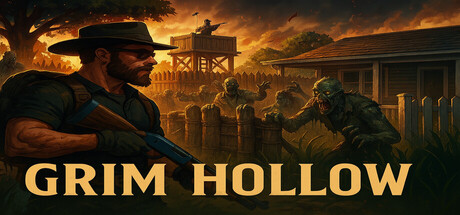
The game focuses heavily on the player’s ability to survive in a world where food, water, and ammunition are scarce, and the natural world is now a dangerous place. The evolution of the zed symbolizes the unintended consequences of humanity’s overreach and experimentation.
$9.99No user reviews
AdventureStrategyAction
Fernino DefJun 28, 2025