Scoring genre clarity...
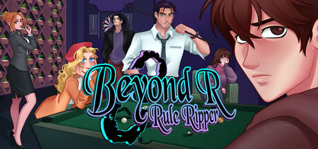
An evolving death game set in a bar, where getting to know its players is the only way out. Each person hides one of the game's rules. Discover them through their pasts, tastes, and finding hidden clues, then face them in an all-out discussion. Only three can survive, unless you fight back.
$24.99Positive(28)
Visual NovelStory RichSingleplayer
Tohriv, GJ StaffNov 14, 2025