Scoring genre clarity...
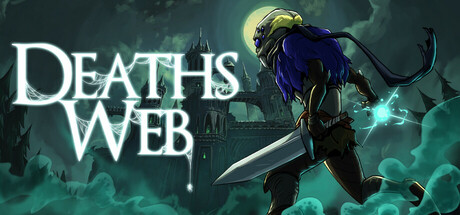
Death’s Web is a brutal rogue-lite where curses twist every run. These aren't just debuffs but deadly effects that force you to move or die. Survive their chaos to earn powerful blessings, harvest souls to upgrade permanently, and battle through a cursed world where every choice matters.
$11.993 user reviews
Action RoguelikePixel GraphicsInventory Management
ArachnocoderJan 20, 2026