Scoring genre clarity...

Century of Anticipation capsule

Century of Anticipation

Locked away at home, time slows to a crawl. Enjoy our gift to you, this delightful adventure with an unforgettable soundtrack by Brazilian artists.

Free to PlayPositive(48)
AdventureAtmosphericHand-drawn
gools, Time GalleonFeb 26, 2025

Century of Anticipation scores 62/100 — better than 3% of Adventure capsules (n=7,922).

Positive (48 reviews) · Free to Play · Released Feb 26, 2025 · By gools

Quick text summary

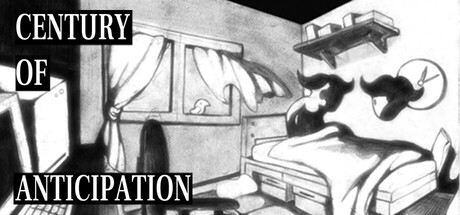
Century of Anticipation scored 62/100 on Steam Analyzer — Solid for a Adventure capsule. Top priority fix: [genre_clarity] Introduce one clear gameplay or thematic symbol (e.g., a clock, time distortion effect, or core character) to communicate genre and mechanical identity at tiny size

Capsule scores by dimension

  • Genre Clarity: 5/10 — Ambiguous narrative intent unclear. The monochrome illustration shows a figure in bed with surreal floating elements, evoking psychological or narrative-driven adventure vibes, but the visual language is too abstract to clearly signal genre at tiny size. At TINY size, it reads as moody and artistic but fails to communicate whether this is puzzle, adventure, horror, or experimental—the silhouettes are ambiguous without clear gameplay iconography or environmental context clues.
  • Title Readability: 7/10 — White text stands but awkward placement. The title 'CENTURY OF ANTICIPATION' is split across three lines in white sans-serif on the left side with solid black backdrop, ensuring legibility at full and small sizes. However, at TINY size the line breaks become cramped and the split layout loses impact; the white outline holds but the multi-line arrangement consumes vertical space inefficiently and feels forced rather than designed.
  • Contrast & Color: 8/10 — Strong monochrome value separation. The black and white illustration creates excellent contrast against the Steam dark background (#1b2838), with crisp edge definition and clear silhouettes throughout the composition. The grayscale treatment ensures zero muddy mid-tones and the white title pops distinctly; at TINY size, the contrast remains readable and the composition doesn't collapse into illegibility.
  • Uniqueness & Polish: 6/10 — Stylish but thematically generic surrealism. The monochrome illustration style is polished and intentional, evoking mid-century print aesthetic with deliberate line work and composition craft. However, the surreal bedroom-with-floating-objects motif feels familiar in indie game circles and doesn't communicate a distinctive core mechanic or unique selling point—it reads as thematically moody rather than mechanically distinctive.
  • Brand Consistency: 5/10 — No recognizable identity cues present. The capsule lacks any memorable character, icon, color palette, or visual motif that would create instant recognition across multiple touchpoints in the Steam store. The monochrome style is coherent internally but offers no distinctive brand signature; without access to the store screenshots, the capsule communicates artistic intent but not a recognizable brand identity that would help players recall this game later.
  • Composition: 6/10 — Balanced but focal point diffuse. The composition is evenly weighted with title on the left and illustration on the right, creating symmetrical balance but no dominant focal point—the eye competes between reading text and observing the abstract scene. At SMALL and TINY sizes, the right side illustration becomes a small, indistinct silhouette while the title still dominates, creating awkward hierarchy; the composition is safe from cropping but doesn't leverage the space for maximum impact at thumbnail scale.

What works

  • Monochrome contrast resilience. The black-and-white treatment ensures strong value separation and readability against Steam's dark background without color shift or legibility collapse at tiny thumbnail size.
  • Intentional artistic style. The mid-century illustration aesthetic demonstrates deliberate craft and polish with clean line work and coherent visual language throughout.
  • Title legibility maintained. White text on black backing ensures the 'CENTURY OF ANTICIPATION' title remains decipherable even at small viewport sizes.

What hurts the capsule

  • Ambiguous genre identity. The surreal bedroom imagery communicates mood but fails to clearly signal adventure, puzzle, narrative, or experimental game type at thumbnail scale.
  • Weak focal hierarchy at scale. At SMALL and TINY sizes, the right-side illustration becomes an indistinct silhouette competing with the left-side title rather than creating a clear primary focal point.
  • Generic surrealist composition. The floating objects and dreamlike interior motif feel familiar in indie circles without communicating a distinctive mechanic, hook, or unique selling point beyond artistic mood.
  • No brand identity signals. The capsule lacks memorable character, icon, or signature visual element that would enable recognition and recall across future game discovery touchpoints.

Priority fixes

  1. [genre_clarity] Introduce one clear gameplay or thematic symbol (e.g., a clock, time distortion effect, or core character) to communicate genre and mechanical identity at tiny size
  2. [uniqueness_polish] Add a subtle but distinctive visual hook—such as a signature color accent, iconic object, or silhouette—that differentiates this from generic surrealist indie titles
  3. [composition] Right-align or center the illustration and left-align the title to create depth layering and a clearer primary focal point that reads at SMALL size
  4. [brand_consistency] Establish a recognizable motif or character asset visible at thumbnail scale that could serve as a visual anchor across all store marketing

Store copy priority fixes

  1. [hook_strength] Lead the short description with the free-to-play status and add a specific gameplay verb: 'Free adventure: pass time locked indoors by playing instruments, writing poetry, and exploring strange corners of your mind—all set to an unforgettable Brazilian soundtrack.'
  2. [audience_targeting] Add a sentence to the detailed description addressing player type explicitly: 'Perfect for those seeking a meditative, story-rich experience that values mood and discovery over action' to clarify the contemplative indie audience.
  3. [uniqueness] Expand the Brazilian artist credit with a line comparing the soundtrack's role to the gameplay: 'The original score by Recife-based musicians becomes a character itself, shaping the emotional rhythm of your lockdown.'
  4. [feature_communication] Clarify the 'realms of your own thoughts' mechanic with one concrete example (e.g., 'daydream sequences,' 'memory exploration') to match the clarity of other activities.

Related guides

Steam app ID: 2555760 · Tags: Adventure, Atmospheric, Hand-drawn, Point & Click, Relaxing