Quick text summary
Cities: Skylines scored 87/100 on Steam Analyzer — Excellent for a City Builder capsule. Top priority fix: [uniqueness_polish] Introduce a subtle distinctive visual hook (e.g., signature UI element, traffic flow visualization, or unique city aesthetic) that differentiates this from generic city-builder competitors
Capsule scores by dimension
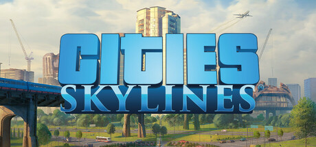
- Genre Clarity: 9/10 — City building genre immediately clear. The capsule communicates city simulation through multiple genre-specific visual cues: construction cranes, high-rise buildings under development, urban skyline, and active construction equipment. At TINY size, the combination of cranes and dense mixed-use architecture clearly signals a city-building/management game without ambiguity. The scene composition perfectly encodes the core loop of urban development.
- Title Readability: 9/10 — Strong title hierarchy and legibility. The "CITIES SKYLINES" text is rendered in bold, bright blue with clean sans-serif letterforms that maintain excellent contrast against the lighter sky background. The title placement is centered and strategically positioned on a controlled background region (sky), not competing with building textures. At TINY size, the thick letterforms and high value separation ensure the title remains fully readable.
- Contrast & Color: 9/10 — Excellent value separation and pop. The bright cyan-blue title creates strong contrast against the gradient sky (light blue to hazy warm tones). The composition uses warm golden construction cranes and cool blue buildings to create visual layering and depth. In grayscale, the light sky background separates cleanly from mid-tone and dark architectural elements, ensuring silhouette clarity even at TINY size.
- Uniqueness & Polish: 8/10 — Premium craft with intentional staging. The capsule demonstrates high production value through realistic architectural rendering, dynamic crane placement, and a carefully composed urban development scene that communicates the core gameplay loop visually. The lighting is cohesive (morning/golden hour) and the environmental storytelling shows an active, thriving city under construction rather than a generic scene. The polish level exceeds typical genre entries and signals a AAA-quality title.
- Brand Consistency: 8/10 — Recognizable brand identity cues. The bright blue title treatment is the signature Cities: Skylines brand mark that carries across marketing materials and store presence. The urban construction aesthetic with mixed commercial and residential towers aligns with established game visuals from screenshots. The color palette (cyan, warm construction yellows, concrete grays) remains consistent with the game's visual identity and is immediately recognizable to franchise players.
- Composition: 9/10 — Balanced focal hierarchy and depth. The composition uses strong layering: foreground green ground plane, midground construction cranes and buildings, background sky gradient, and airplane detail for scale reference. The title sits in the middle third on stable sky background with excellent safe margins from edges. At SMALL and TINY sizes, the eye is drawn first to the bright blue title, then to the prominent central tower, creating clear hierarchy without clutter.
What works
- Genre-specific visual storytelling. Cranes, mixed-use buildings, and active construction immediately communicate city-building gameplay and set clear player expectations.
- Strong title-background separation. Bright blue text positioned on lighter sky ensures readability at all sizes without relying on outline tricks or complex effects.
- Cohesive lighting and color palette. Warm golden-hour lighting with cool architectural tones creates professional depth and visual appeal that feels premium and intentional.
- Excellent size resilience. The composition scales well from full header to TINY thumbnail without losing clarity, focal point, or title legibility.
What hurts the capsule
- Limited uniqueness from genre peers. While polished, the urban construction scene is a familiar visual trope across city-building games and doesn't convey a distinctive mechanical hook unique to Skylines.
- No character or iconic mascot presence. The capsule relies entirely on environmental storytelling rather than a memorable character or symbol that could build long-term brand recognition.
Priority fixes
- [uniqueness_polish] Introduce a subtle distinctive visual hook (e.g., signature UI element, traffic flow visualization, or unique city aesthetic) that differentiates this from generic city-builder competitors
- [brand_consistency] Consider adding a subtle franchise icon or visual motif that becomes the recognizable brand anchor across all Cities: Skylines marketing materials
Store copy priority fixes
- [hook_strength] Replace 'a modern take on the classic city simulation' with a verb-forward statement such as: 'Build, manage, and grow your own thriving metropolis—balance budgets, traffic, and citizen needs as you expand from town to sprawling megacity.' This immediately clarifies gameplay and appeal.
- [feature_communication] Restructure the detailed description to lead with a 'Core Features' section covering base game mechanics (zones, services, economy, traffic, districts, policies, day-night cycle) before listing any DLC or expansions. Use a bulleted list for clarity.
- [uniqueness] Add a paragraph explaining what sets Cities: Skylines apart, such as: 'Colossal Order's extensive traffic simulation and deep citizen simulation create emergent city management unlike other builders. With Steam Workshop integration, thousands of user-created assets and mods extend replayability indefinitely.'
- [audience_targeting] Include a line explicitly addressing the intended audience: 'Perfect for strategy fans, city planning enthusiasts, and creative builders who want deep systems with unlimited creative freedom.'
Related guides
Steam app ID: 255710 · Tags: City Builder, Simulation, Building, Management, Strategy