Scoring genre clarity...

Biped 2 capsule

Biped 2

Biped 2 is a coop action adventure game with a strong focus on moment-to-moment collaboration alone or between 2 or 4 players.

$19.99Mostly Positive(61)
Co-opFunnyPuzzle
META Publishing, NEXT Studios, PlayJoy StudiosNov 5, 2025

Biped 2 scores 73/100 — better than 49% of Co-op capsules (n=1,513).

Mostly Positive (61 reviews) · $19.99 · Released Nov 5, 2025 · By META Publishing

Quick text summary

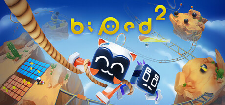
Biped 2 scored 73/100 on Steam Analyzer — Good for a Co-op capsule. Top priority fix: [genre_clarity] Add a second character in an action pose (e.g., climbing, pushing, or interacting) to visually communicate active gameplay and cooperation, not just standing idle.

Capsule scores by dimension

  • Genre Clarity: 7/10 — Quirky robots hint at puzzle adventure. The stylized robot characters with glowing eyes and compact proportions suggest a playful, cooperative experience rather than combat-heavy action. The pastoral setting with foliage and the non-threatening character designs clearly communicate indie adventure or puzzle-focused gameplay. However, at TINY size the genre reads as 'cute game' rather than specifically 'cooperative action adventure,' losing some clarity about the collaboration and moment-to-moment gameplay emphasis.
  • Title Readability: 8/10 — Bold yellow title reads clearly at all sizes. The large, chunky yellow 'biped 2' text with clean sans-serif letterforms has excellent contrast against the darker background and maintains legibility down to TINY size. The number '2' positioned centrally as a focal point reinforces the sequel identity without clutter. Minor issue: slight partial obscuring of letters by robot silhouettes ('b' and 'd' edges), but readability remains strong even at smallest viewing size.
  • Contrast & Color: 8/10 — Vibrant yellow and cyan neon pop effectively. The bright yellow title and cyan neon eye details create strong value separation against the dark teal-green forest background, with warm orange-brown soil tones providing mid-tone depth. The glowing robotic elements read as luminous points even at small scale, aided by the surrounding darker foliage. In grayscale, the composition holds clear silhouettes and hierarchy, though the overall palette relies heavily on a narrow warm-to-cool spectrum that could benefit from wider tonal range.
  • Uniqueness & Polish: 7/10 — Charming character design elevates generic scene. The round-bodied robot characters with distinctive neon eye rings feel genuinely cute and memorable, with thoughtful design choices like varied eye colors (cyan, pink) and expressive proportions. The scene composition is competent but leans toward a generic 'cute robots in nature' template seen in indie games. The craft is clean and polished, though the central visual concept—cute robots standing in a forest setting—doesn't communicate a unique mechanic or hook beyond 'whimsical adventure.'
  • Brand Consistency: 7/10 — Consistent aesthetic cohesion within capsule. The art style is internally coherent: consistent rendering of the robot characters, unified color palette dominated by cyan-pink neon accents and warm earthy tones, and a recognizable miniature art direction throughout. The robot design language is distinctive enough to become a brand identifier, though without reference to other Biped 2 marketing materials, it reads as a charming visual direction rather than an iconic franchise signature. The neon eye motif repeats across multiple robots, suggesting a consistent brand identity system.
  • Composition: 7/10 — Well-balanced focal point with minor edge risk. The central robot (pink-eyed) anchors the composition as the primary focal point, with the title 'biped 2' layered above as a secondary anchor, and supporting robots and environmental elements creating visual balance around the frame. The depth layering is clear: foliage background, robots mid-ground, foreground soil detail. Slight weakness: the left and right robots edge toward frame boundaries and may crop unpredictably depending on display size; the title placement is safe but slightly competes with robot hierarchy at SMALL size when scanning quickly.

What works

  • Strong title-to-background contrast. Bright yellow text maintains excellent readability at all sizes against dark foliage, with no outline or effect degradation at TINY scale.
  • Memorable character design. Round robot proportions and neon eye rings create a distinctive, charming visual identity that stands out from generic indie game aesthetics.
  • Clear layered depth. Foreground, midground, and background elements create visual hierarchy and prevent the composition from feeling flat even at small viewing sizes.

What hurts the capsule

  • Limited visual communication of core mechanic. The capsule does not visually communicate the '2 or 4 player cooperative' focus or the action-adventure gameplay intensity; it reads as a generic cute-robot-adventure scene.
  • Title partially obscured by character silhouettes. The 'b' and 'd' letterforms have edges softened or hidden by robot elements, reducing overall text prominence even though readability persists.
  • Narrow tonal palette limits separation. Reliance on warm-cool contrast without significant mid-tone variation reduces dimensional depth and can flatten visual impact when squinting or viewing at reduced size.
  • Character edge proximity to frame boundary. Left and right robots sit close to frame edges and risk unfavorable cropping on different display formats or Steam carousel sizes.

Priority fixes

  1. [genre_clarity] Add a second character in an action pose (e.g., climbing, pushing, or interacting) to visually communicate active gameplay and cooperation, not just standing idle.
  2. [composition] Tighten character spacing inward from edges by 8–10% and reposition title to sit fully clear of robot silhouettes without overlap.
  3. [uniqueness_polish] Introduce a visual hint of the game's core mechanic (e.g., a shared puzzle element, glowing connection between robots, or environmental interaction) to elevate beyond 'cute robots in forest.'

Store copy priority fixes

  1. [hook_strength] Rewrite the short description to lead with a gameplay verb and emotional payoff: 'Control two robots in perfect sync to solve physics puzzles across alien worlds—solo, with a friend, or in a team of four.' This immediately communicates the core mechanic and co-op appeal.
  2. [feature_communication] Move the ENJOY THE CONTROLS section into the first detailed paragraph to lead with gameplay rather than narrative setup, or integrate specific mechanics (grappling, hang gliding) into the opening hook.
  3. [uniqueness] Add a clear differentiator paragraph: specify what 'pair mechanics' actually feels like in practice (e.g., 'One player controls movement, the other controls jumping—communicate to overcome impossible obstacles') and how four-player co-op changes the puzzle design versus two-player.
  4. [tone_match] Trim saccharine phrases ('brave bipeds,' 'even the tiniest robots') and replace with punchier, more comedic language that matches the 'funny' tag and indie sensibility.

Related guides

Steam app ID: 2560240 · Tags: Co-op, Funny, Puzzle, Adventure, Split Screen