Scoring genre clarity...
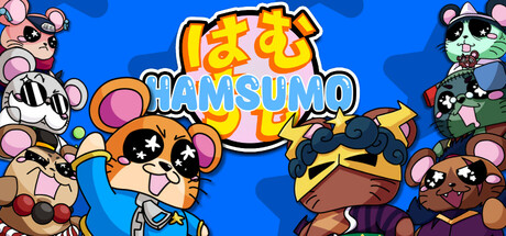
BONK YOUR FRIENDS in this action-packed, roly-poly, multiplayer action game! Choose your favorite HamSumo fighter to duke it out with your friends in this adorable PvP arena! Unleash unique and powerful Star Moves to blast away the competition and show the world your Sumo Spirit!
$10.995 user reviews
Martial ArtsPvPArcade
Sleepy Bears IndieAug 29, 2025