Scoring genre clarity...

Seekers of Eclipse capsule

Seekers of Eclipse

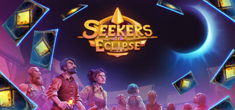
A turn-based roguelike combining city-building and deckbuilding. Build thriving towns as you forge a path towards the eclipse. Strategically produce resources to appease the gods and unleash their divine wrath upon your enemies.

$10.99Positive(22)
Roguelike DeckbuilderCard GameCity Builder
ThinKING Cat GamesJun 2, 2025

Seekers of Eclipse scores 75/100 — better than 65% of Roguelike Deckbuilder capsules (n=321).

Positive (22 reviews) · $10.99 · Released Jun 2, 2025 · By ThinKING Cat Games

Quick text summary

Seekers of Eclipse scored 75/100 on Steam Analyzer — Good for a Roguelike Deckbuilder capsule. Top priority fix: [genre_clarity] Add a subtle visual cue to communicate the roguelike structure, such as a layered map motif or run-reset symbol, to prevent expectations mismatch

Capsule scores by dimension

  • Genre Clarity: 7/10 — Strategy and fantasy clear, roguelike less obvious. The golden sun/eclipse icon at top center and mystical purple atmosphere immediately signal fantasy strategy. Multiple characters in formation with glowing lantern cards suggest resource management and deckbuilding mechanics. At tiny size, the eclipse symbol and character group silhouettes read as strategy-fantasy, though the specific roguelike + city-building combo is not visually obvious without prior knowledge.
  • Title Readability: 8/10 — Bold golden text, excellent at all sizes. The title 'SEEKERS OF ECLIPSE' uses a thick, bright golden font with clean black outline that stands out sharply against the dark purple background. At tiny size the text remains clearly legible and maintains strong presence. No taglines or competing text clutter the composition, allowing full focus on the game name.
  • Contrast & Color: 8/10 — High-value separation, strong visual pop. The golden title and bright cyan eclipse corona create excellent value contrast against the dark purple-blue gradient background. Character silhouettes are warm-toned (pink-purple), lantern cards glow with cyan and yellow accents, creating clear depth layers. In grayscale, elements maintain distinct separation and the composition remains readable at small sizes.
  • Uniqueness & Polish: 7/10 — Polished aesthetic, somewhat familiar fantasy trope. The design shows professional craft with cohesive lighting, clear particle effects (floating lantern cards), and intentional color grading. The eclipse motif and city-builder + deckbuilding hook are communicated visually. However, the mystical purple-gold aesthetic and character grouping feels somewhat derivative of other indie strategy games, limiting distinctiveness despite solid execution.
  • Brand Consistency: 7/10 — Consistent magical strategy identity. The capsule establishes a clear brand identity through the eclipse symbol, warm character palette, glowing card mechanics, and purple-gold color scheme. These elements would be recognizable across marketing materials. The visual language—mystical, organized, celestial—aligns with the described town-building and divine wrath mechanics, creating internal coherence.
  • Composition: 8/10 — Strong hierarchy, balanced focal points. The golden title anchors the upper third with clear visual dominance. The eclipse corona pulls the eye upward-right, while the character formation creates a secondary focal point in the lower half. Floating lantern cards distributed around the edges add dynamism without scattering attention. The composition maintains clear depth (sky, characters, foreground cards) and reads well at small and tiny sizes with safe margins preserved.

What works

  • Readable golden title with strong outline. The thick, bright font with black outline remains legible and eye-catching across all viewing sizes, ensuring immediate title recognition in quick scrolls.
  • Effective use of color contrast and lighting. The warm purple-pink characters and glowing cyan eclipse against the dark background create visual separation that holds up in grayscale and at tiny sizes.
  • Clear focal point hierarchy. Title, eclipse, and character formation establish a logical visual flow that guides the eye without competing elements or dead space.
  • Polished visual execution and effects. The floating lantern cards, eclipse corona glow, and character lighting demonstrate professional craft and intentional art direction.

What hurts the capsule

  • Roguelike mechanics not visually communicated. The capsule emphasizes fantasy-strategy and city-building but does not hint at the roguelike structure or run-based gameplay loop, potentially misleading expectations.
  • Generic mystical purple aesthetic. While well-executed, the purple-gold fantasy style is common among indie strategy games, reducing visual distinctiveness compared to top-performing peers like Balatro or DAVE THE DIVER.
  • Character silhouettes lack individual identity. The character formation reads as a generic group rather than establishing a memorable protagonist or faction visual, weakening brand recognition potential.

Priority fixes

  1. [genre_clarity] Add a subtle visual cue to communicate the roguelike structure, such as a layered map motif or run-reset symbol, to prevent expectations mismatch
  2. [uniqueness_polish] Introduce a more distinctive visual hook—such as a unique faction silhouette, iconic building type, or signature card design—to stand out from similar fantasy-strategy titles
  3. [brand_consistency] Develop a recognizable character or mascot for the protagonist to serve as an identity anchor across marketing materials and future media

Store copy priority fixes

  1. [feature_communication] Replace 'all sorts of unique resources' with 2–3 named resource types and brief explanation of how they differ (e.g., 'harvest wheat and ore to trade with different gods').
  2. [uniqueness] Add one sentence after the short description clarifying what makes this fusion unique (e.g., 'No other game fuses town management with turn-by-turn deckbuilding in a roguelike structure').
  3. [feature_communication] Expand the relic sentence with a concrete example: 'seek ancient relics like the Timeshard, which reduces the cost of deck upgrades' instead of vague 'help in different ways'.
  4. [hook_strength] Rewrite the opening line to lead with action: 'Build cities, forge decks, and manipulate the gods to survive the path to the eclipse' instead of starting with the descriptor 'A turn-based roguelike.'

Related guides

Steam app ID: 2577850 · Tags: Roguelike Deckbuilder, Card Game, City Builder, Roguelike, Resource Management