Scoring genre clarity...
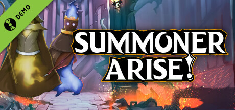
Summoner Arise Demo capsule

Summoner Arise Demo

Turn-based. Tactics. Roguelike. Summon units and battle your way past wave after wave of enemies. Start with a fixed amount of mana as you ascend a mysterious ruined temple. Run out and you lose. With hundreds of upgrades available, customize and command your army to victory!

Free to Play
Turn-Based TacticsRogueliteProcedural Generation
CookieLegendsMar 4, 2024

Summoner Arise Demo scores 85/100 — better than 98% of Turn-Based Tactics capsules (n=1,411).

Free to Play · Released Mar 4, 2024 · By CookieLegends

Quick text summary

Summoner Arise Demo scored 85/100 on Steam Analyzer — Excellent for a Turn-Based Tactics capsule. Top priority fix: [brand_consistency] Establish a signature color palette or visual motif (e.g., specific rune style, temple architecture, or summoner silhouette variation) that appears consistently across all marketing assets to strengthen brand recall.

Capsule scores by dimension

  • Genre Clarity: 9/10 — Clear tactical summoning fantasy. The central armored summoner figure with raised staff, flanked by three distinct summoned creatures (fire elemental, golden golem, dark mage), immediately communicates turn-based tactics and summoning gameplay. The mystical temple setting with glowing runes and dramatic lighting reinforces fantasy strategy genre. At TINY size, the silhouette hierarchy of summoner + three units remains unmistakable and communicates the core mechanic instantly.
  • Title Readability: 9/10 — Bold white text, excellent contrast. SUMMONER ARISE displays in thick white sans-serif with black outline on a dark background shield emblem, creating maximum legibility across all sizes. The title placement centered and slightly overlaid on the lower portion maintains readability without competing with the character hierarchy. At TINY size, the text remains crisp and fully readable due to the strong outline and high value contrast.
  • Contrast & Color: 9/10 — Strong value separation, vibrant accents. Bright warm reds, golds, and purples in the characters and effects stand out distinctly against the cool blue-teal temple background and dark Steam color #1b2838. The central summoner in gold armor has excellent silhouette definition, and the glowing magical auras (orange fire, purple energy) create clear depth layering. Grayscale test confirms strong mid to light value contrast; no muddy blend-in occurs at small sizes.
  • Uniqueness & Polish: 8/10 — Polished character art, distinct visual hook. The artwork demonstrates high production craft with detailed armor modeling, dynamic pose, and cohesive magical effects around each summoned unit. The summoner's gesture and stance communicate authority and command, reinforcing the player agency fantasy. While the style is recognizable within fantasy tactics genre, the specific character design and visual execution feel premium rather than templated or asset-generic.
  • Brand Consistency: 7/10 — Consistent fantasy aesthetic, recognizable core. The capsule establishes a cohesive fantasy tactics visual identity with consistent warm and cool color grading, unified magical effect style, and a distinctive summoner silhouette that could anchor future marketing. The three-unit formation pattern and central summoner figure create a memorable motif. However, without seeing all 6 store screenshots, full internal brand consistency assessment is limited; the capsule appears self-cohesive but visual identity signals rely primarily on this single asset.
  • Composition: 9/10 — Balanced hierarchy, strong focal point. The golden summoner commands the center as the primary focal point, with three summoned creatures arranged symmetrically on left and right, creating a stable pyramid composition. The title sits cleanly at the bottom without crowding or obscuring characters. The depth layering—foreground characters, midground effects, background temple—guides the eye clearly at all sizes, and important elements stay safely within margins at SMALL and TINY viewports.

What works

  • Instant genre recognition. Central summoner plus three distinct units immediately communicates turn-based summoning tactics, leaving no ambiguity about gameplay type.
  • Excellent title contrast and readability. Bold white text with black outline on shield emblem stays crisp and legible even at thumbnail size without any collapse or blur.
  • Strong color separation from background. Warm character colors (red, gold, purple) pop distinctly against cool blue temple and Steam dark background, maintaining clear silhouettes at all scales.
  • Balanced, non-claustrophobic composition. Three-unit symmetry with centered summoner and safe title placement avoids clutter and maintains visual clarity from full header through tiny thumbnail.

What hurts the capsule

  • Limited brand identity signals beyond this capsule. The iconic summoner and unit formation are strong, but without consistent supporting visual language across all store assets, full brand consistency cannot be verified.
  • Generic fantasy setting backdrop. While the characters are detailed, the ruined temple and magical aura background, though well-rendered, follow familiar fantasy tactics visual conventions without a standout environmental signature.

Priority fixes

  1. [brand_consistency] Establish a signature color palette or visual motif (e.g., specific rune style, temple architecture, or summoner silhouette variation) that appears consistently across all marketing assets to strengthen brand recall.
  2. [uniqueness_polish] Introduce a unique environmental or mechanical callout (e.g., a roguelike-specific visual element like mana crystal, upgrade altar, or wave counter) to differentiate from generic fantasy tactics and emphasize the roguelike progression hook.

Store copy priority fixes

  1. [tone_match] Integrate the feature sections (Customize Units, 3 Factions, Endless Levels) into narrative prose or a consistent voice rather than corporate headers—maintain the atmospheric opening throughout.
  2. [uniqueness] Add one concrete example of a synergy or faction mechanic (e.g., 'Infernal faction units gain power when summoned late in the mana bar, but cost more') to differentiate from generic synergy claims.
  3. [feature_communication] Specify expected run length or typical number of waves per ascent to help players understand pacing and session commitment.
  4. [audience_targeting] Add a sentence signaling difficulty and accessibility (e.g., 'Perfect for veterans of tactical roguelikes' or 'Newcomers welcome with scalable difficulty') to clarify whether this leans hardcore or inclusive.

Related guides

Steam app ID: 2578330 · Tags: Turn-Based Tactics, Roguelite, Procedural Generation, Turn-Based Strategy, Strategy